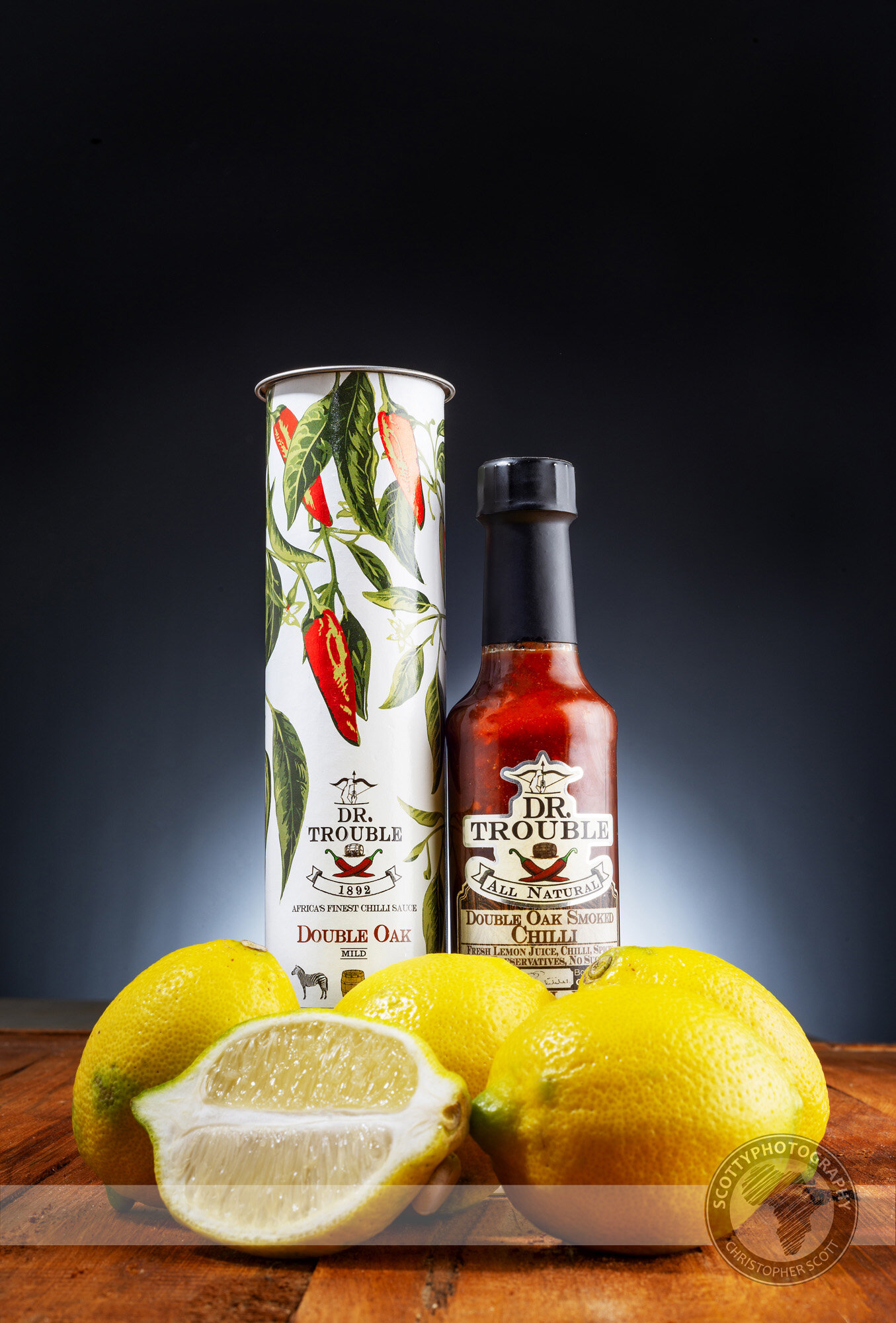
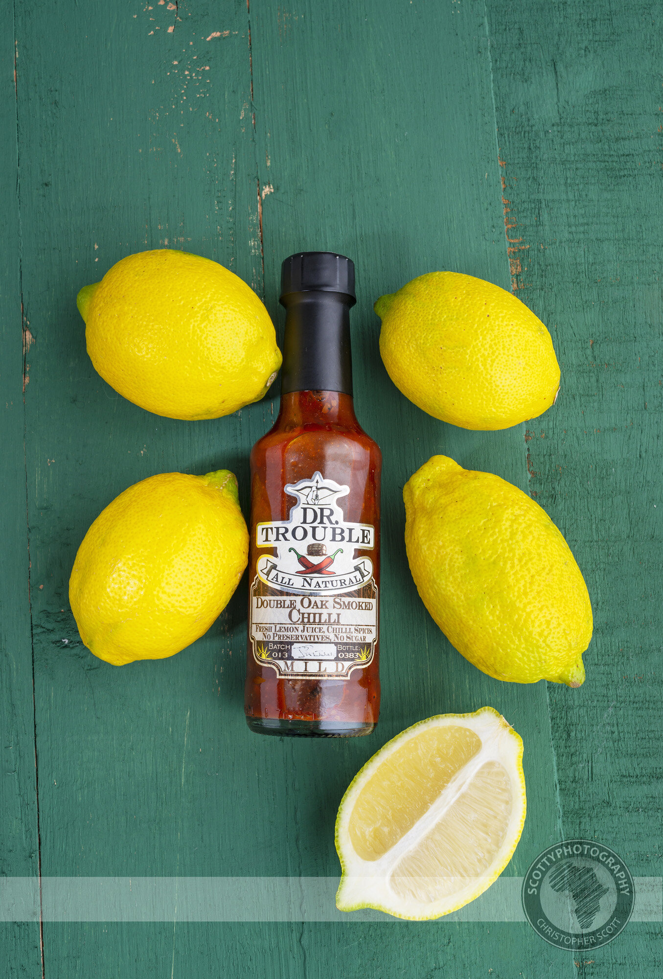
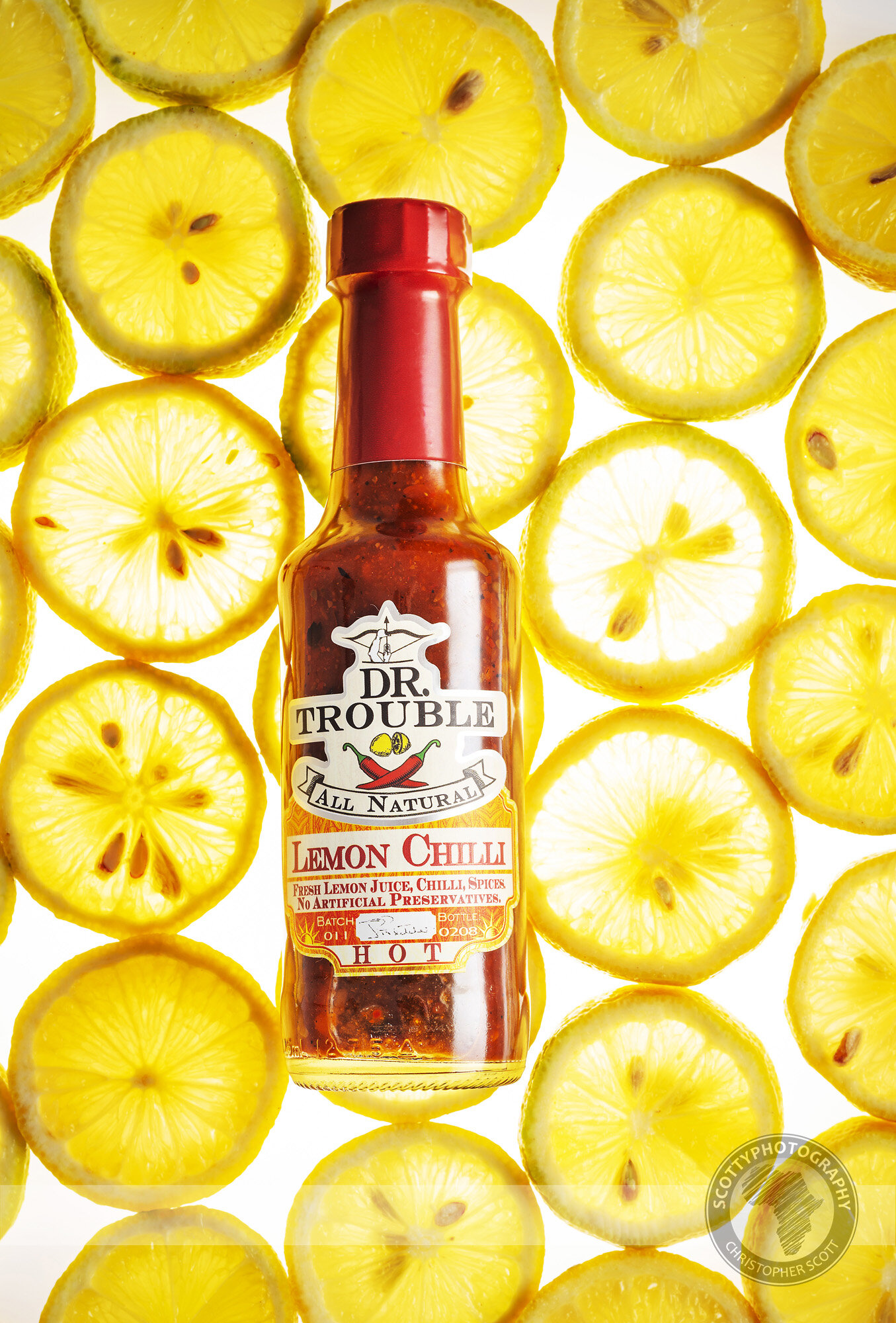
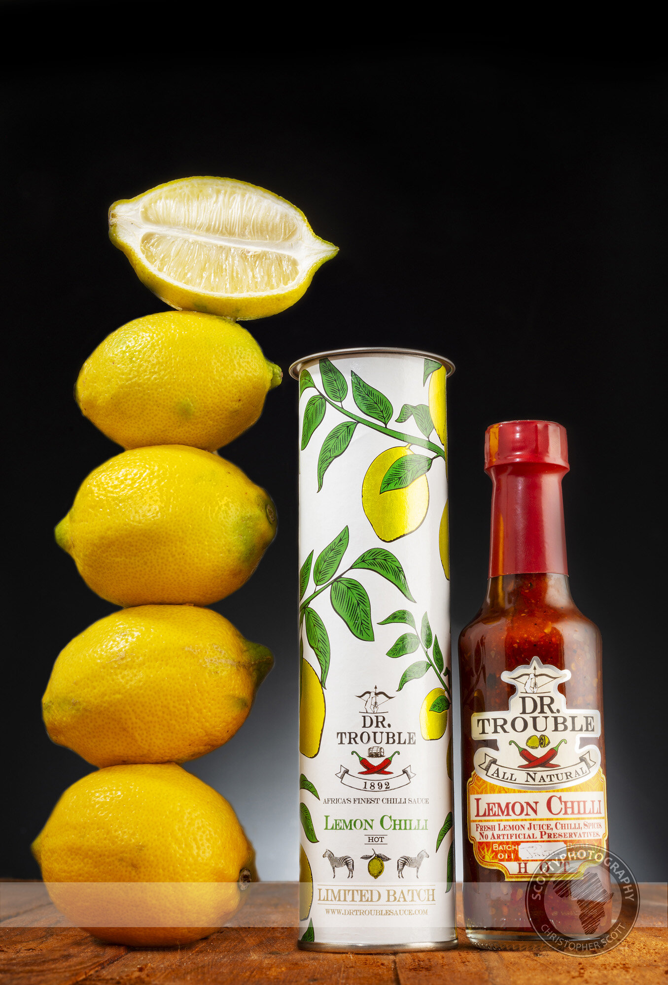
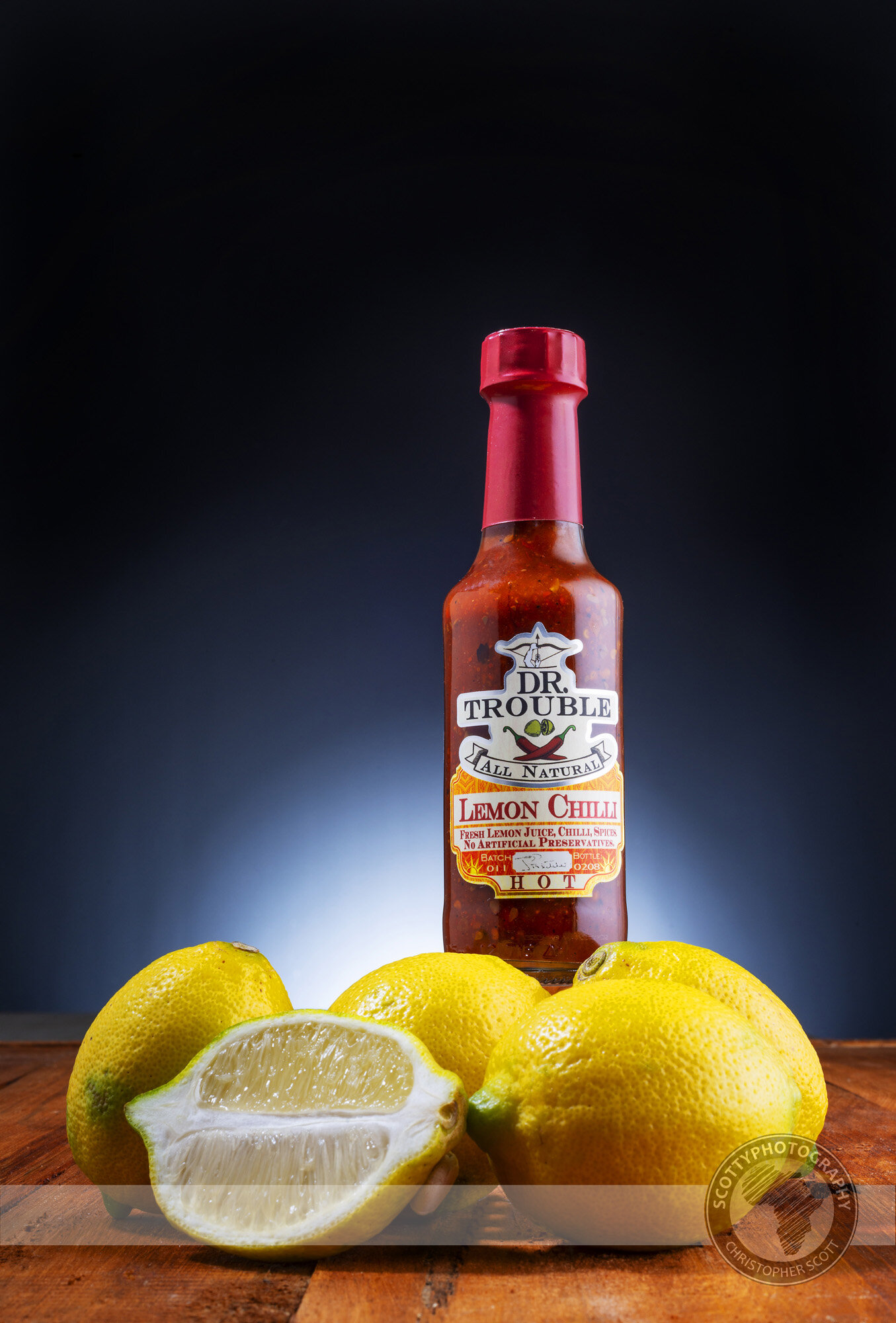
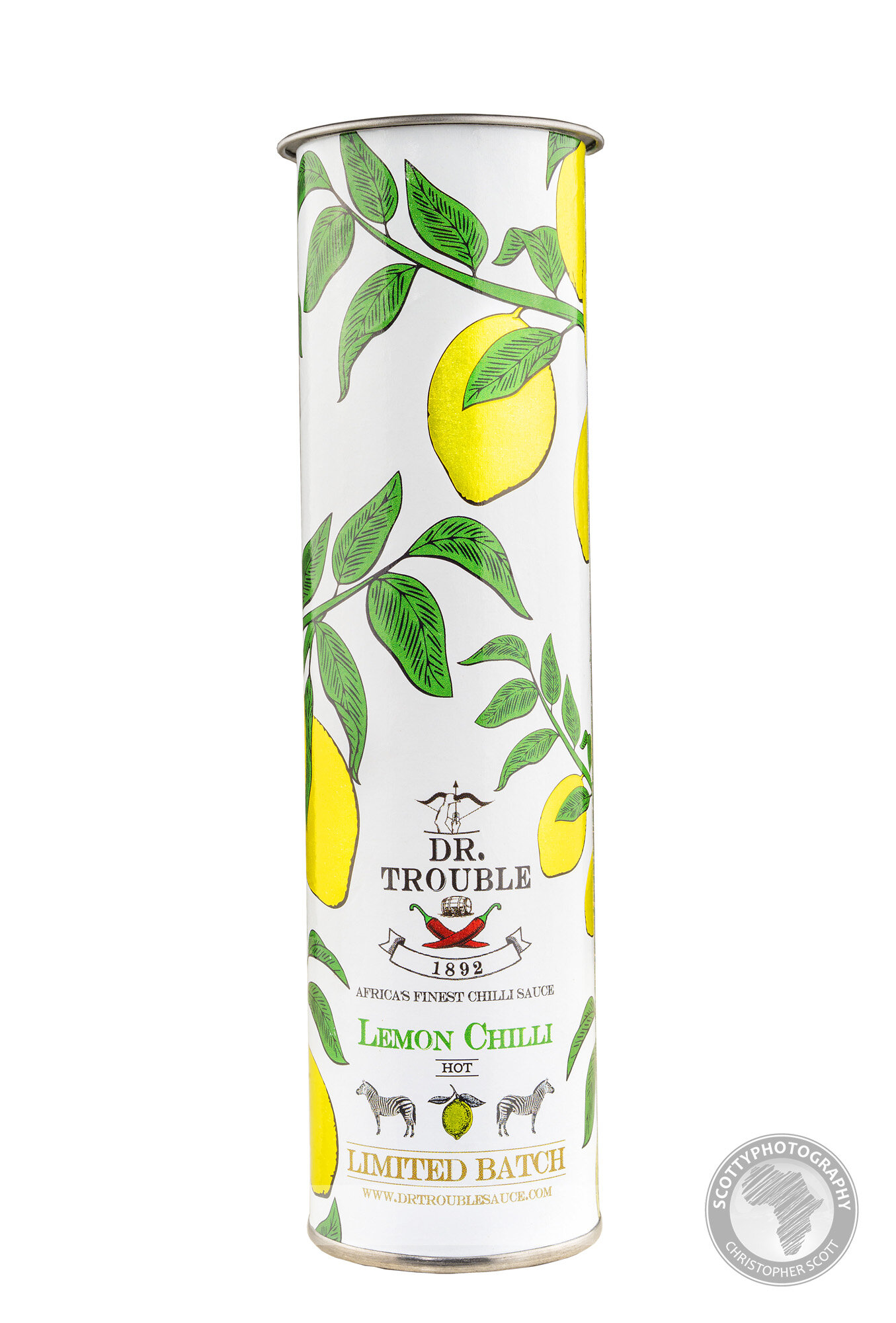
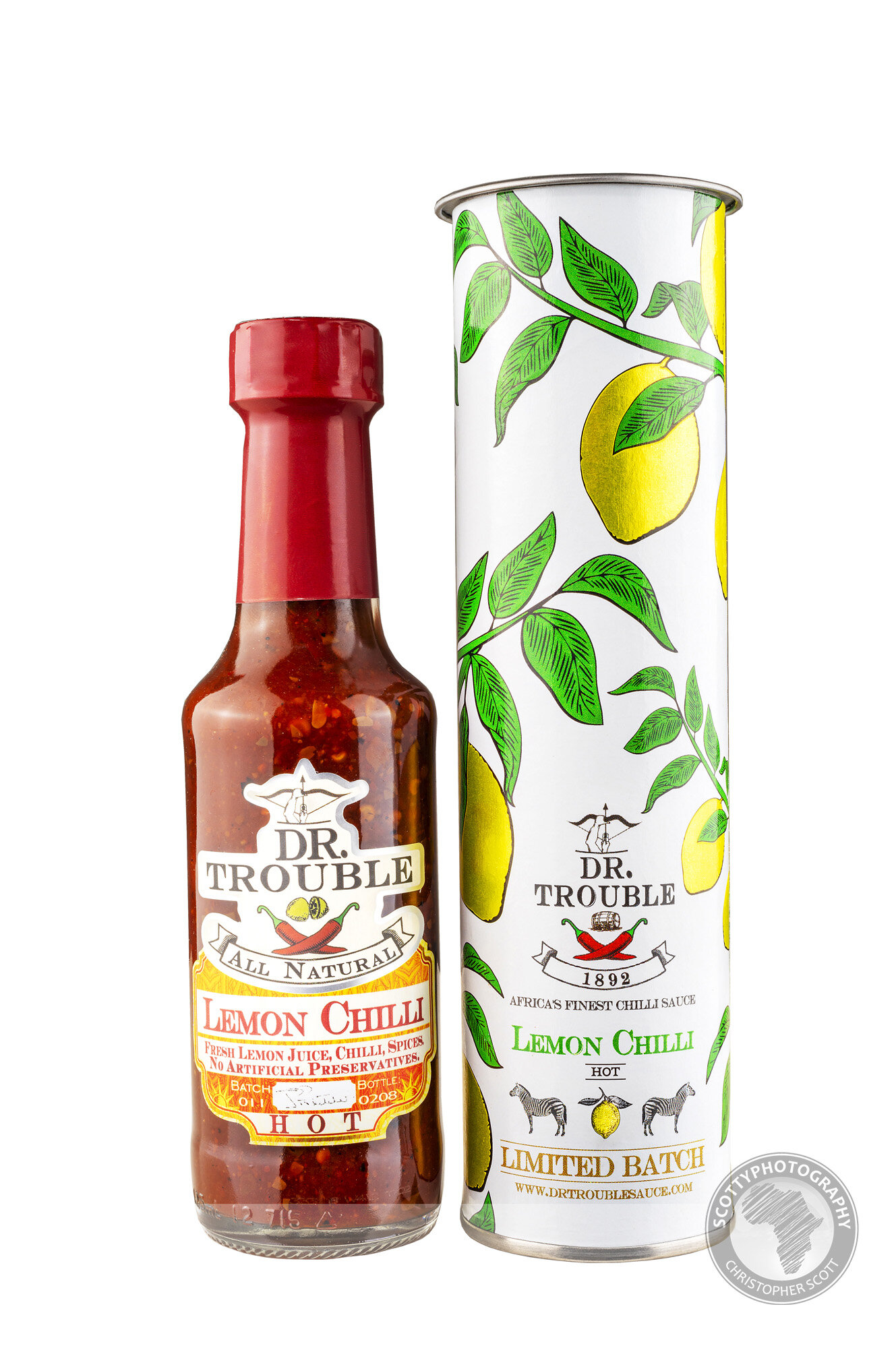
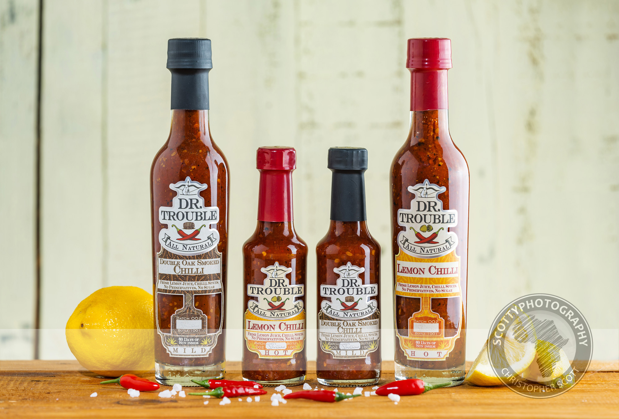
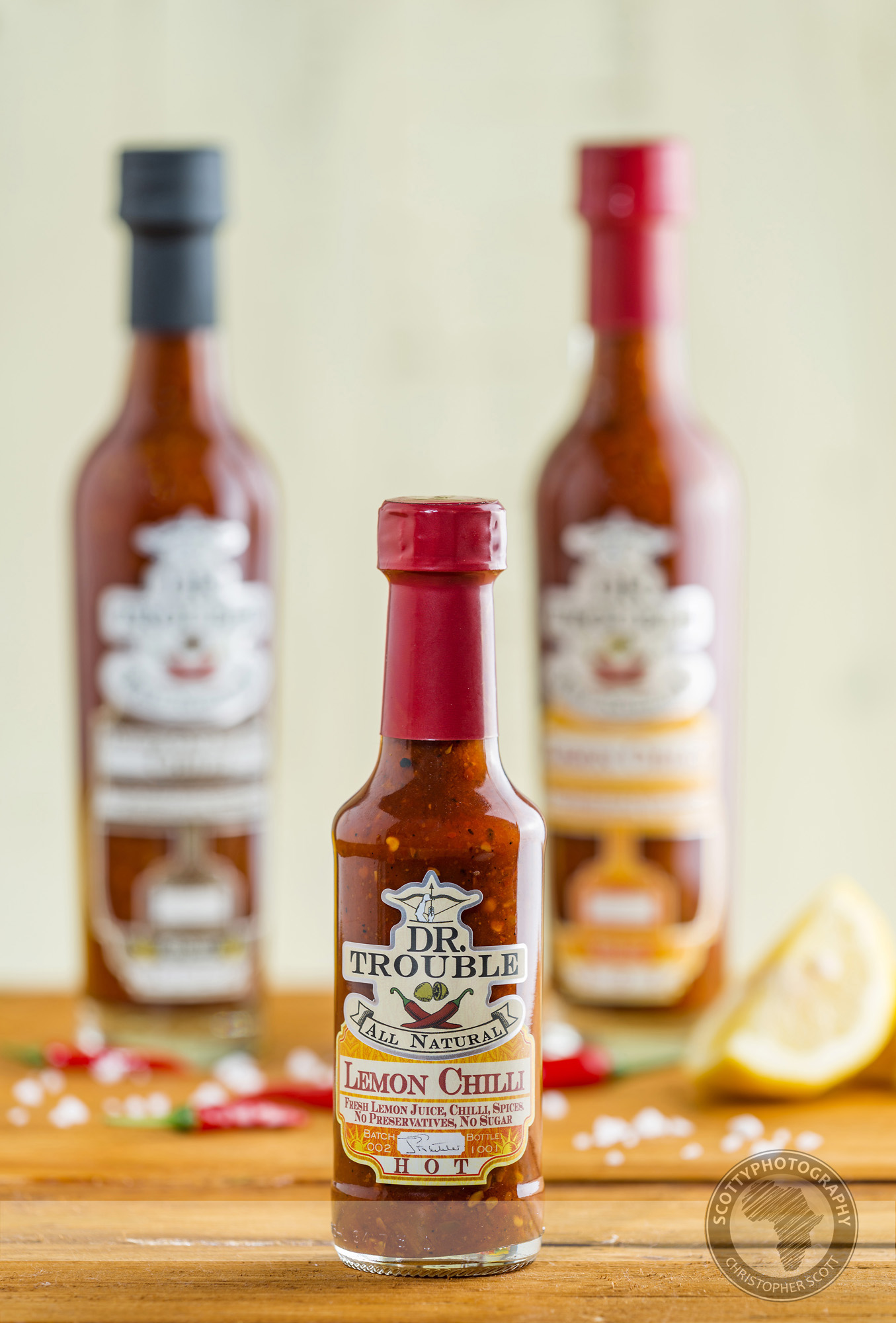
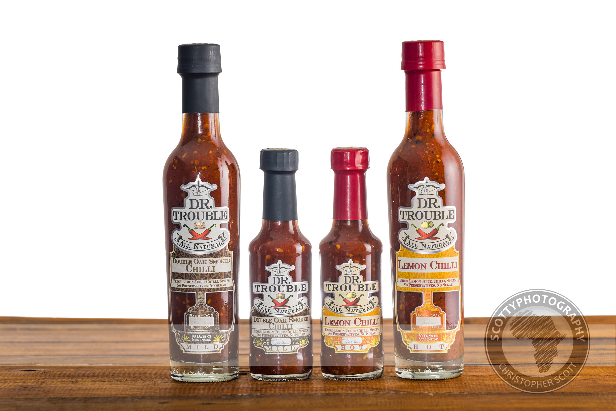
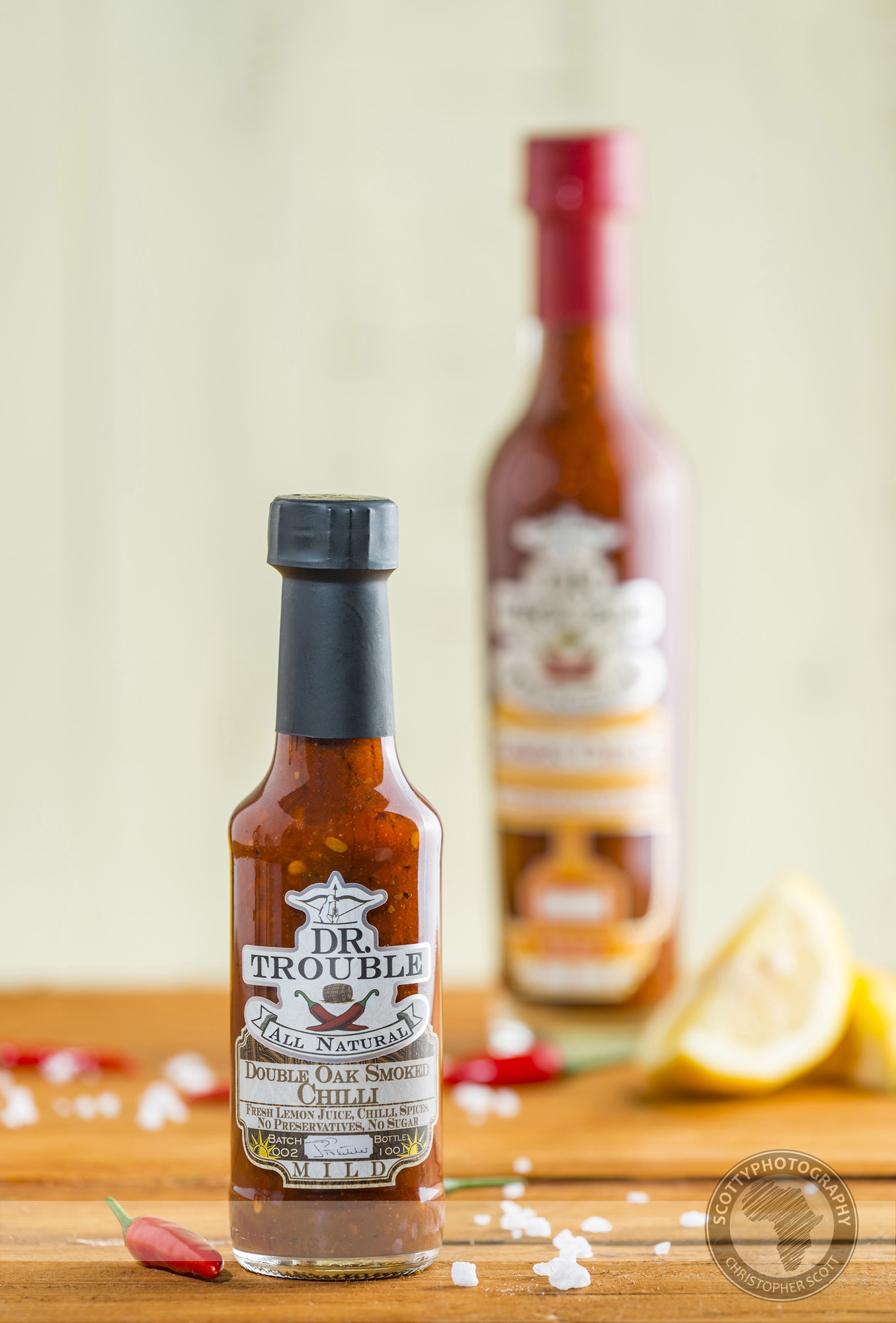
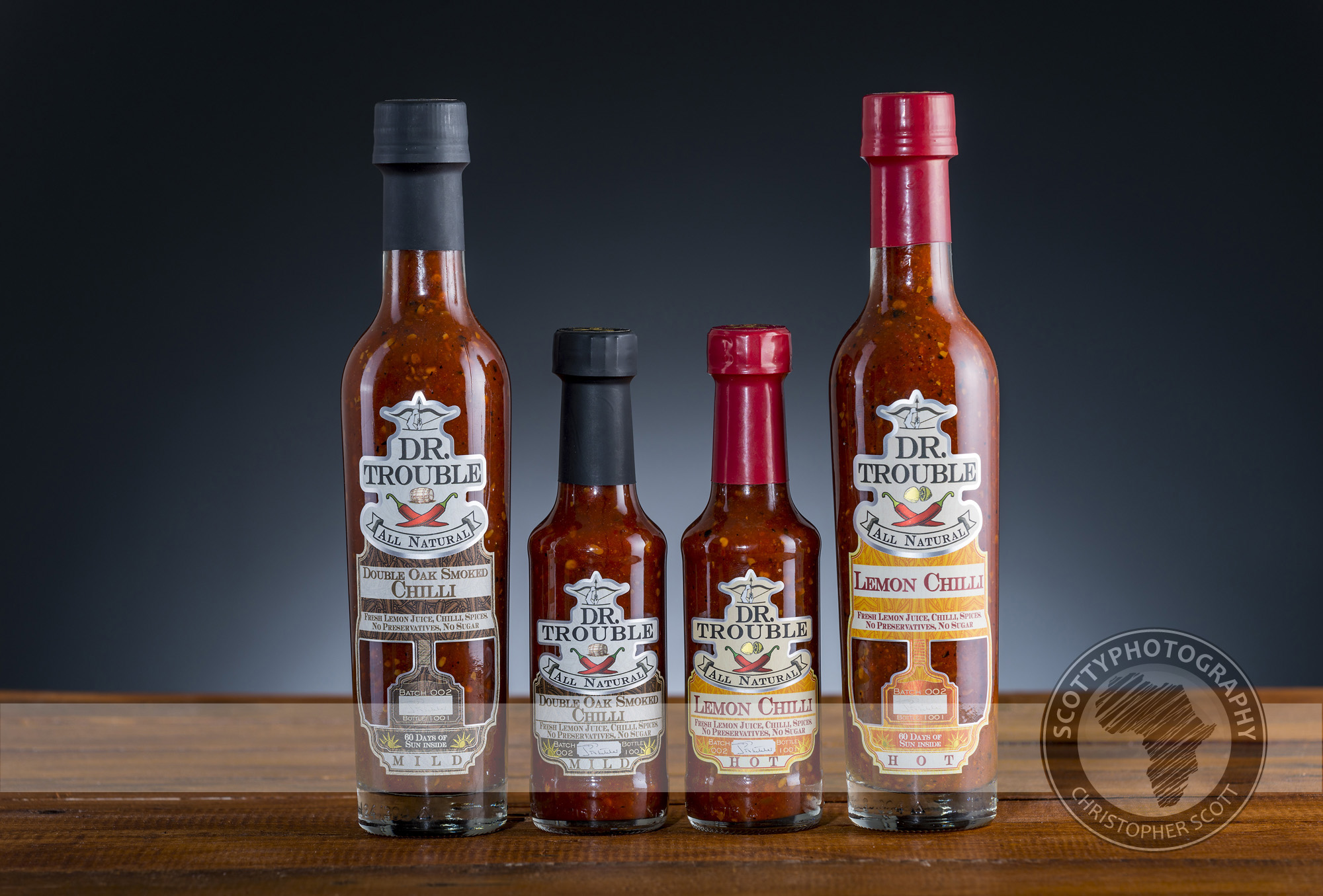
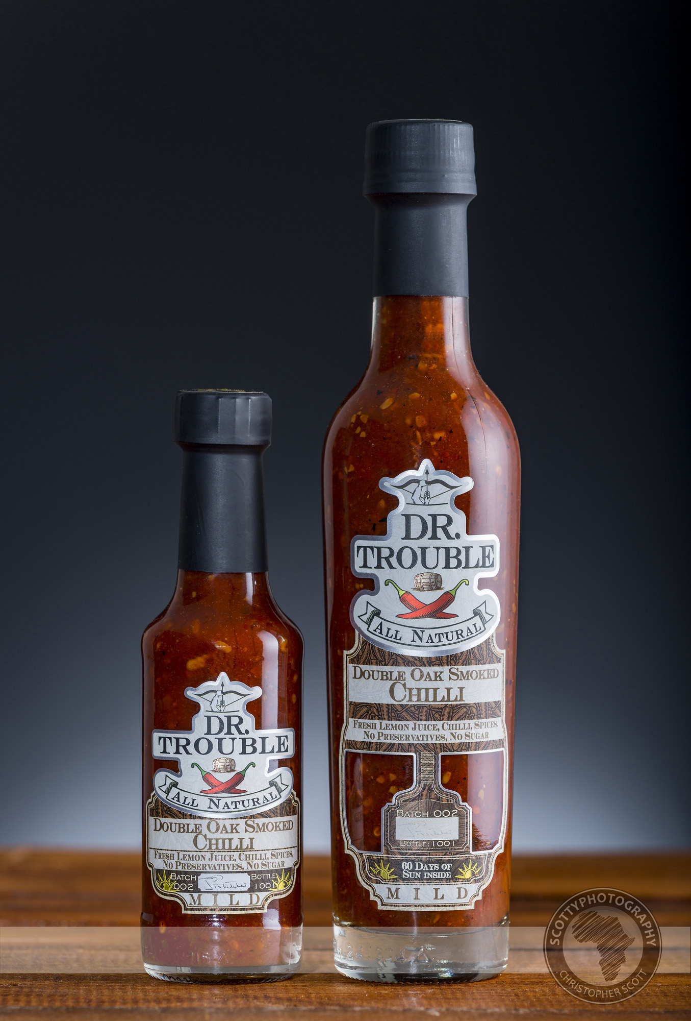
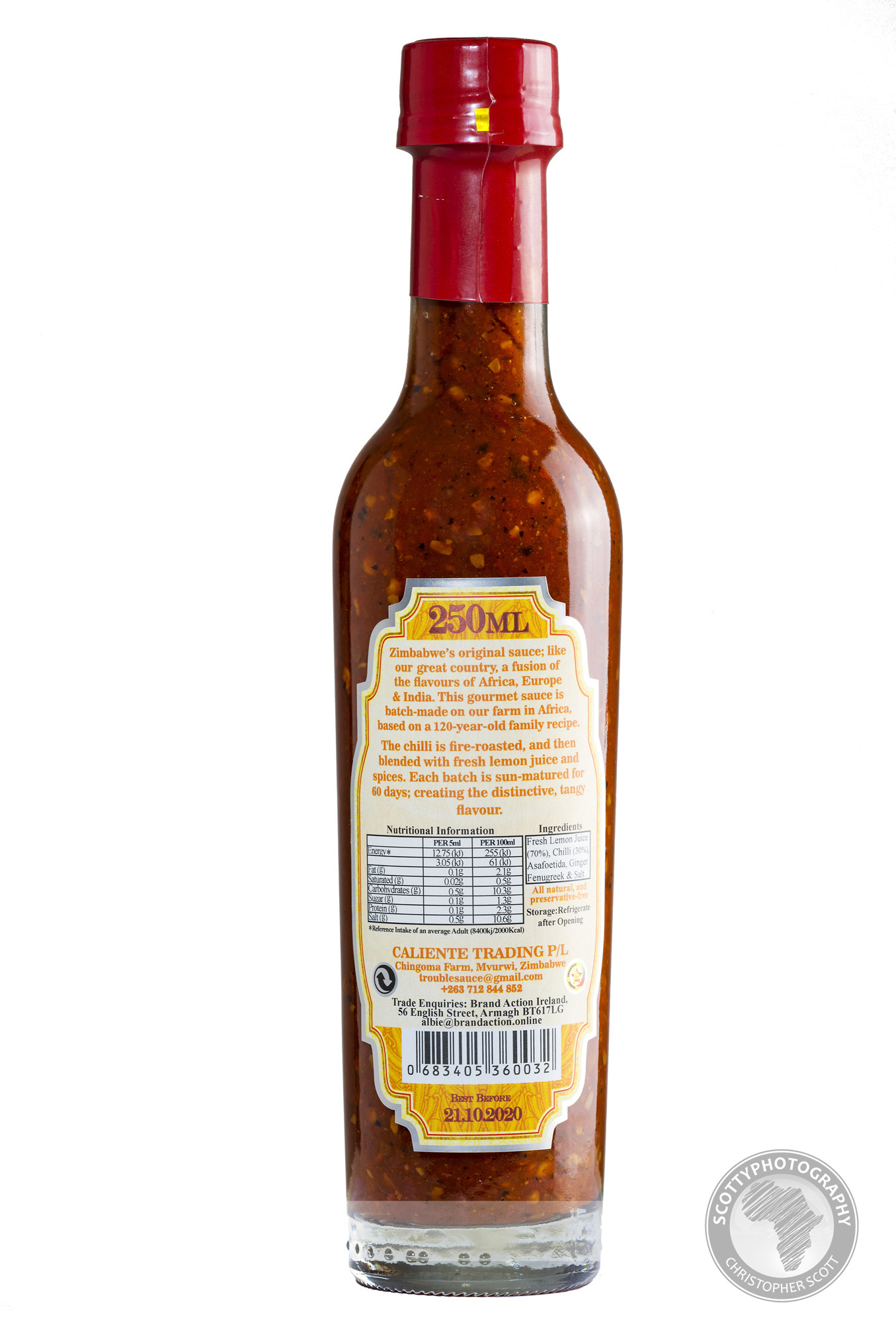
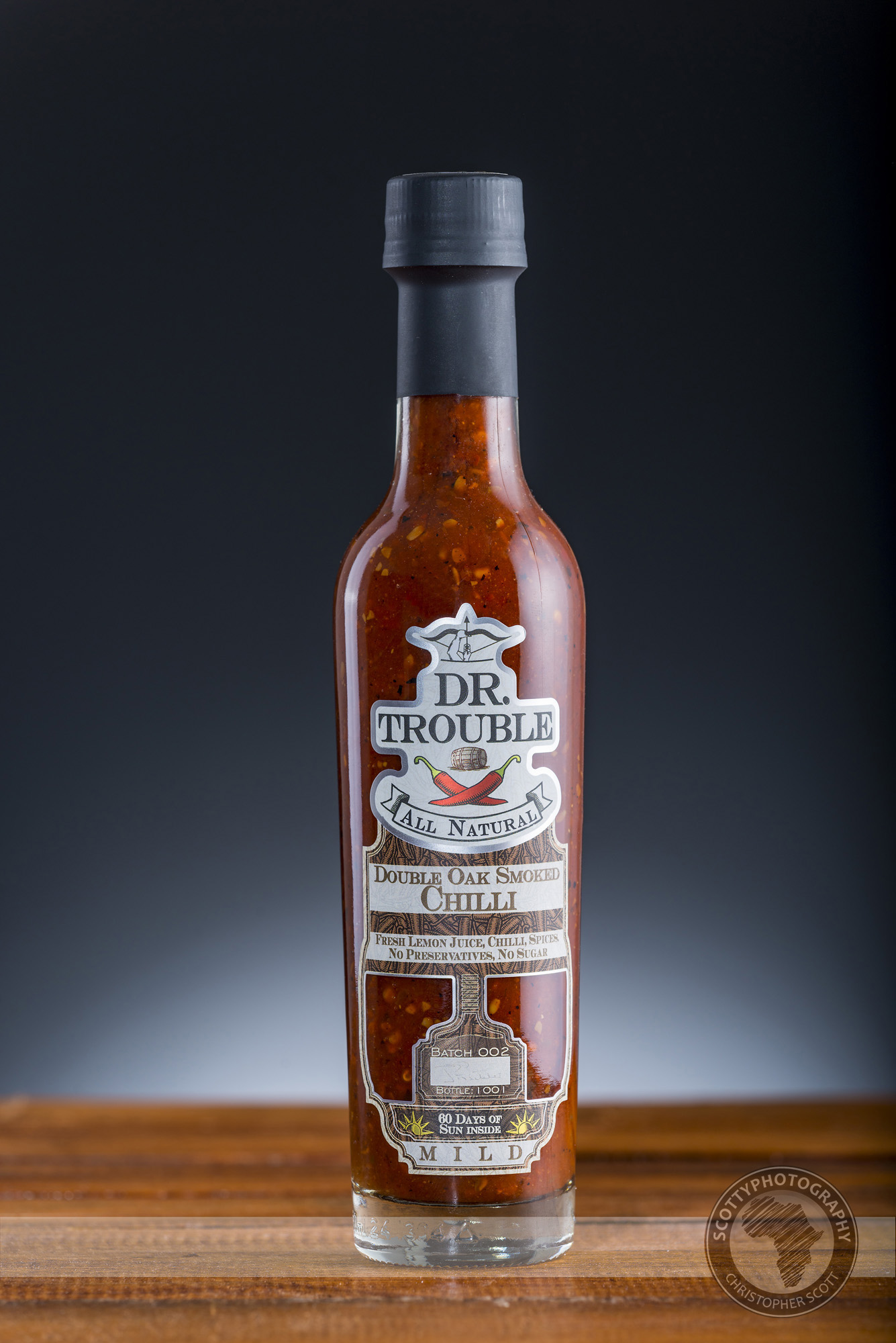
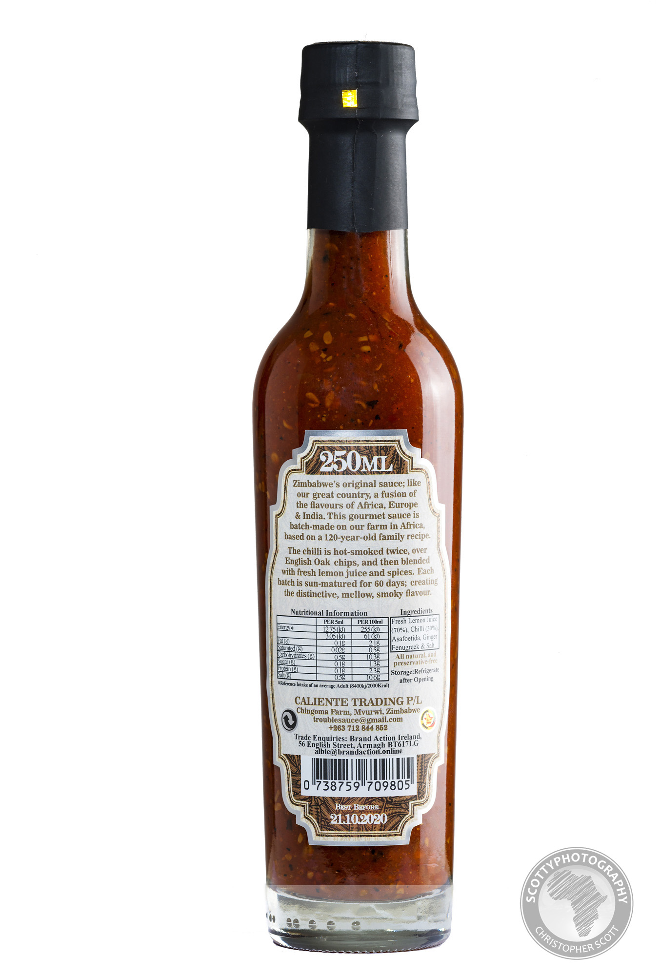
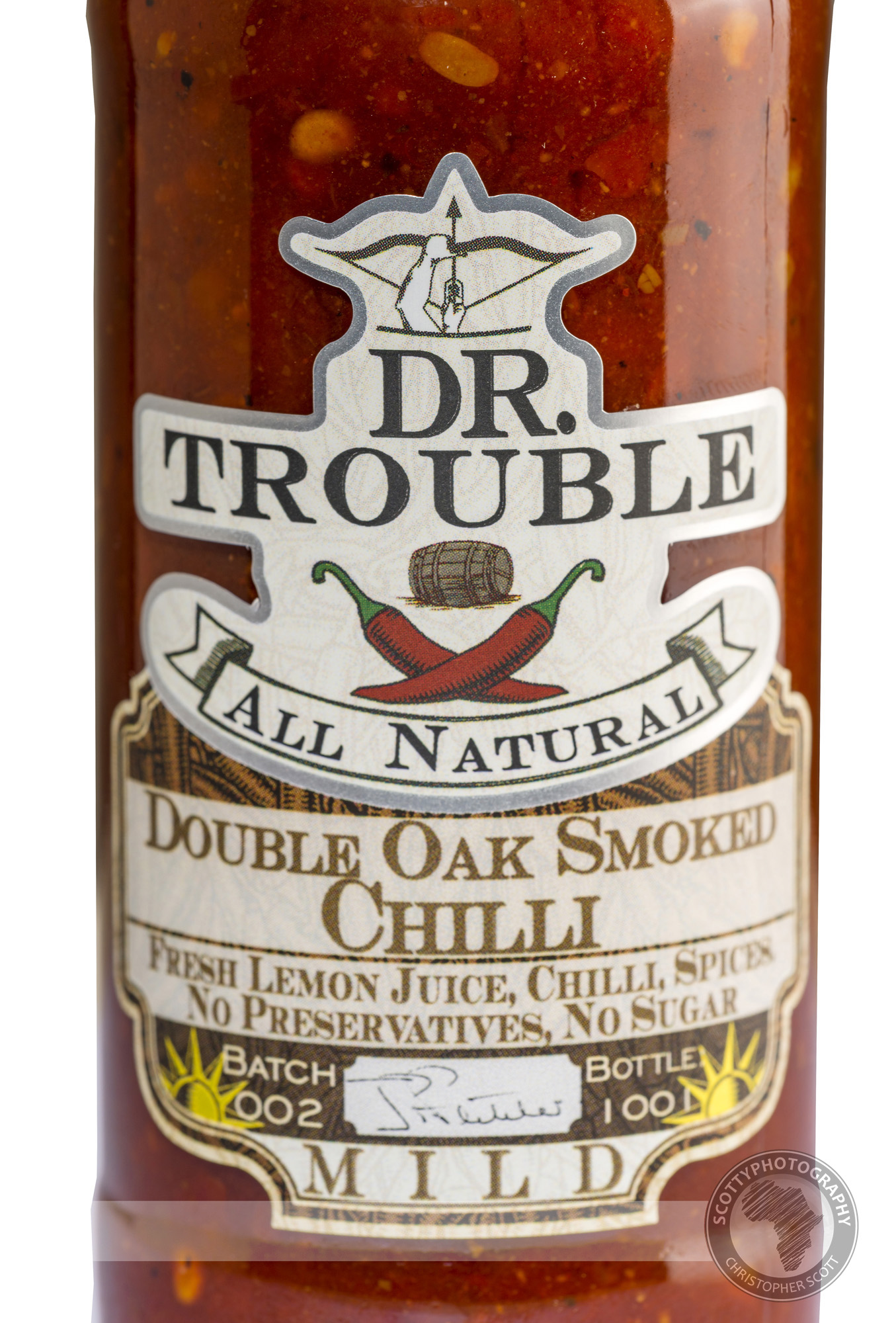
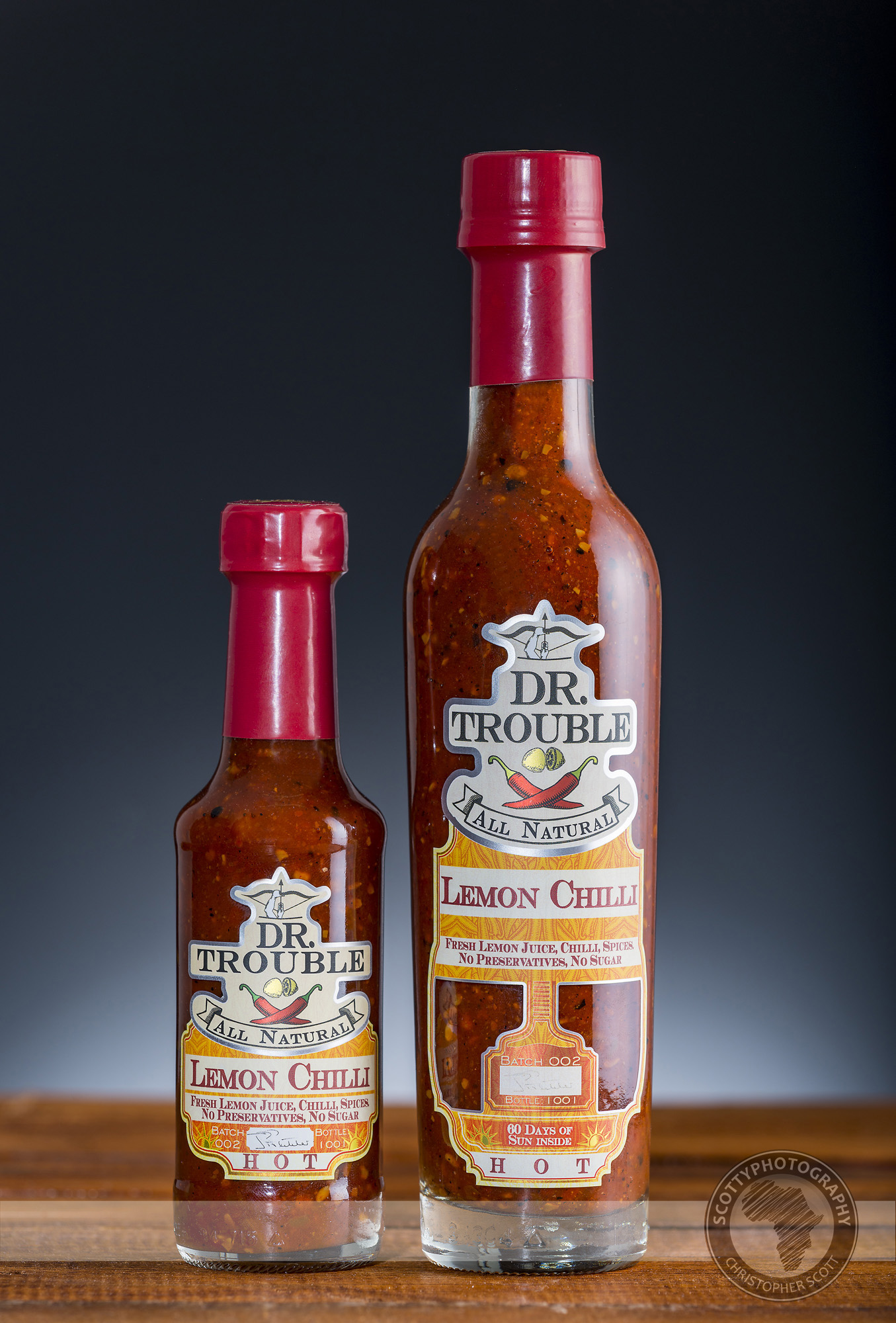
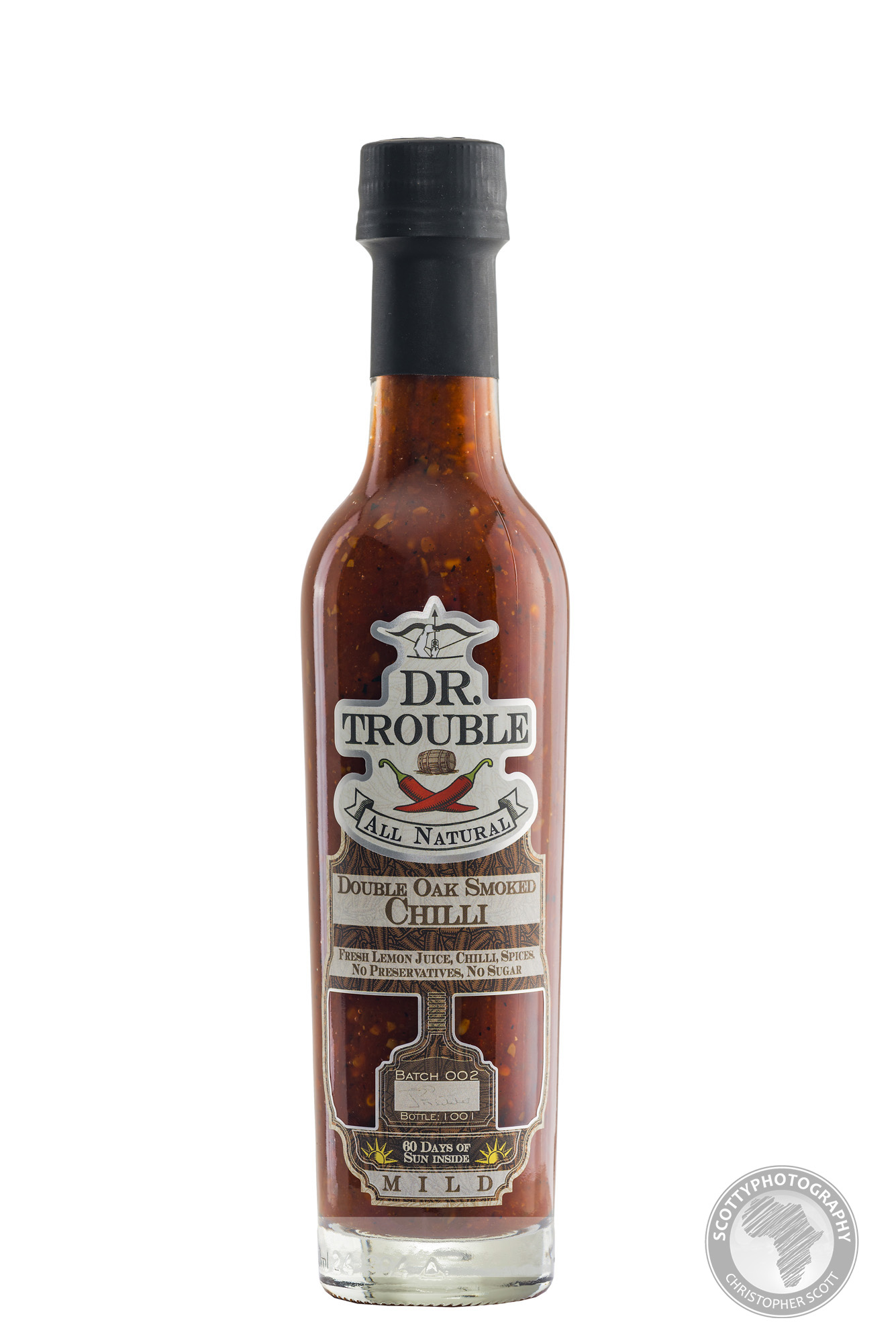
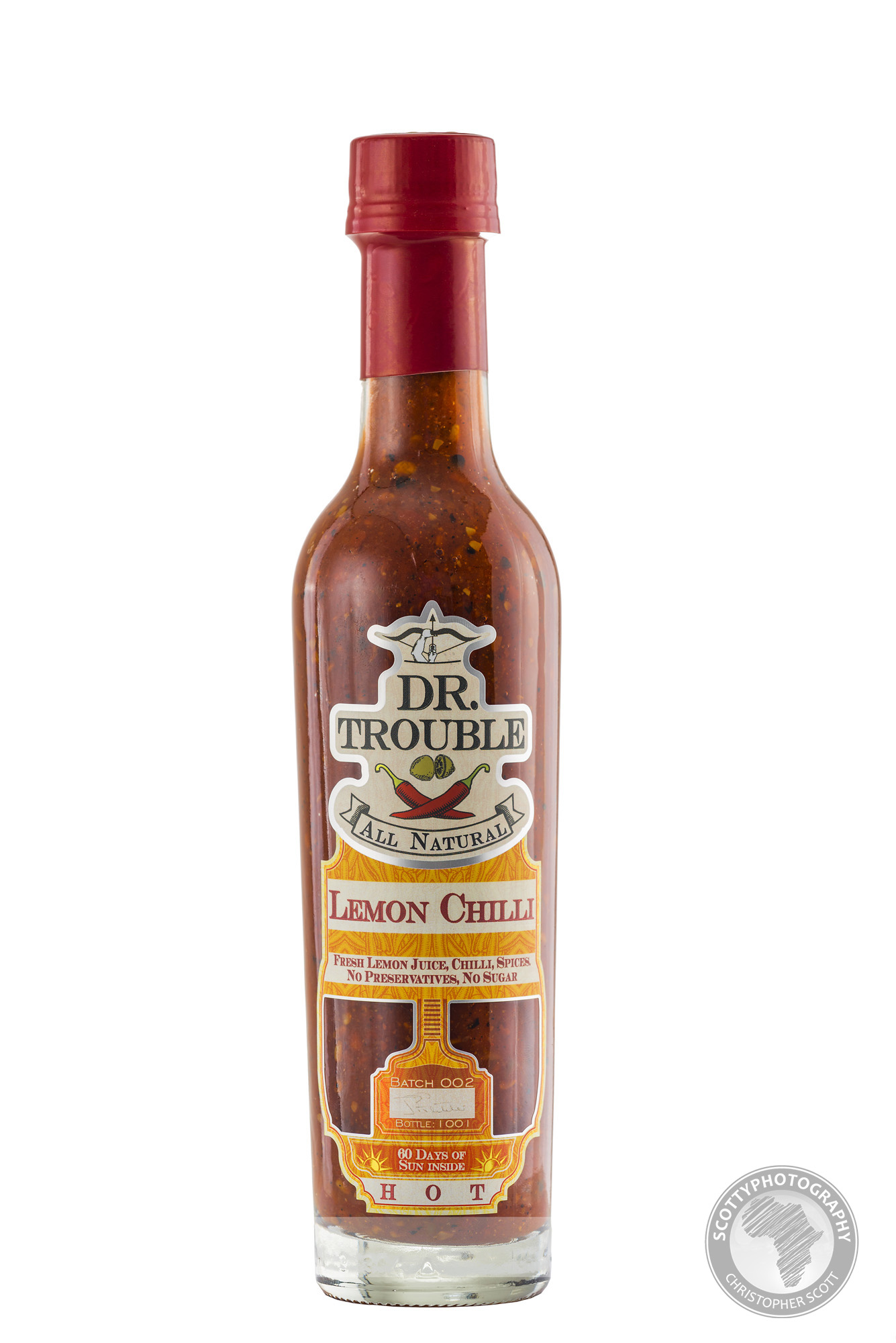
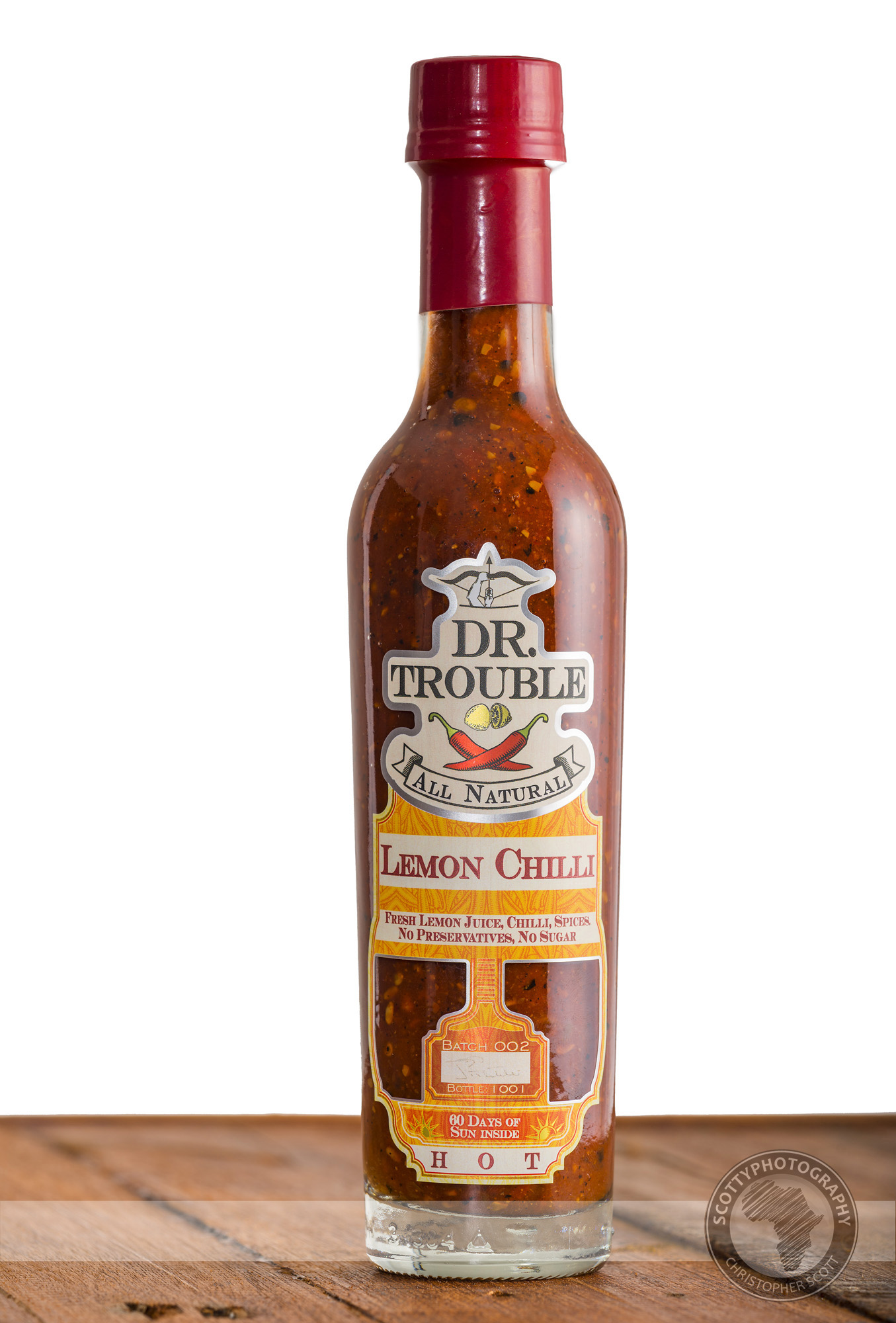
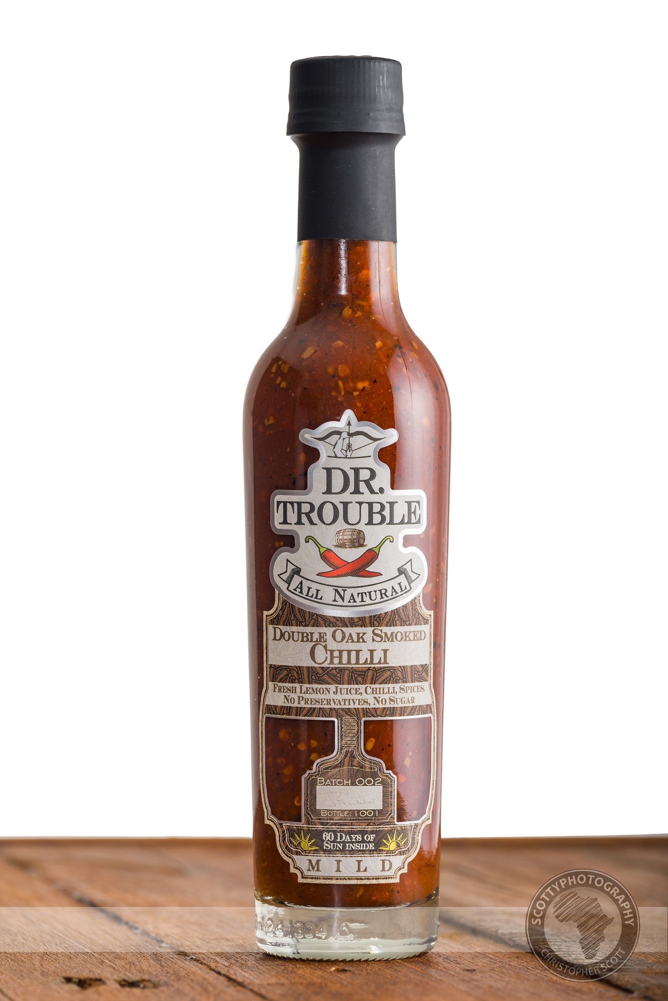
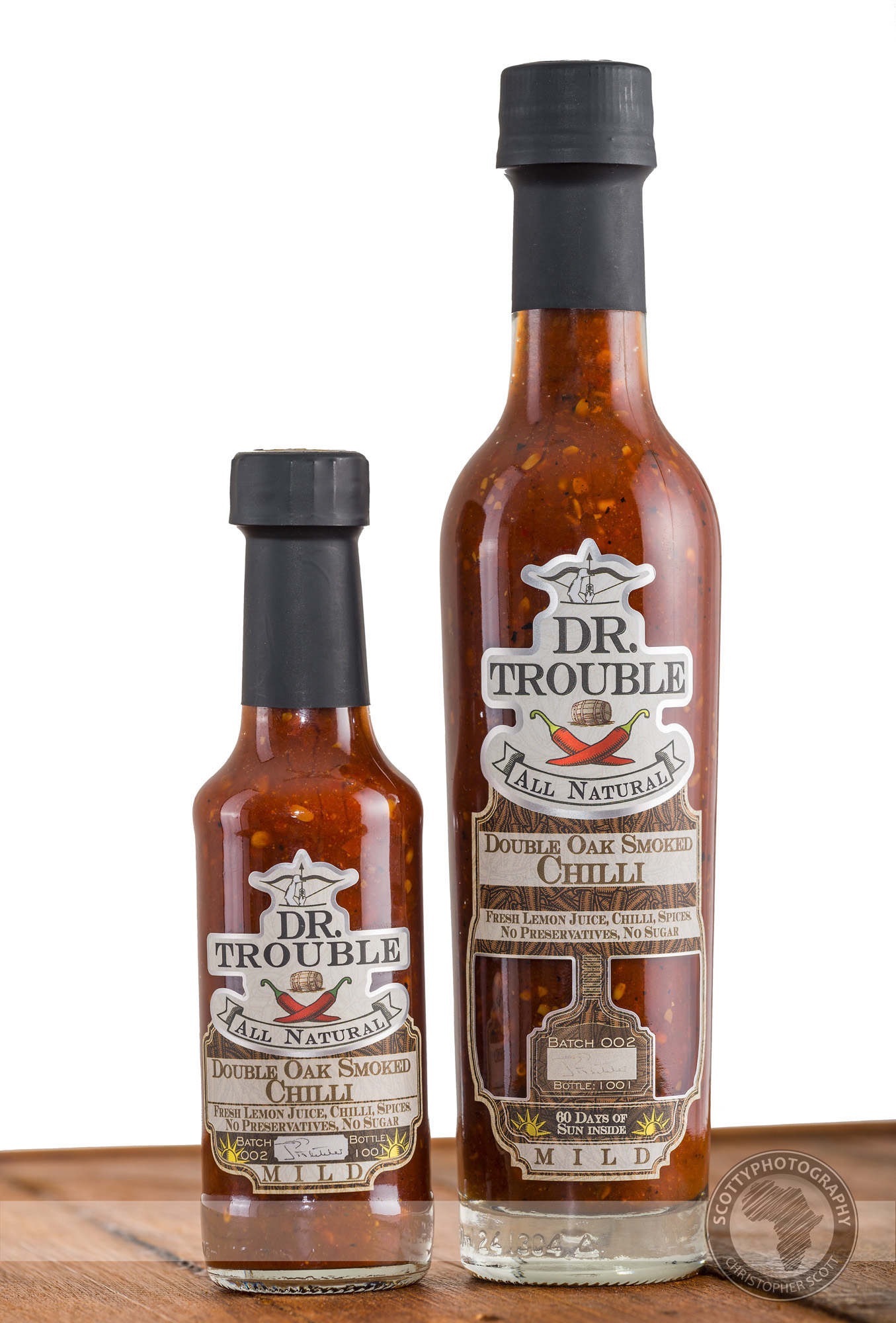
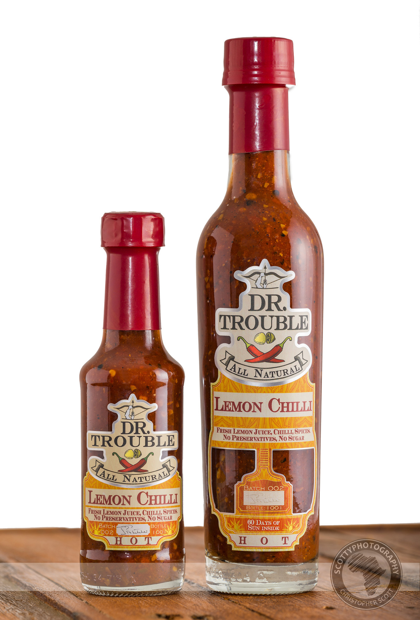
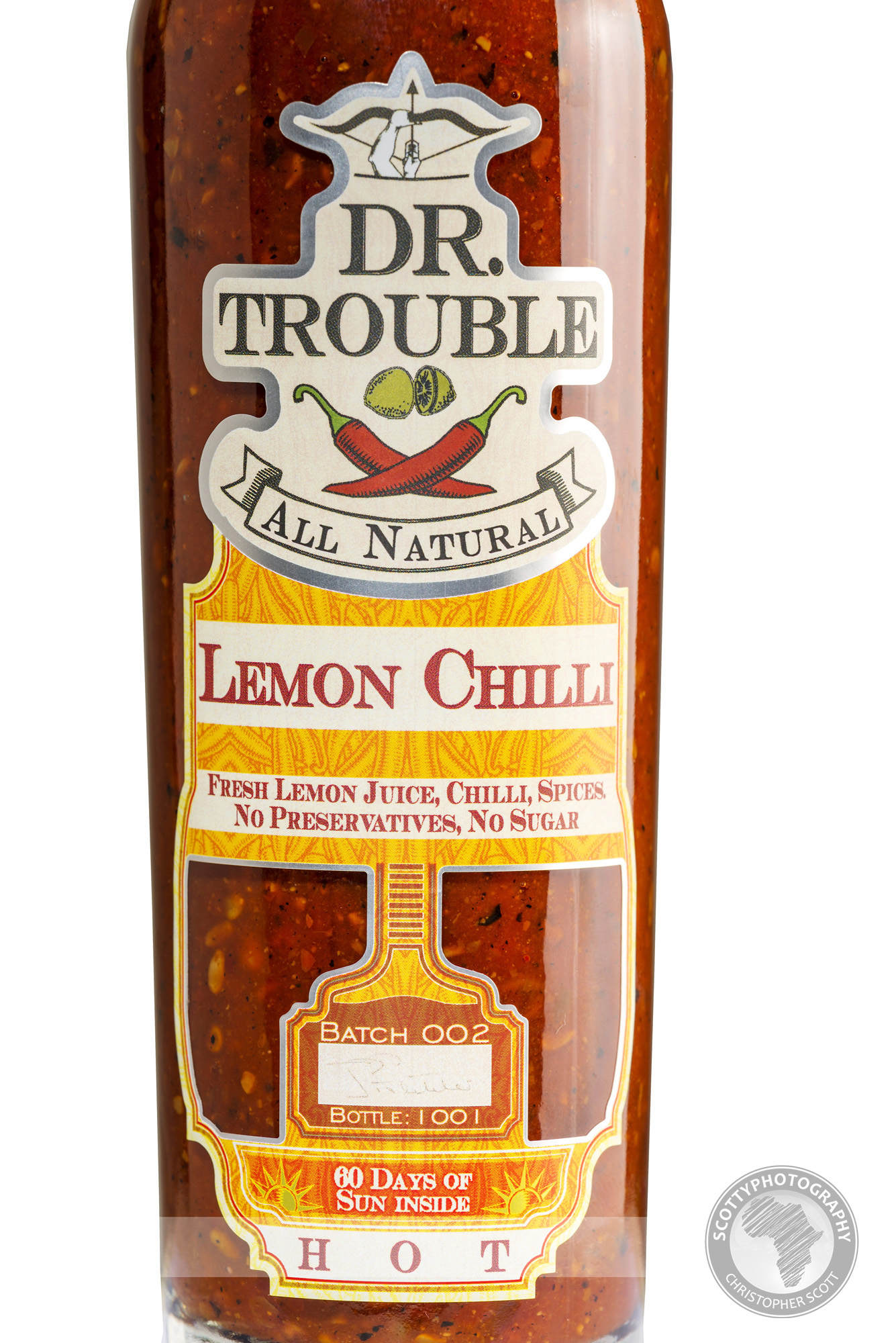
Anyone who has been following this blog over the years should by now know at least 2 things about me; that I love chilli sauce and that I love Dr Trouble’s Chilli sauce more than most! I have been lucky to shoot product shots for the masterminds behind the sauce since the beginning, and I am always thrilled when I get another opportunity to shoot their quality products in the studio. Earlier this year I was tasked with capturing their new, limited edition packaging as well as a few more product shots to illustrate how many lemons are crammed into each bottle of deliciousness. If you are a fan of chilli, check out the food porn below!
studio photography
Power to the Shoe
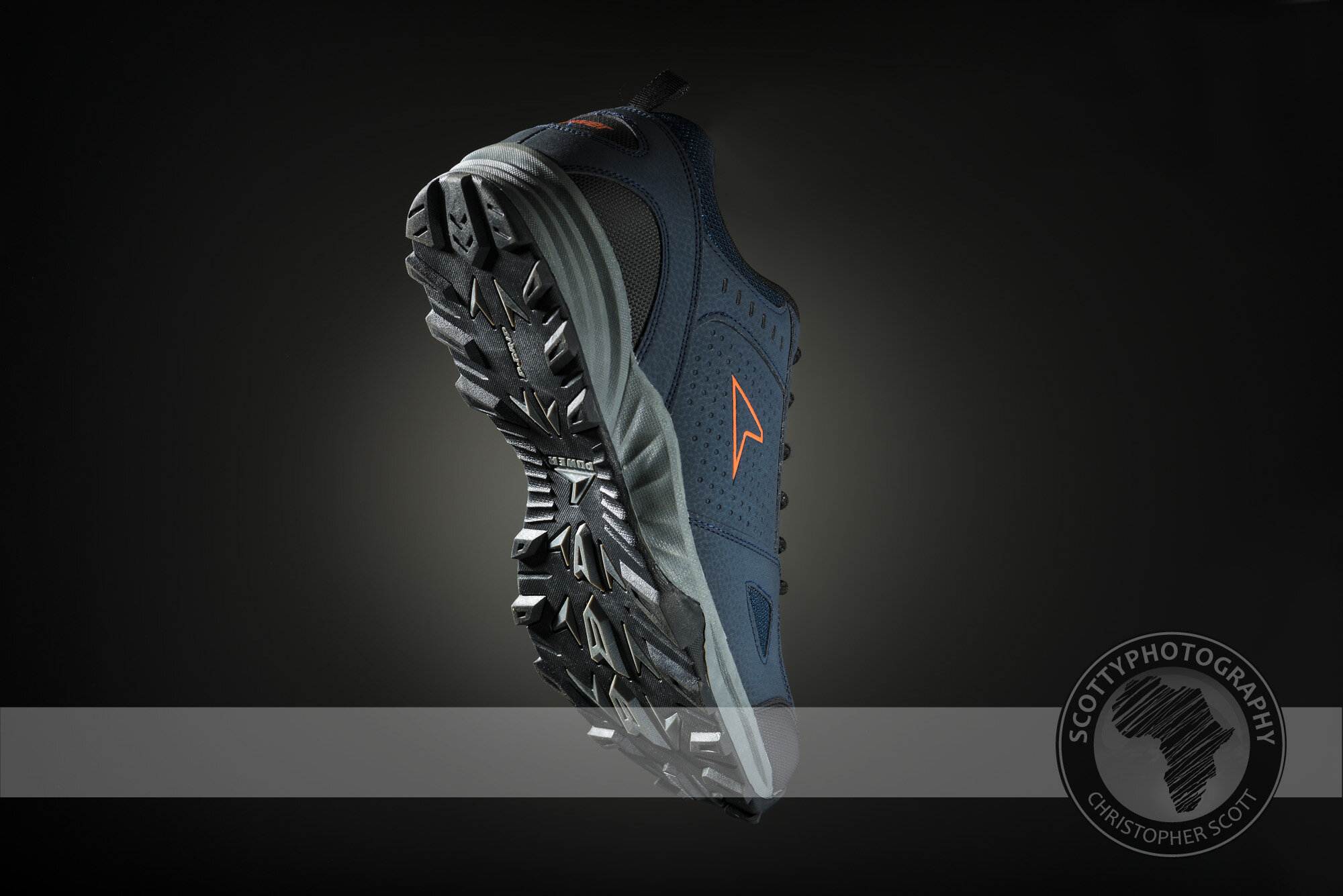
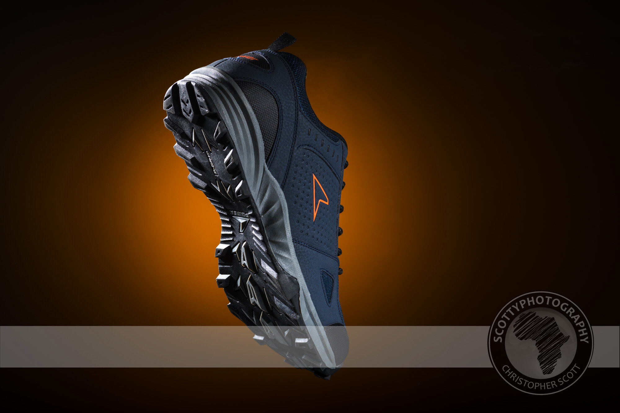
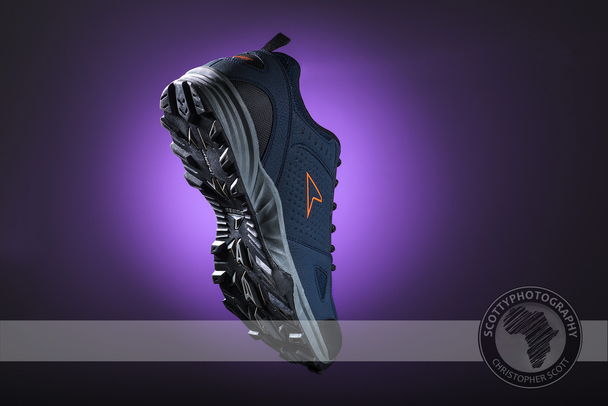
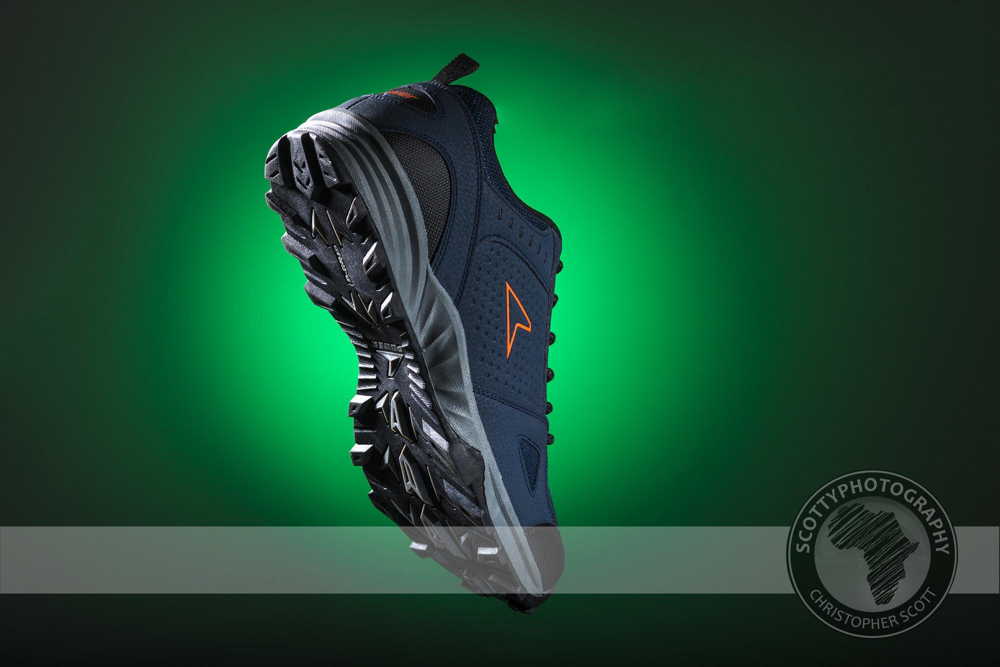
I bought a new pair of shoes recently, and of course being the diehard photographer that I am I couldn’t miss the opportunity to photograph the shoes in my studio! I wanted to show off the great detail on the bottom of the shoes and so used some raking light from quite an acute angle to emphasise the shape and texture. Once I was happy with the lighting on the shoe I shot the shoe on black and then used a variety of gels on the background to create a pop of colour. Which one is your favourite?
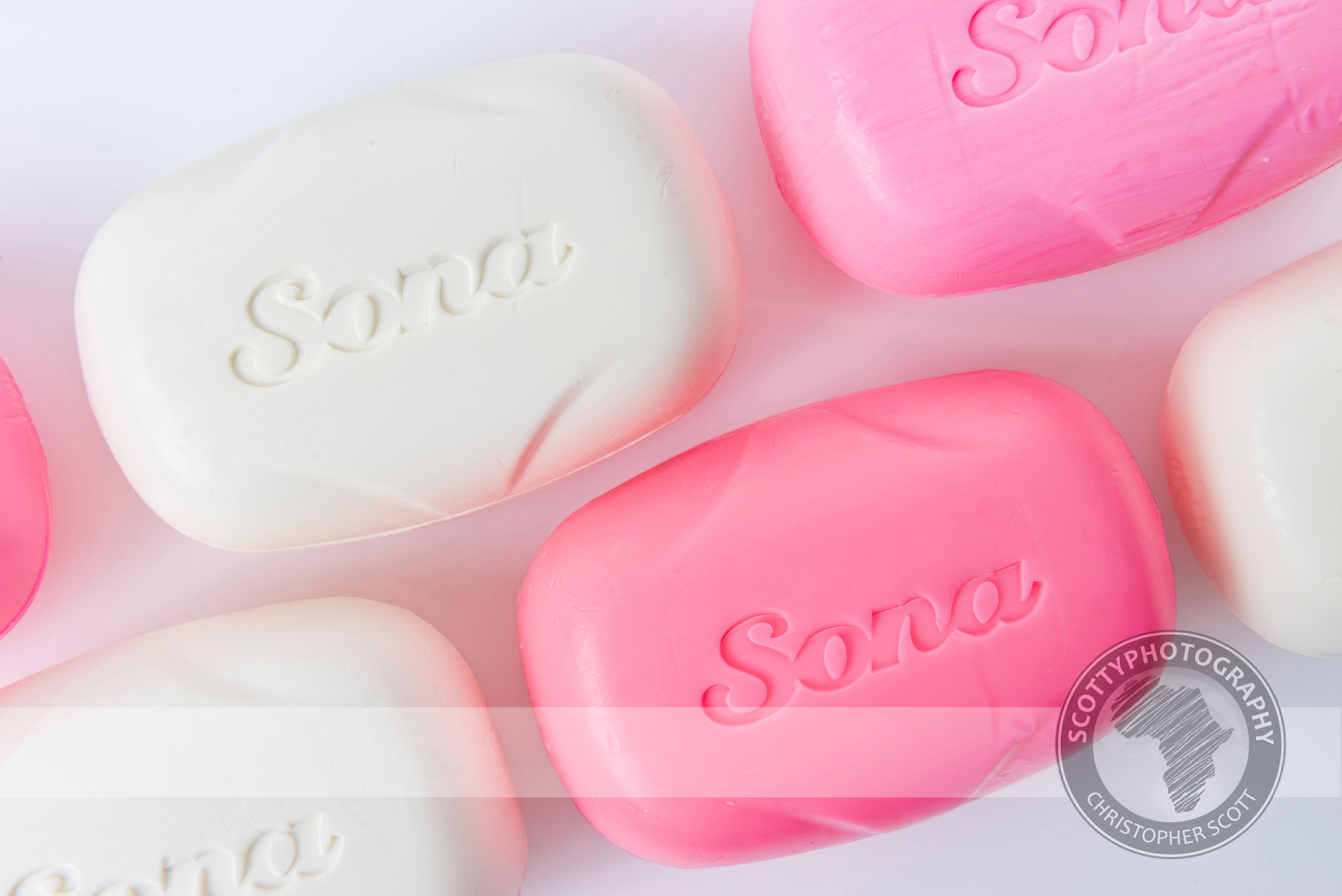
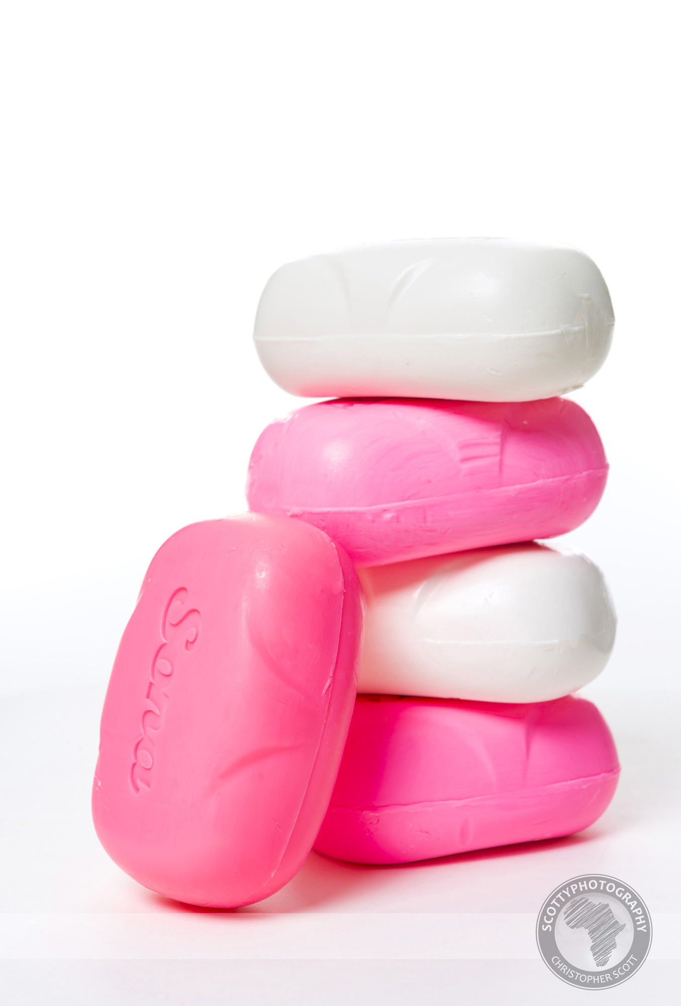
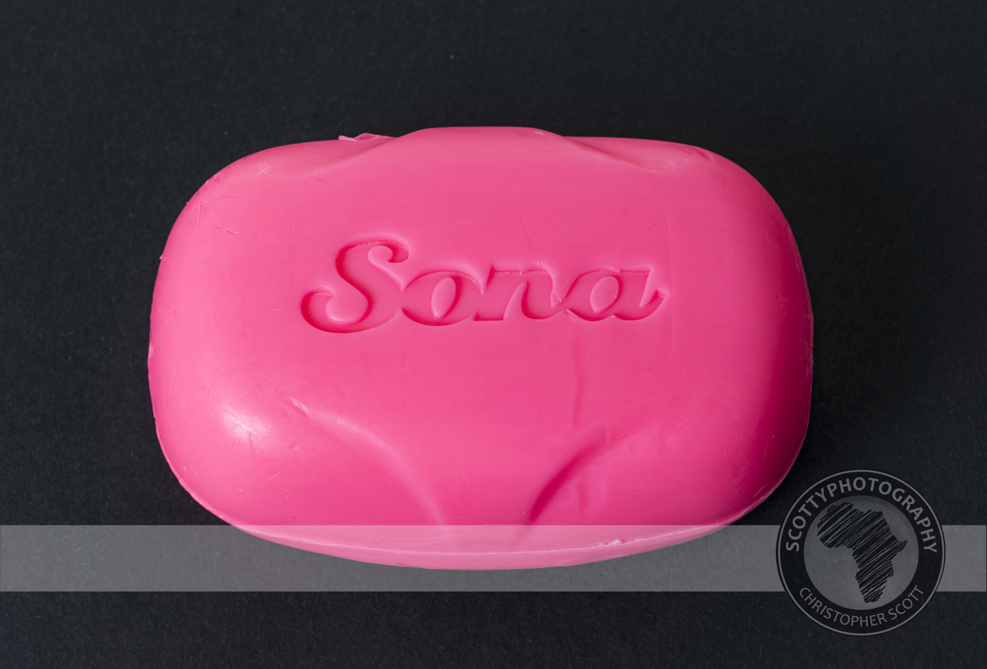
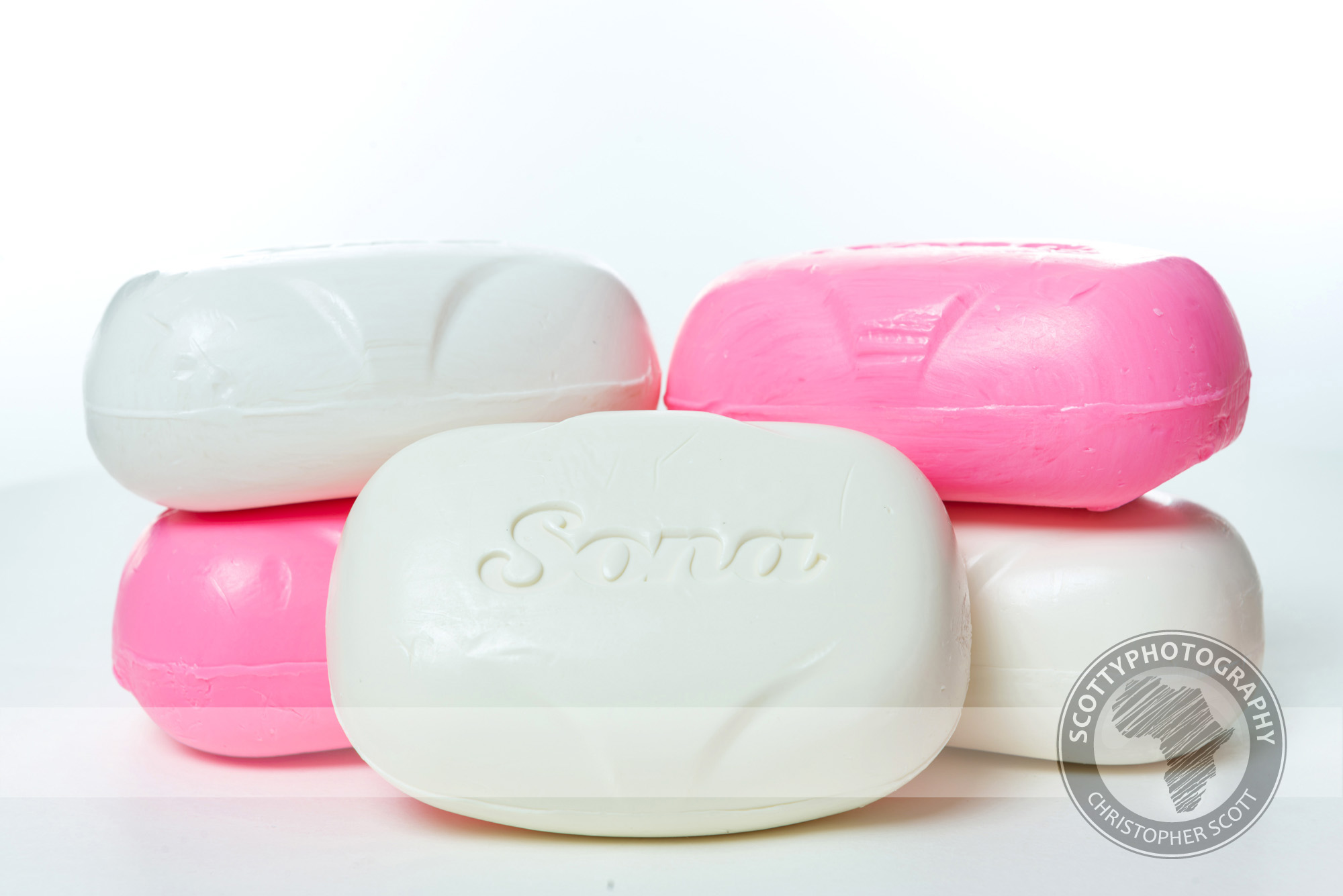
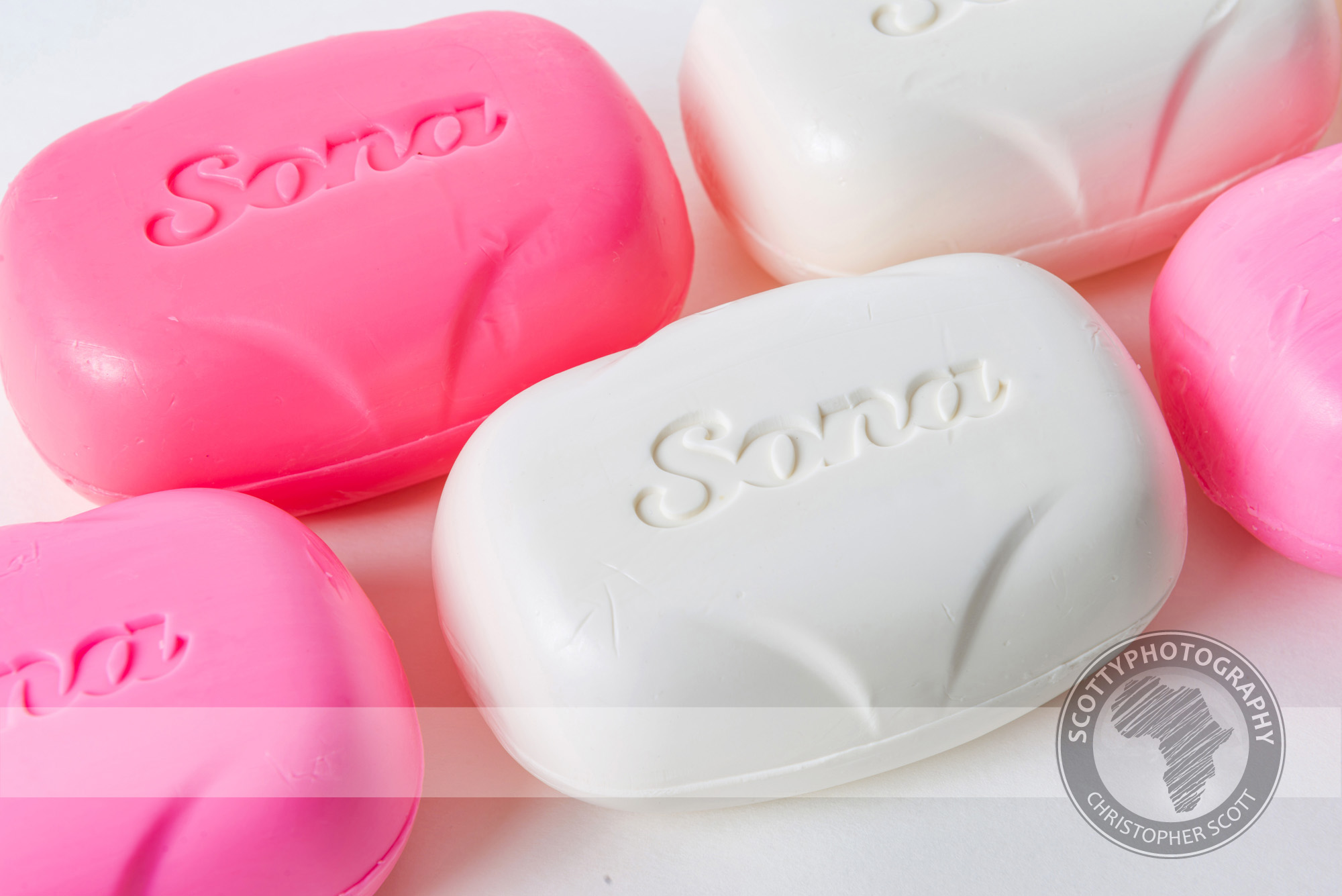
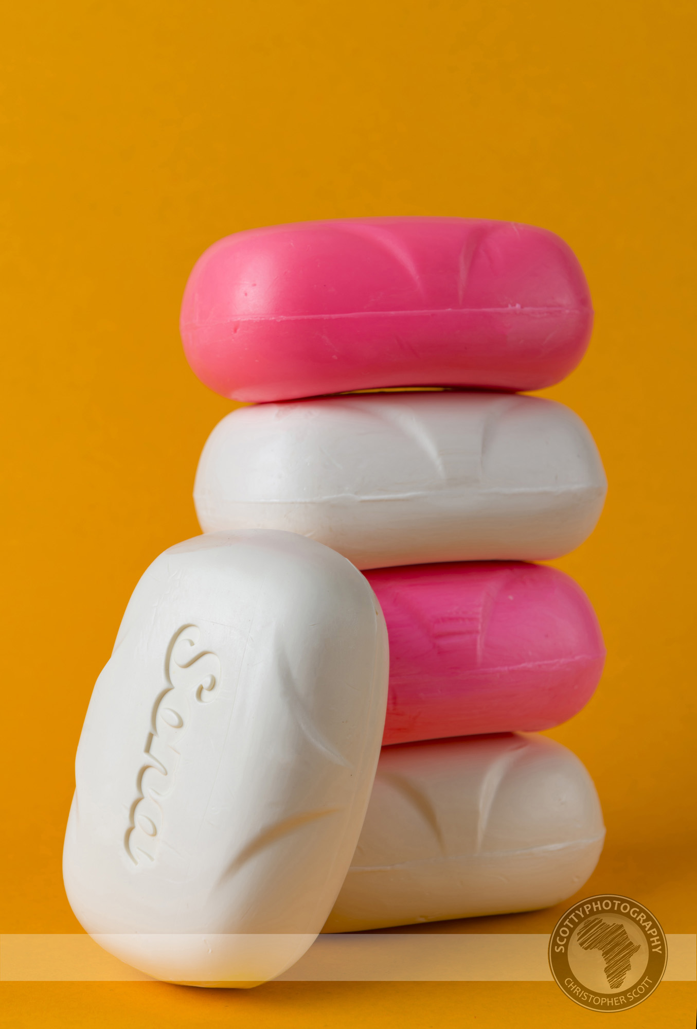
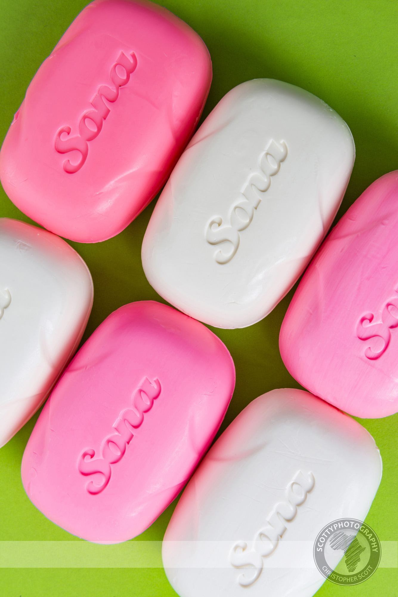
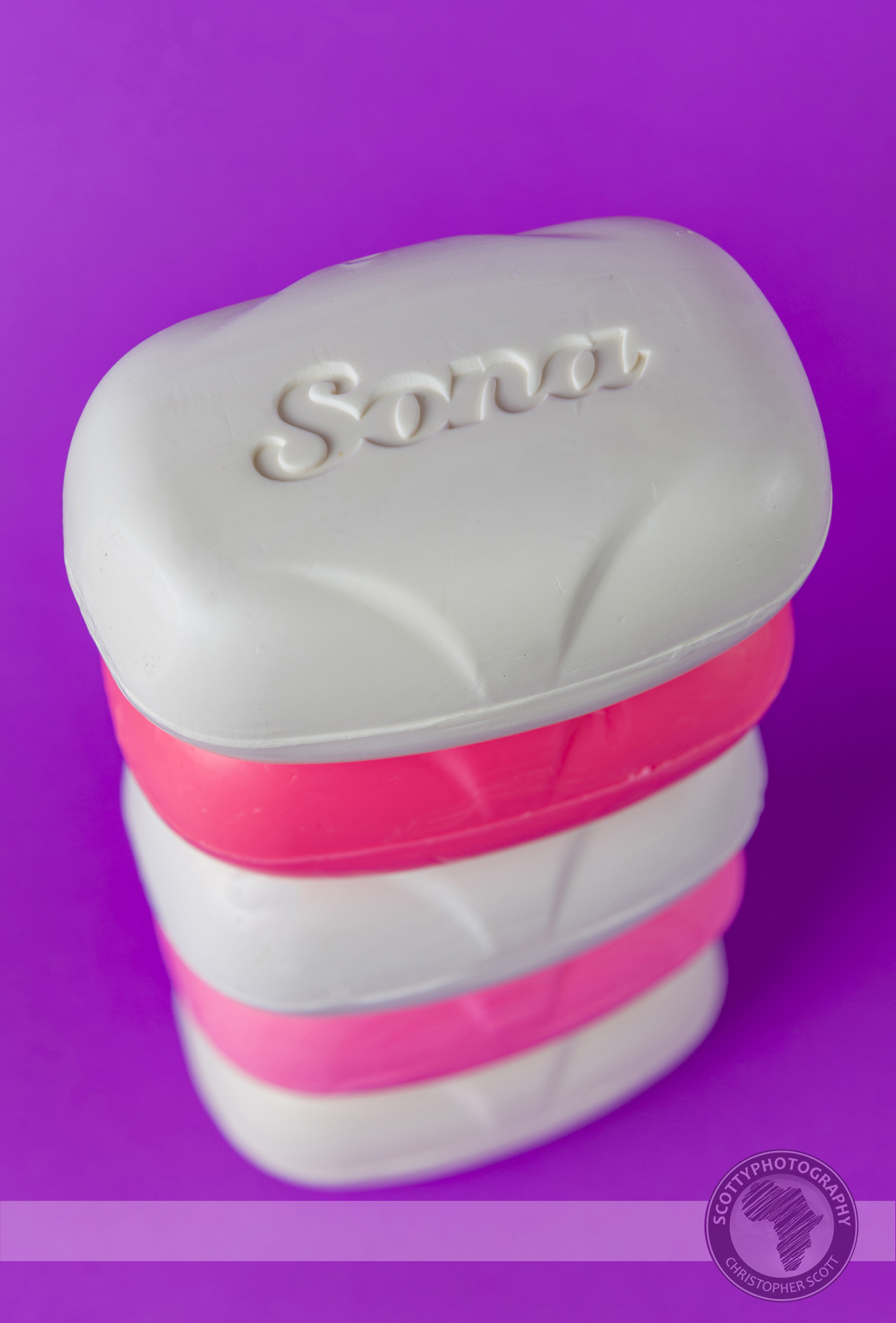
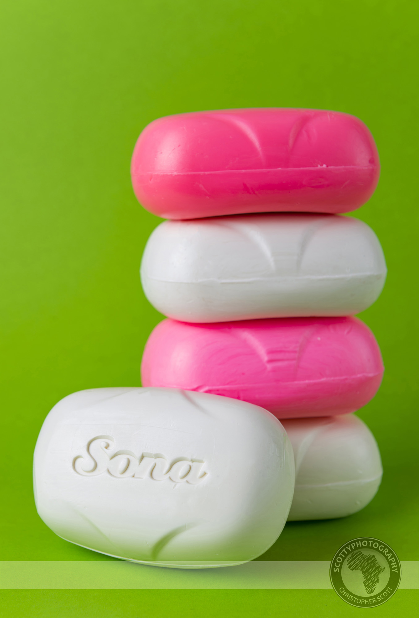
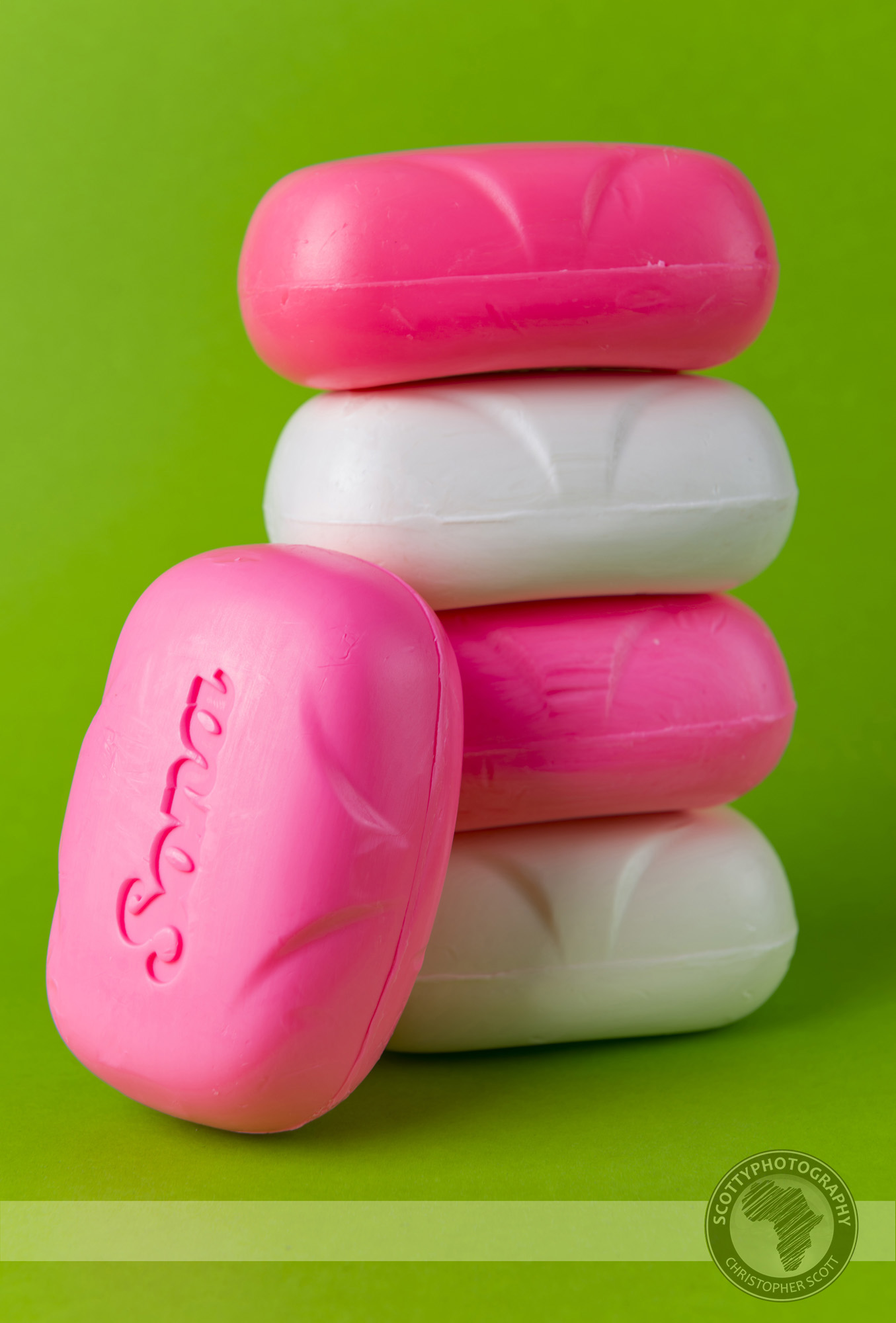
Soapy studio shoot...
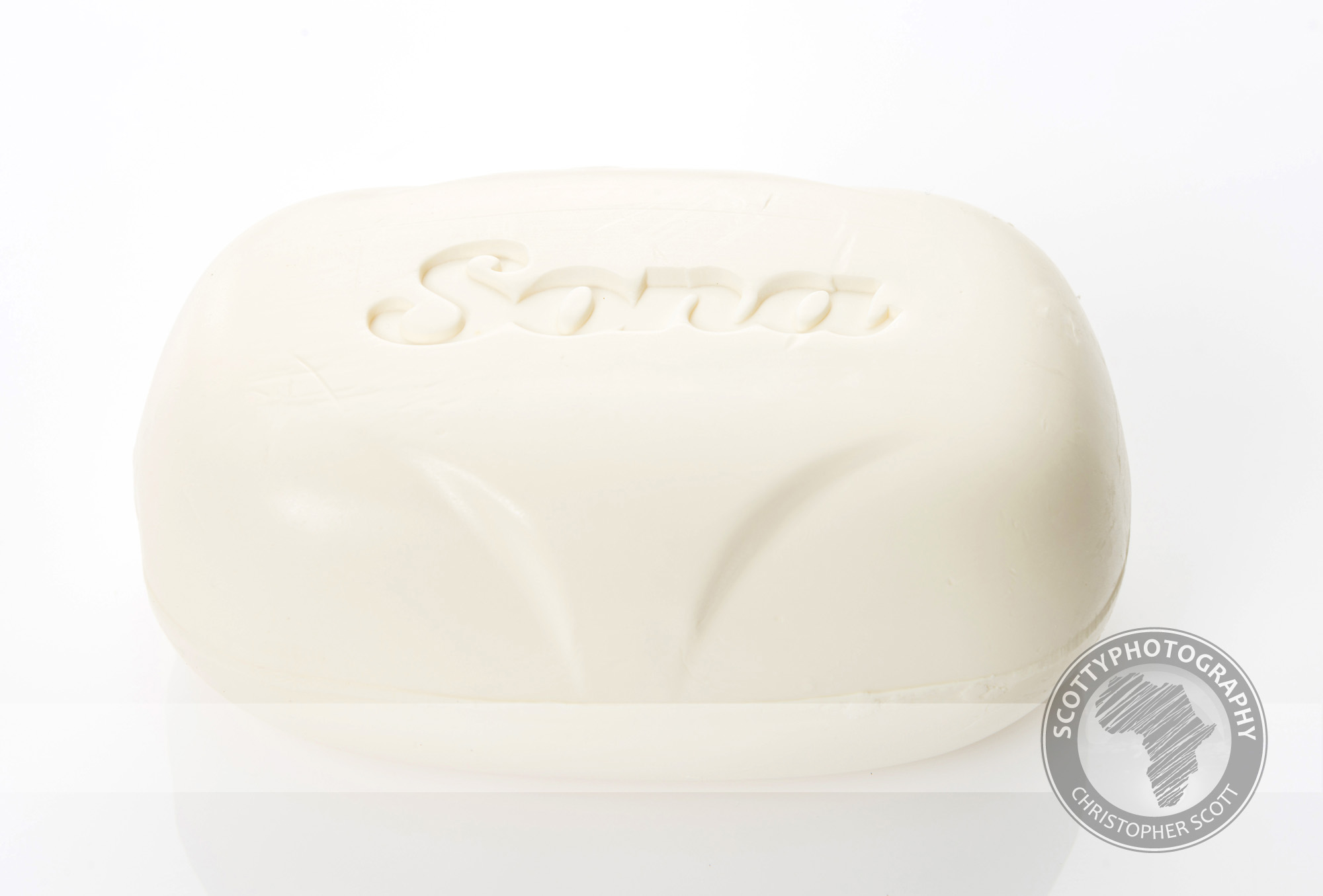
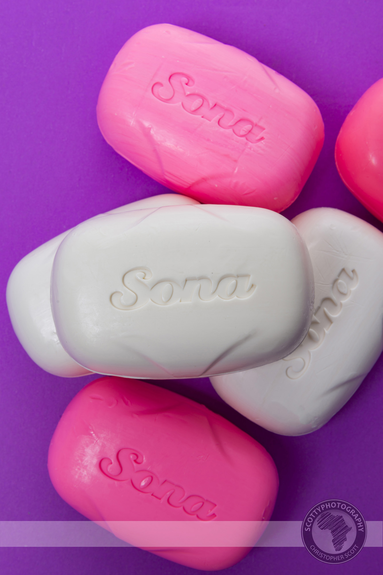
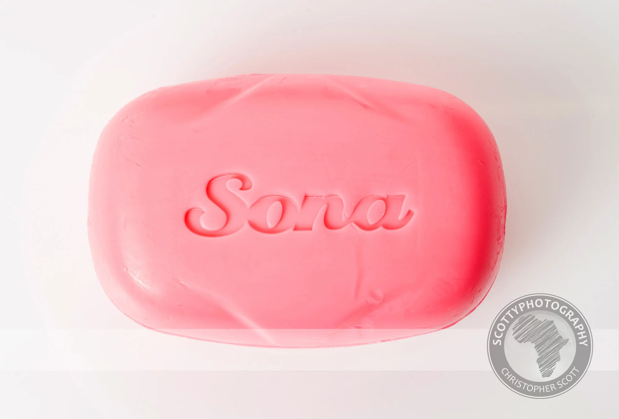
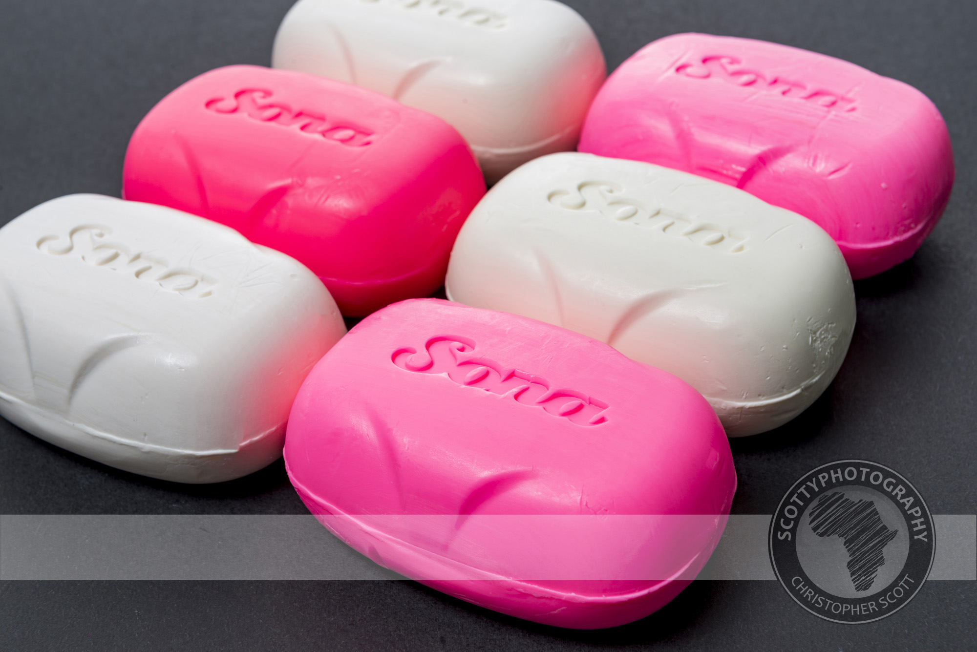
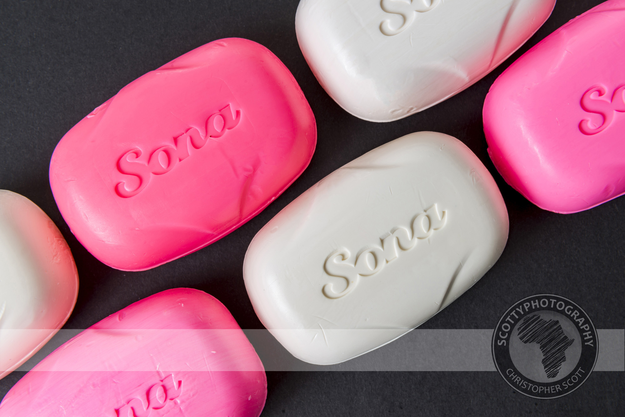
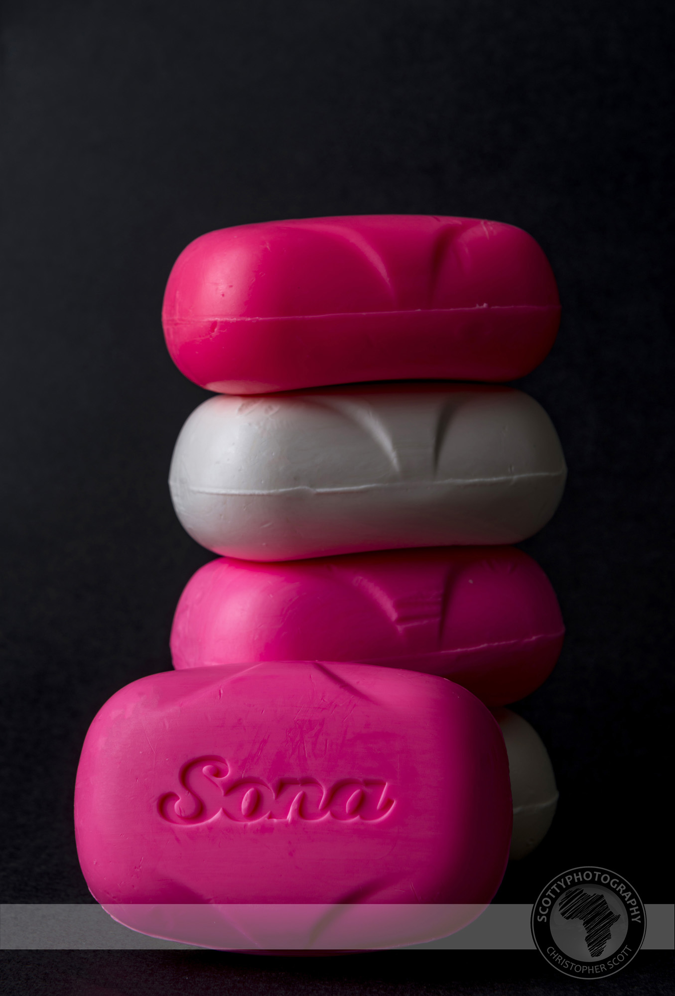
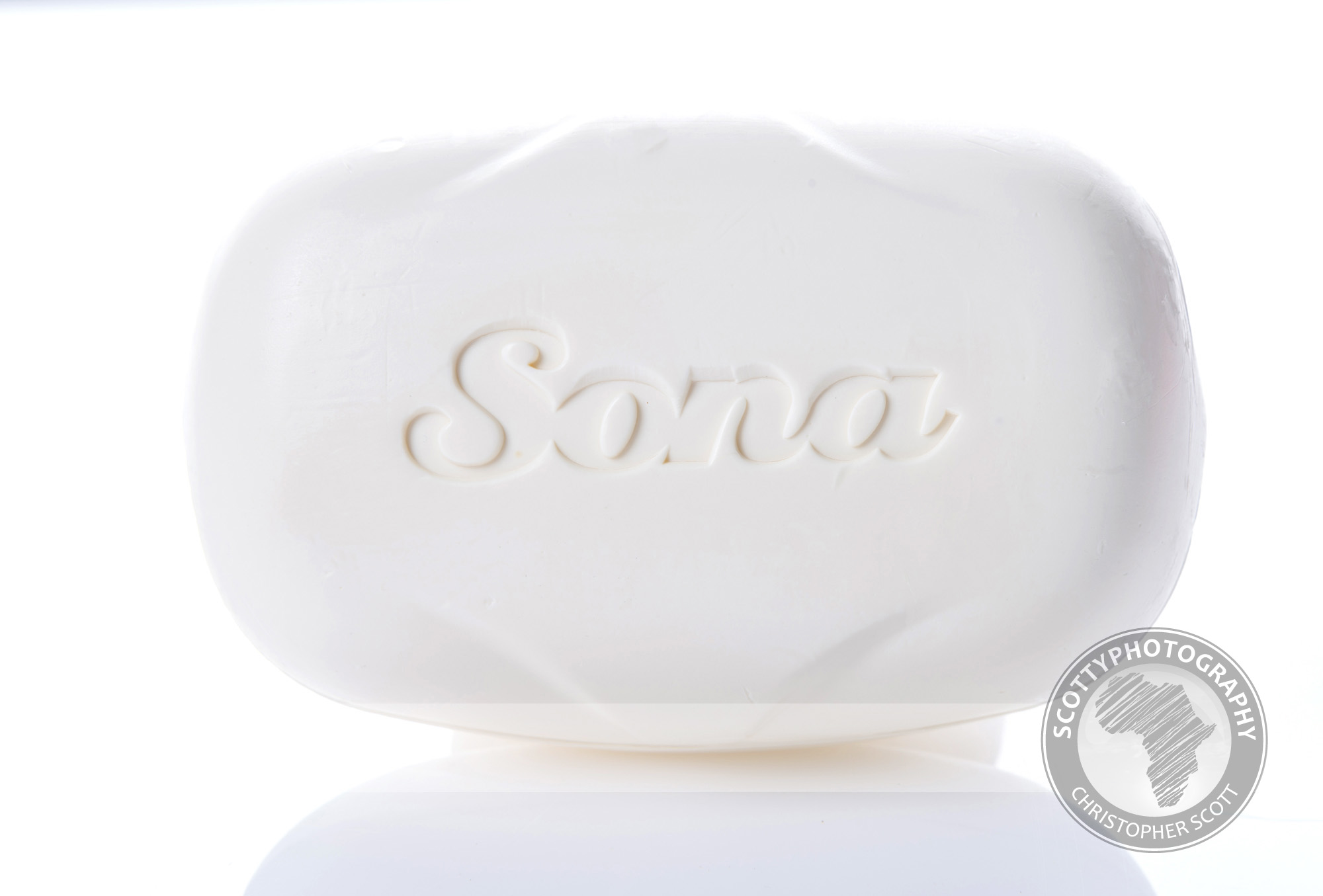
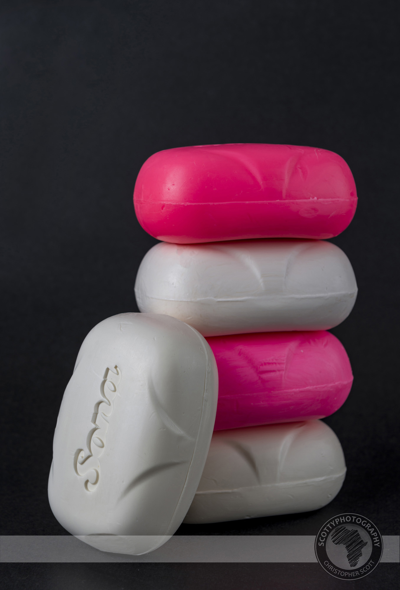
I am very grateful to the Willowton group for allowing me the opportunity to have so much fun in the studio with such a common household item! Who knew that bars of soap could be such fun to shoot? Throw in a few pieces of coloured paper and the game changes completly! Which one is your favourite?
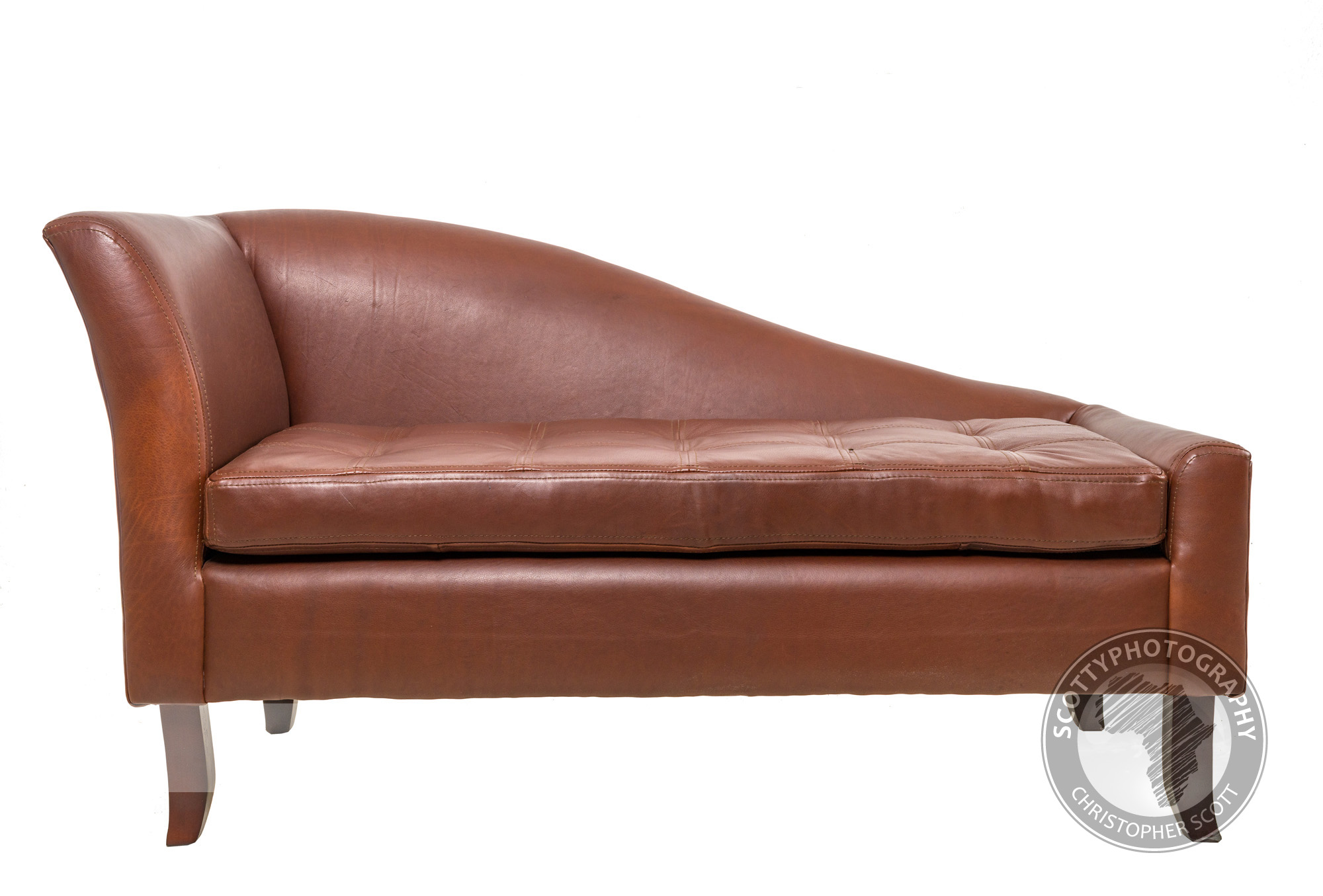
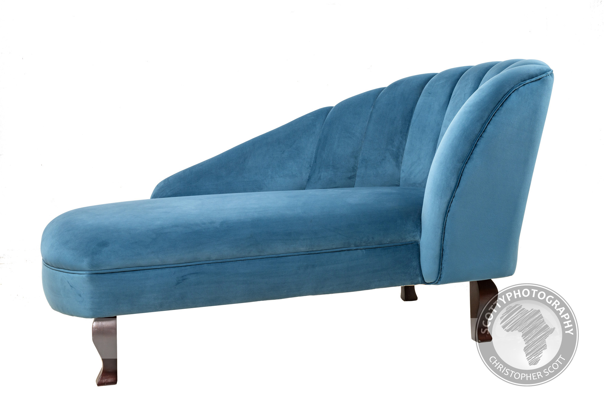
Elite Interiors
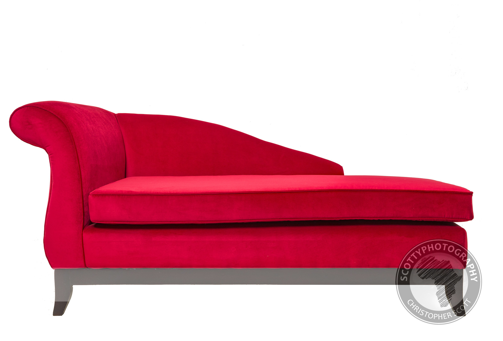
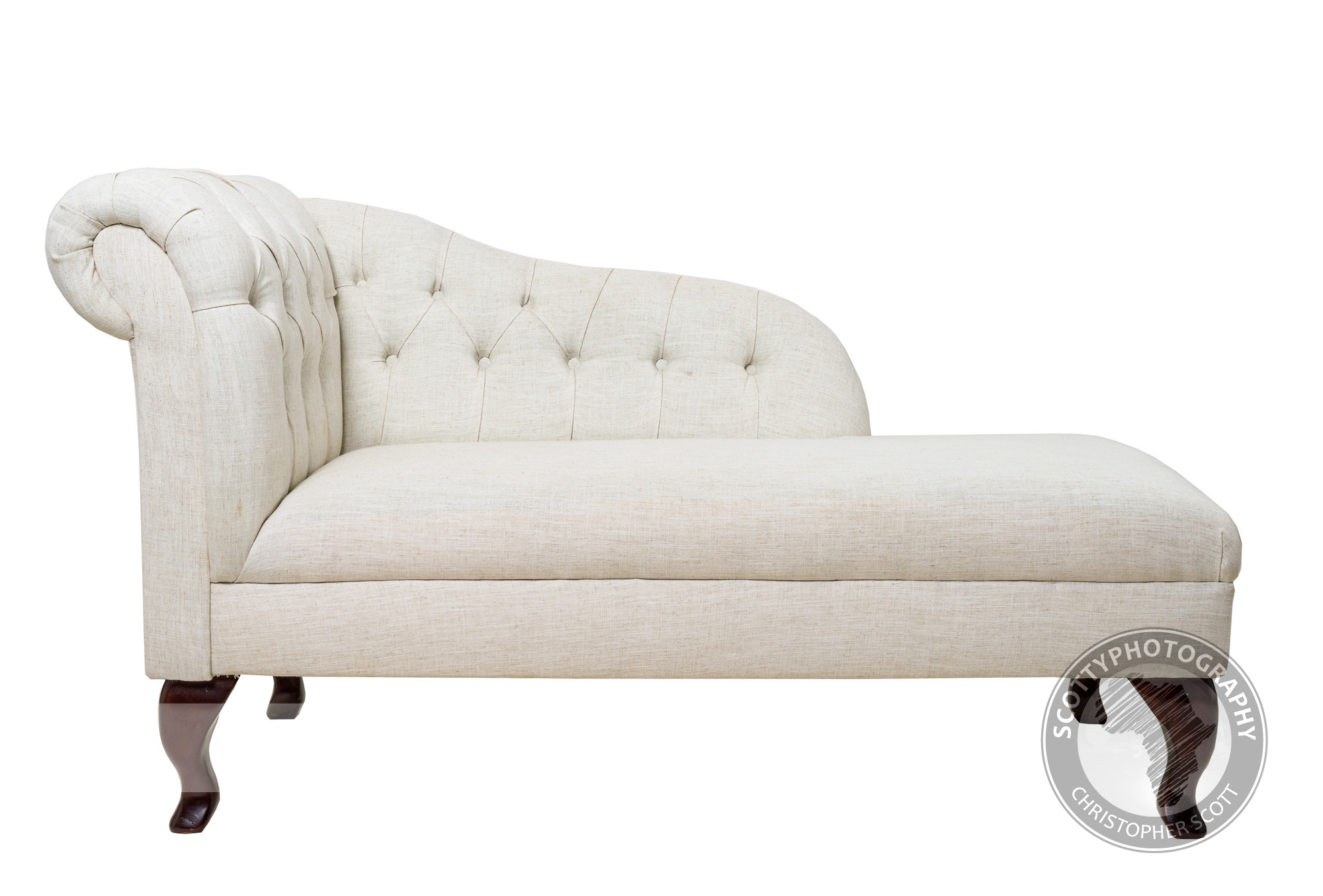
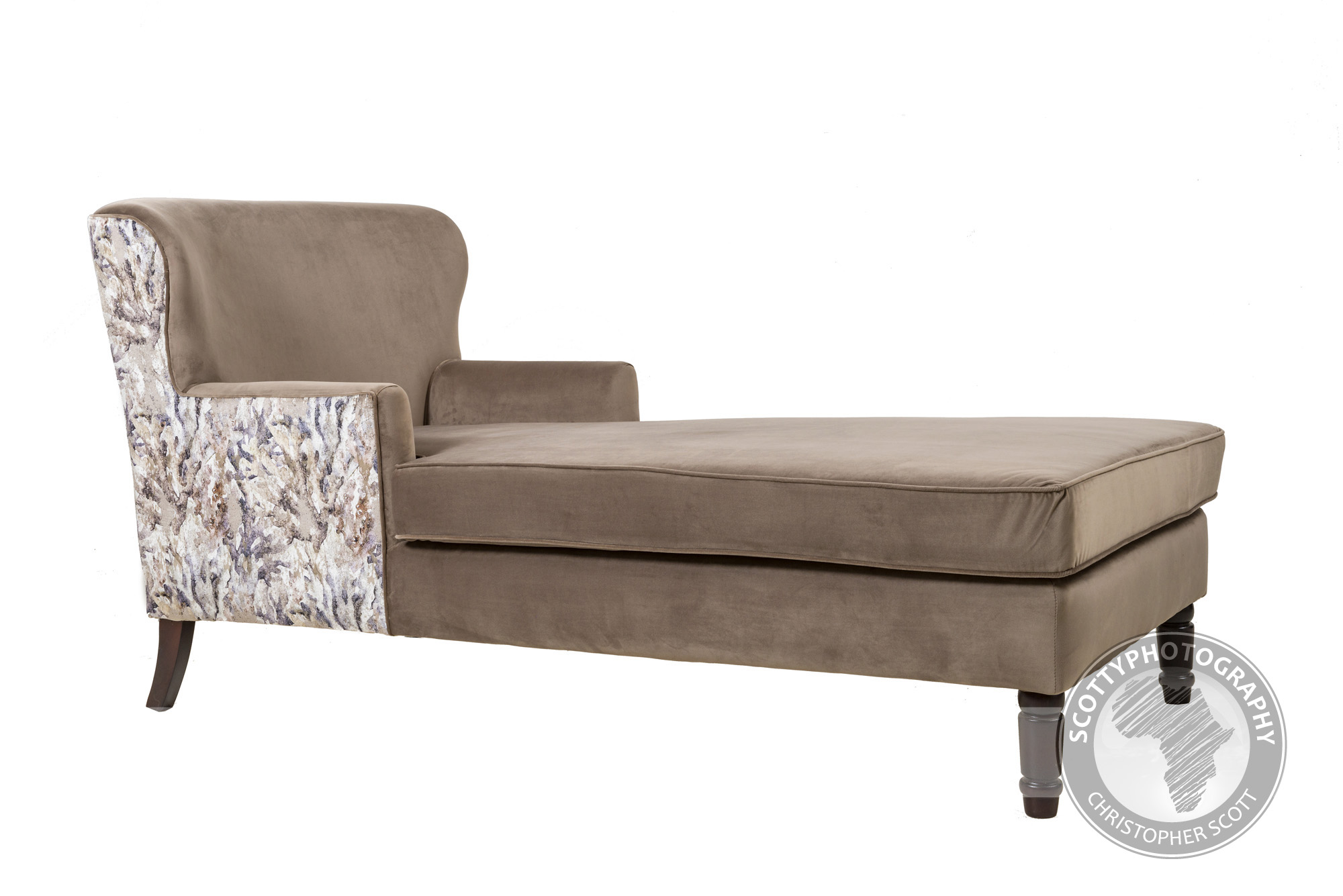
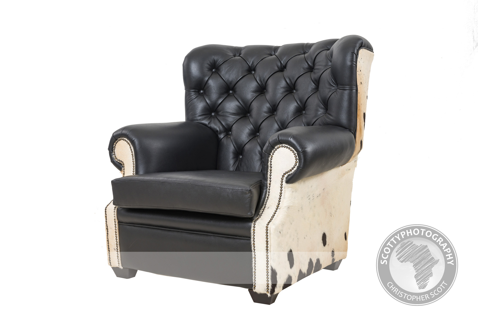
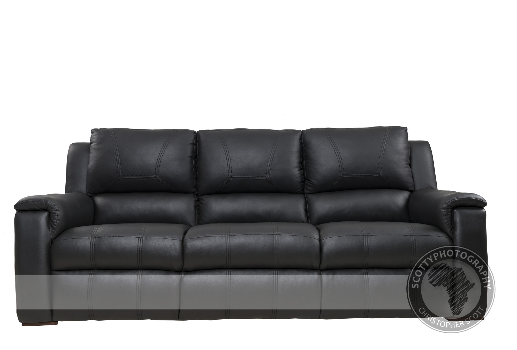
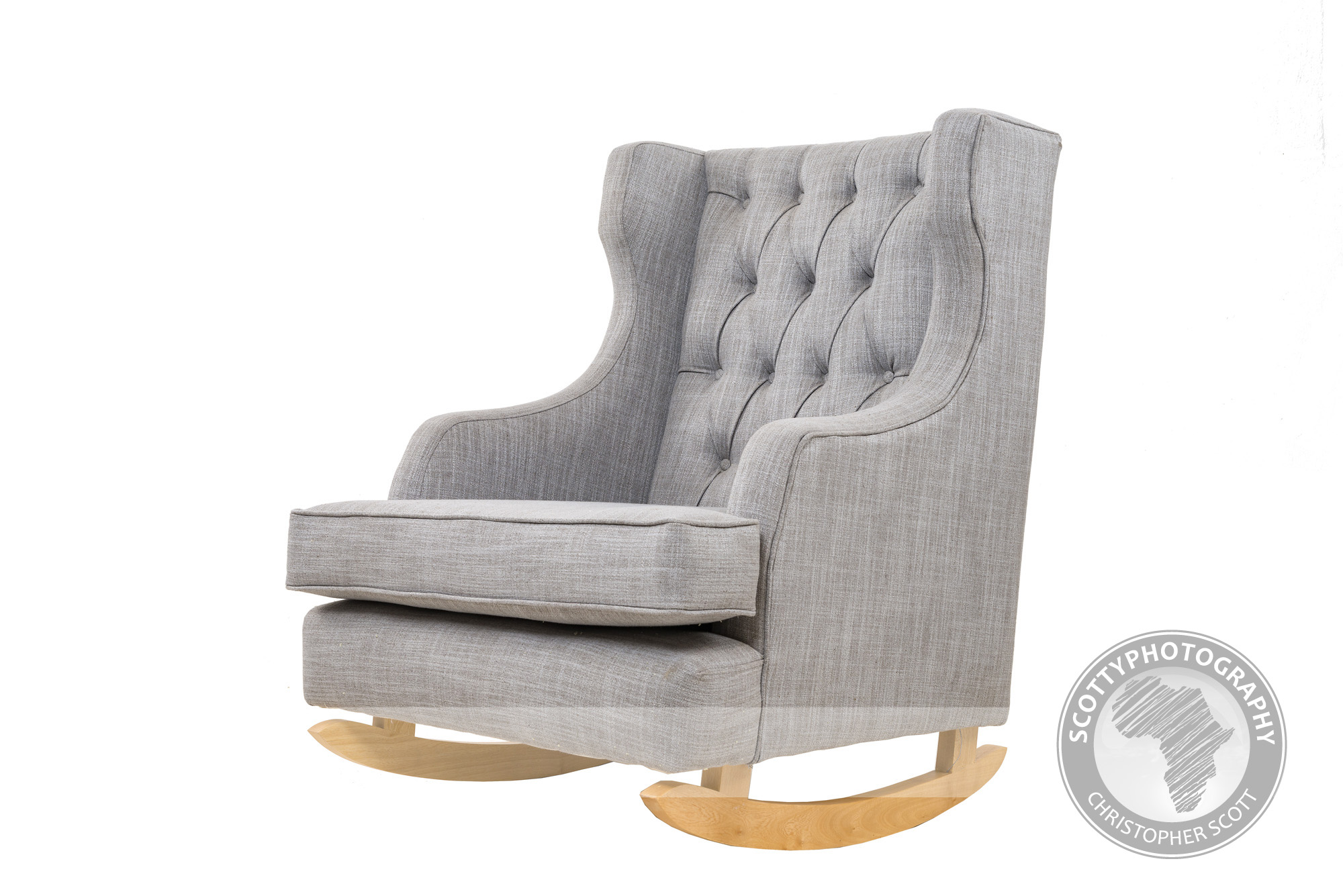
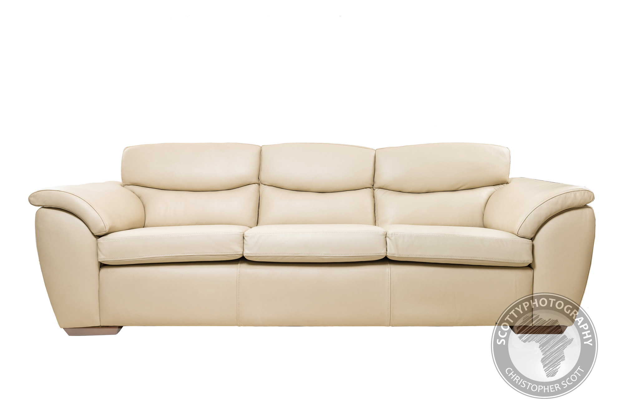
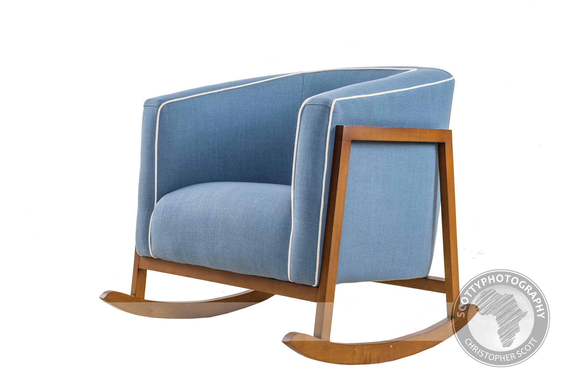
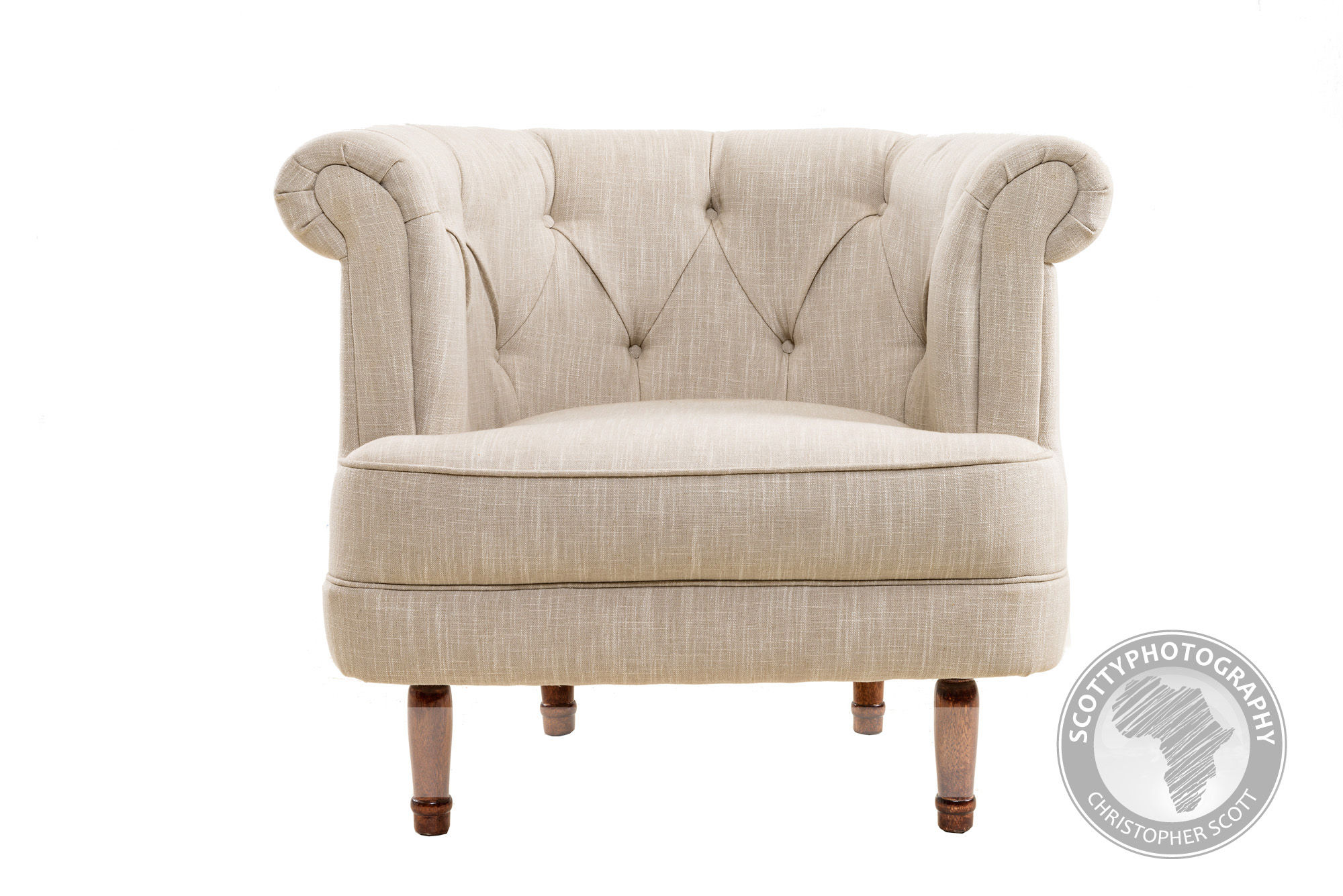
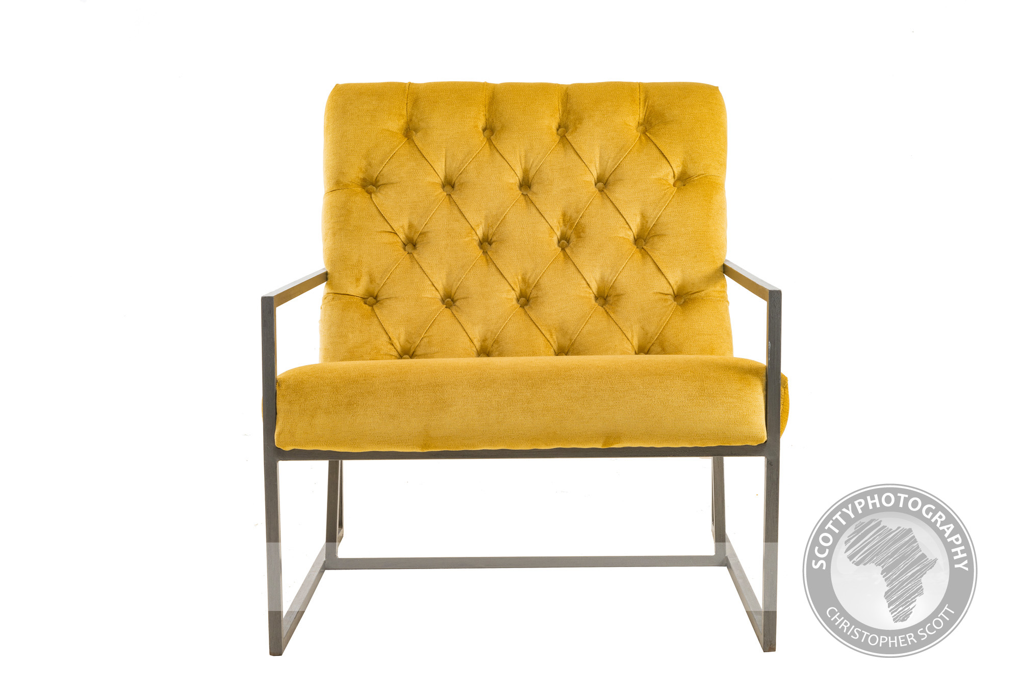
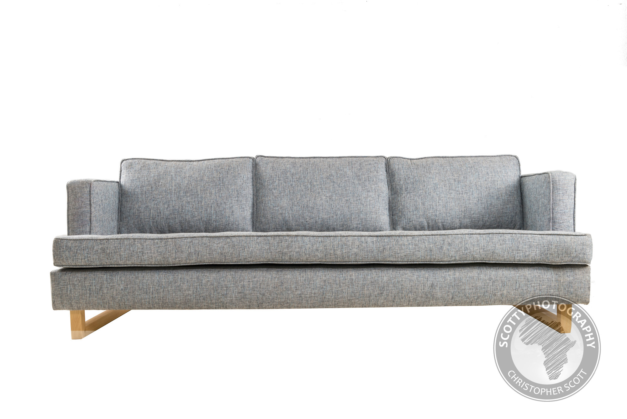
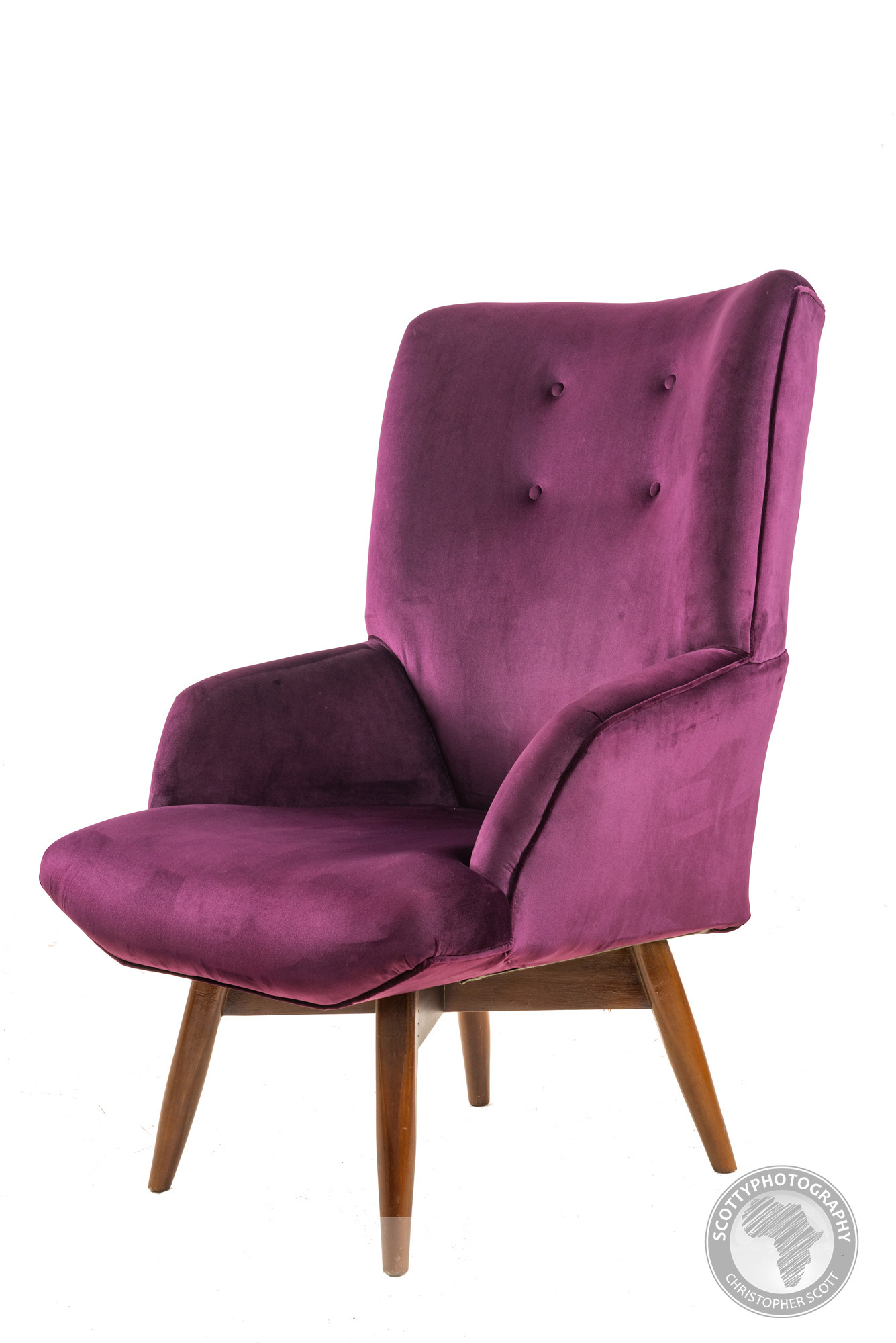
Elite Interiors recently brought in a selection of their boutique handcrafted furniture into my studio to photograph for their website and current catalogue, which piece would you have in your home?
The kind of Trouble we love having in our studio....
I am a great lover of Chilli sauce, and Dr Trouble is about as good as it gets! I have photographed Dr Trouble in the studio before and so was more than excited when I was asked to photograph their new bottles which had been re-labeled. The brief was to get a variety of shots of the front and back of each bottle, as well as a variety of creative shots of individual and groups of bottles. I am very happy with the results, let me what your favourite shot is in the comments below!
Relishing time with Rocco...
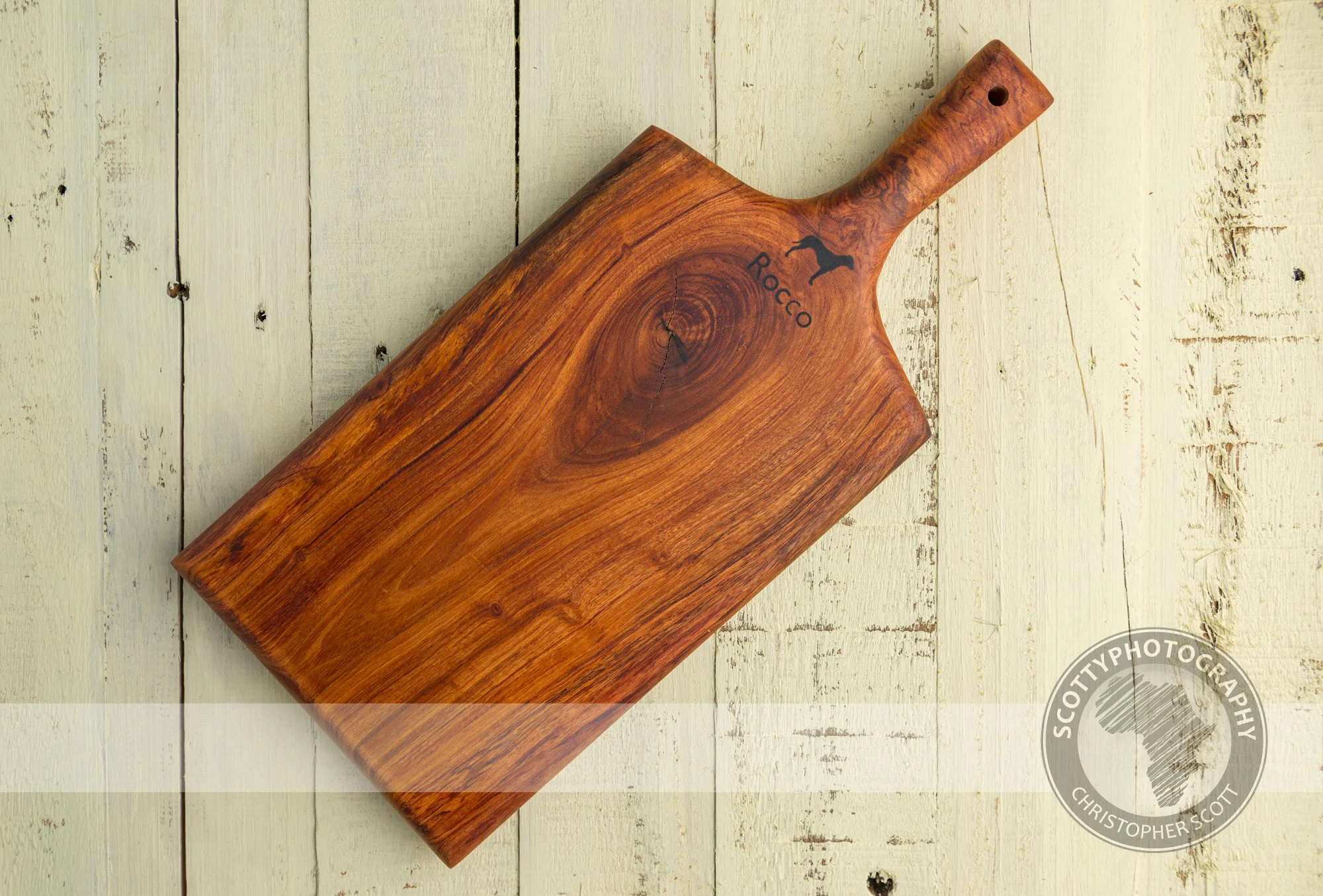
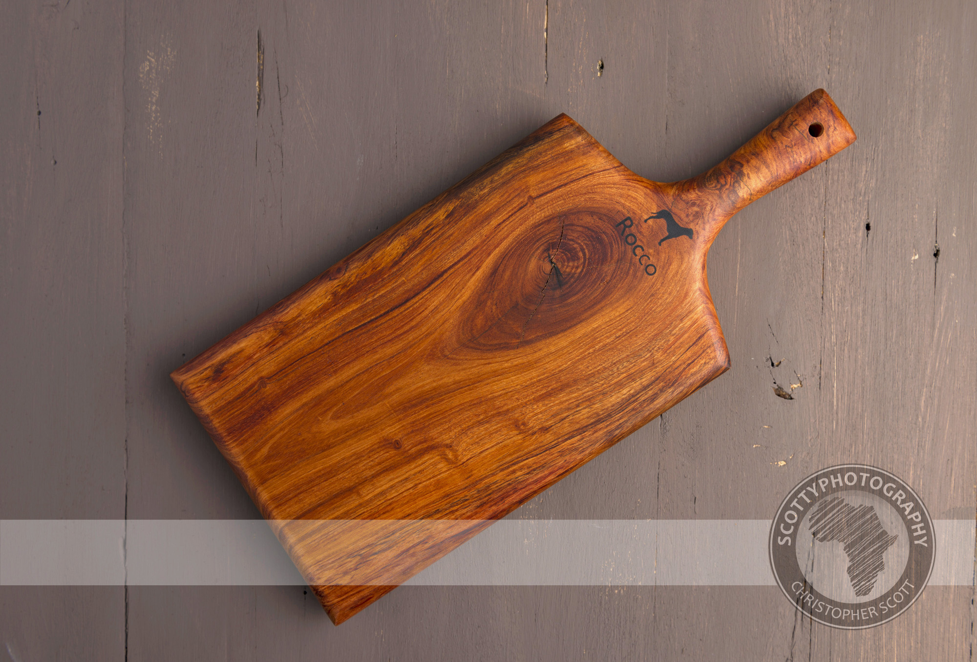
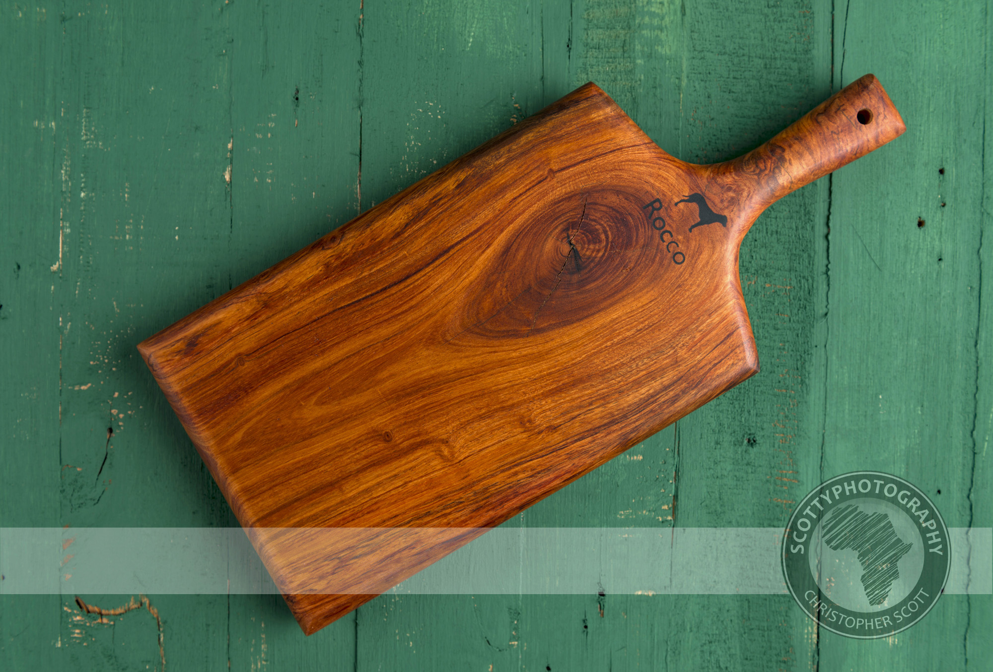
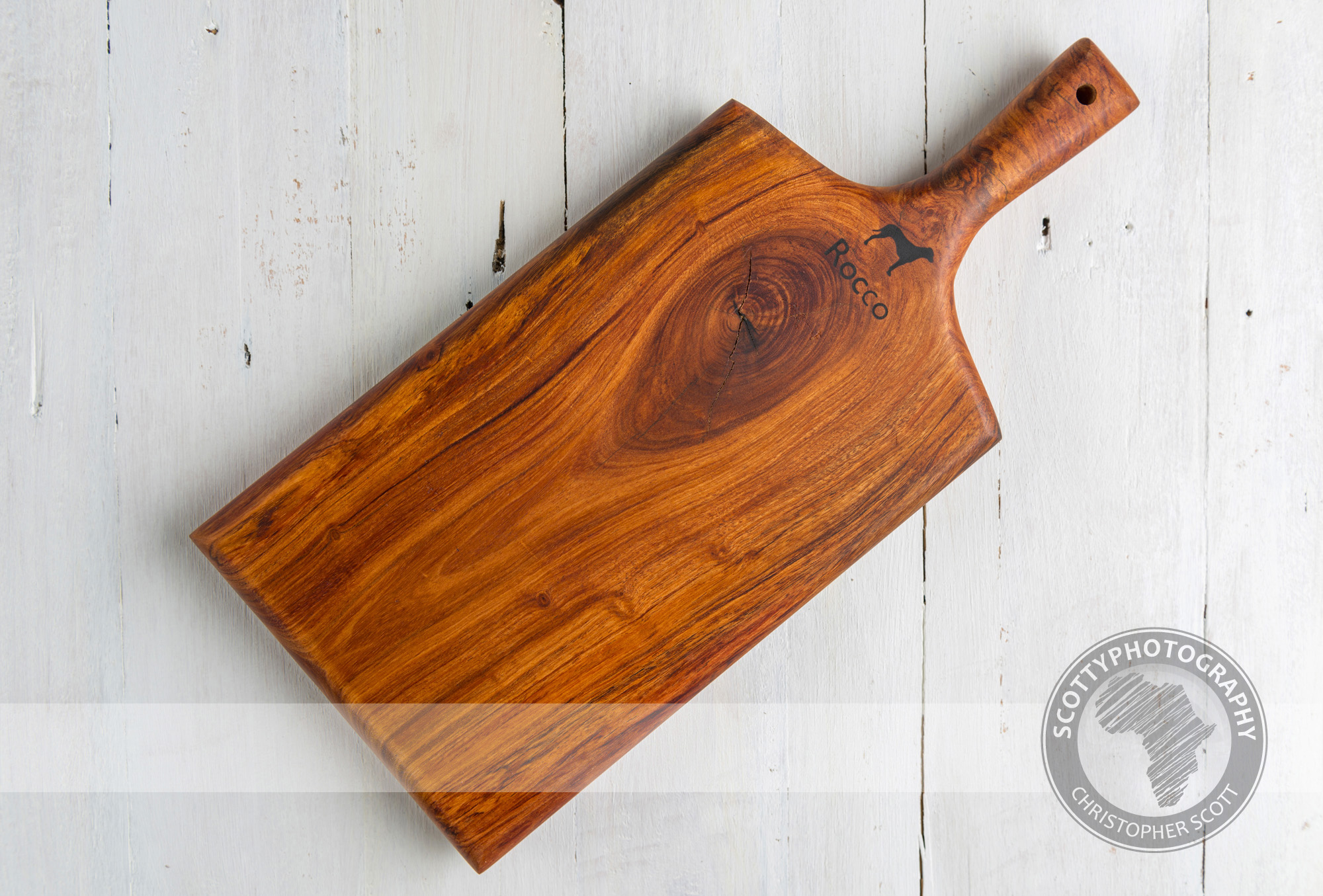
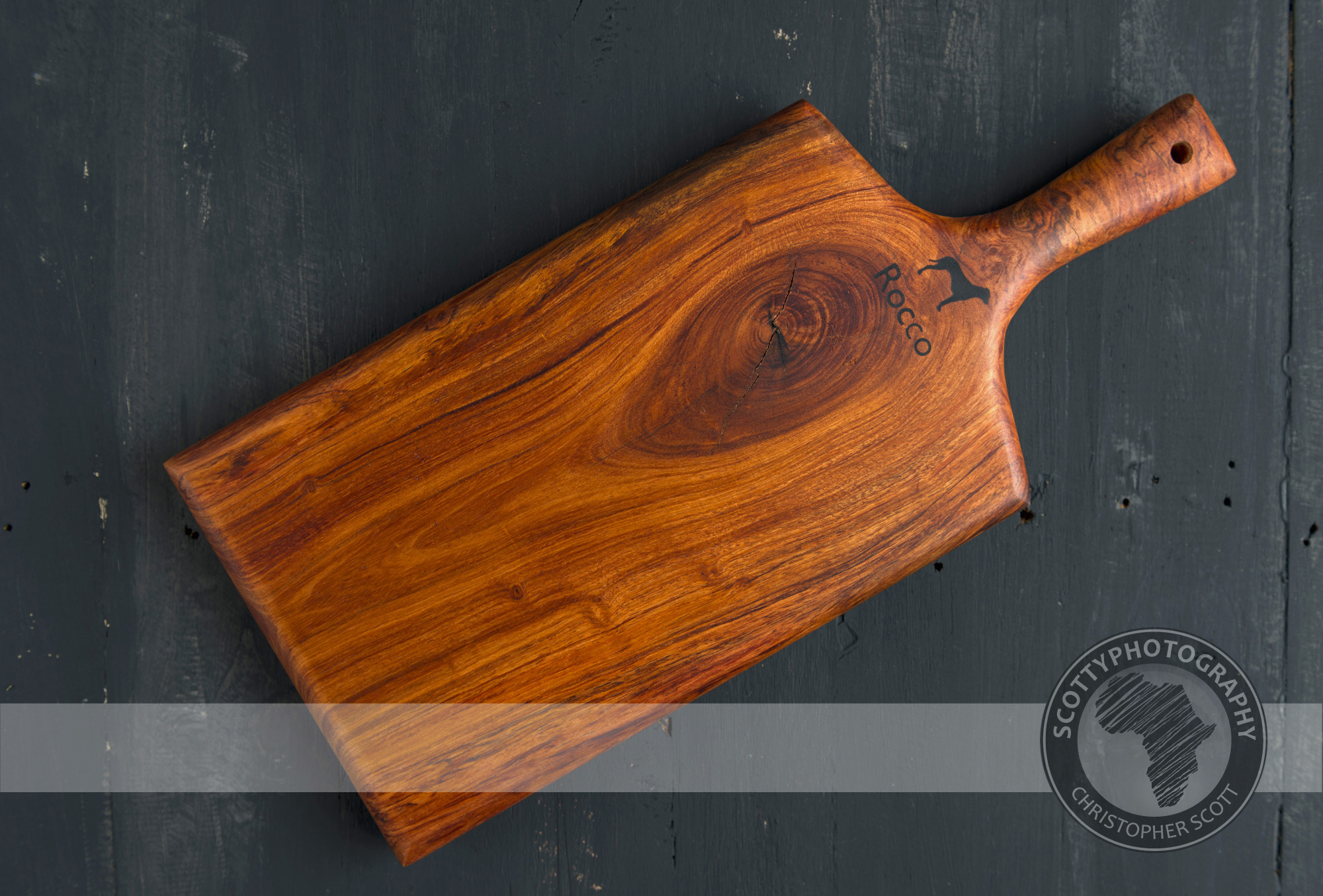
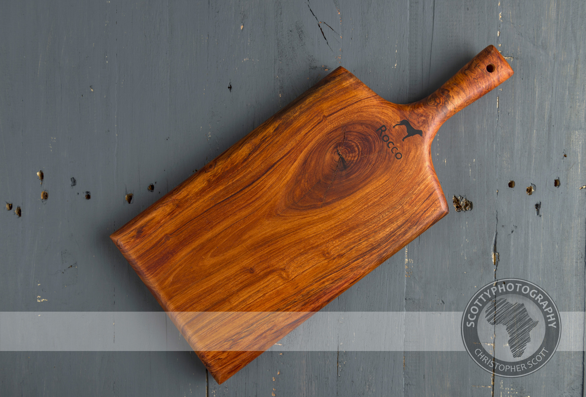
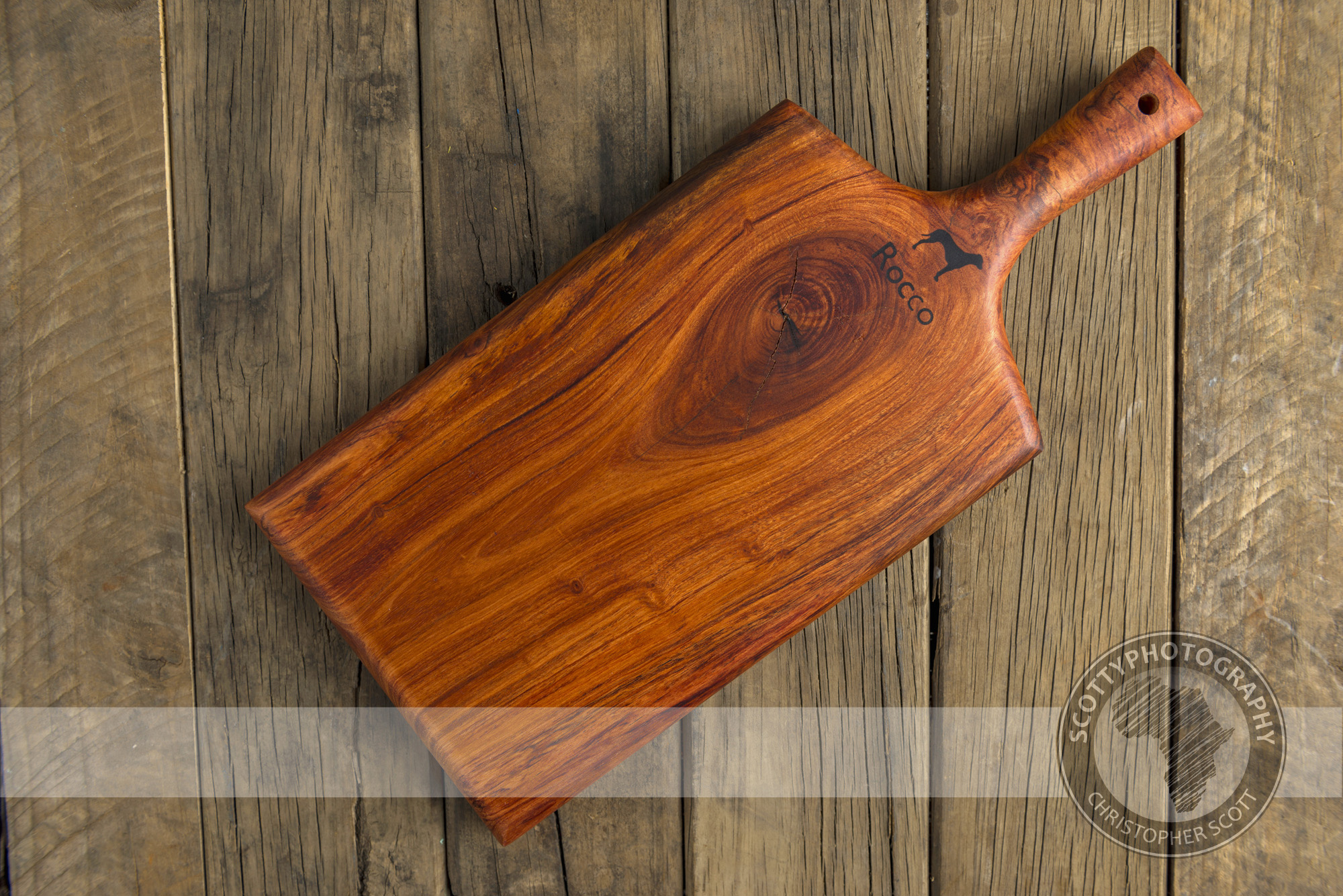
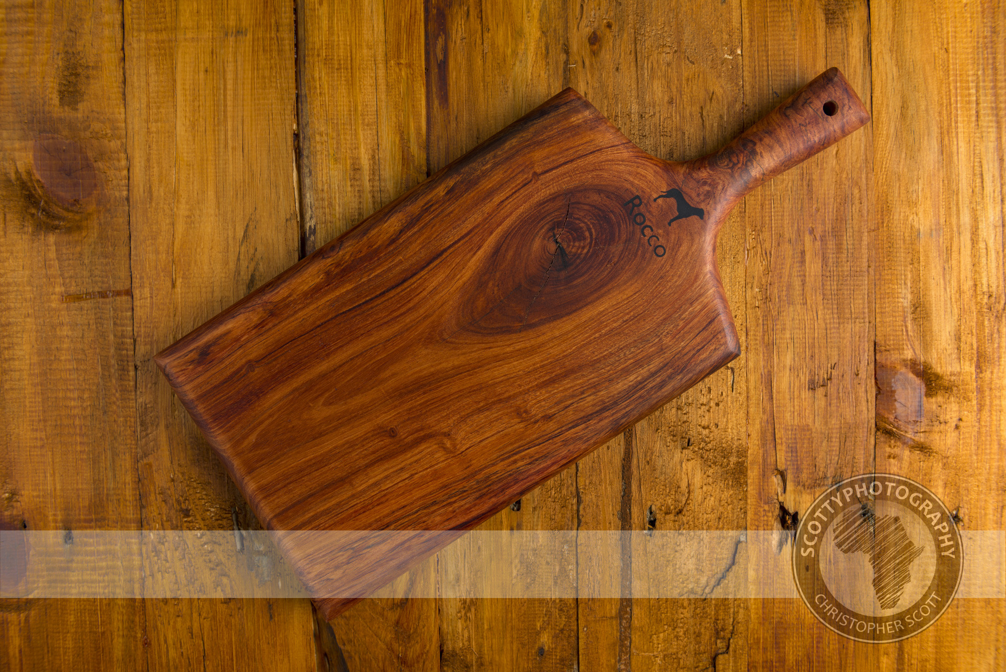
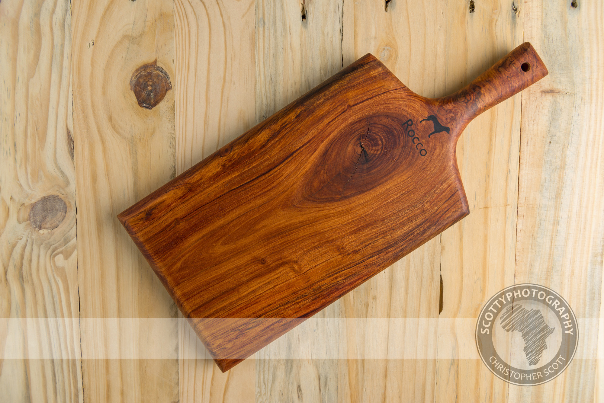
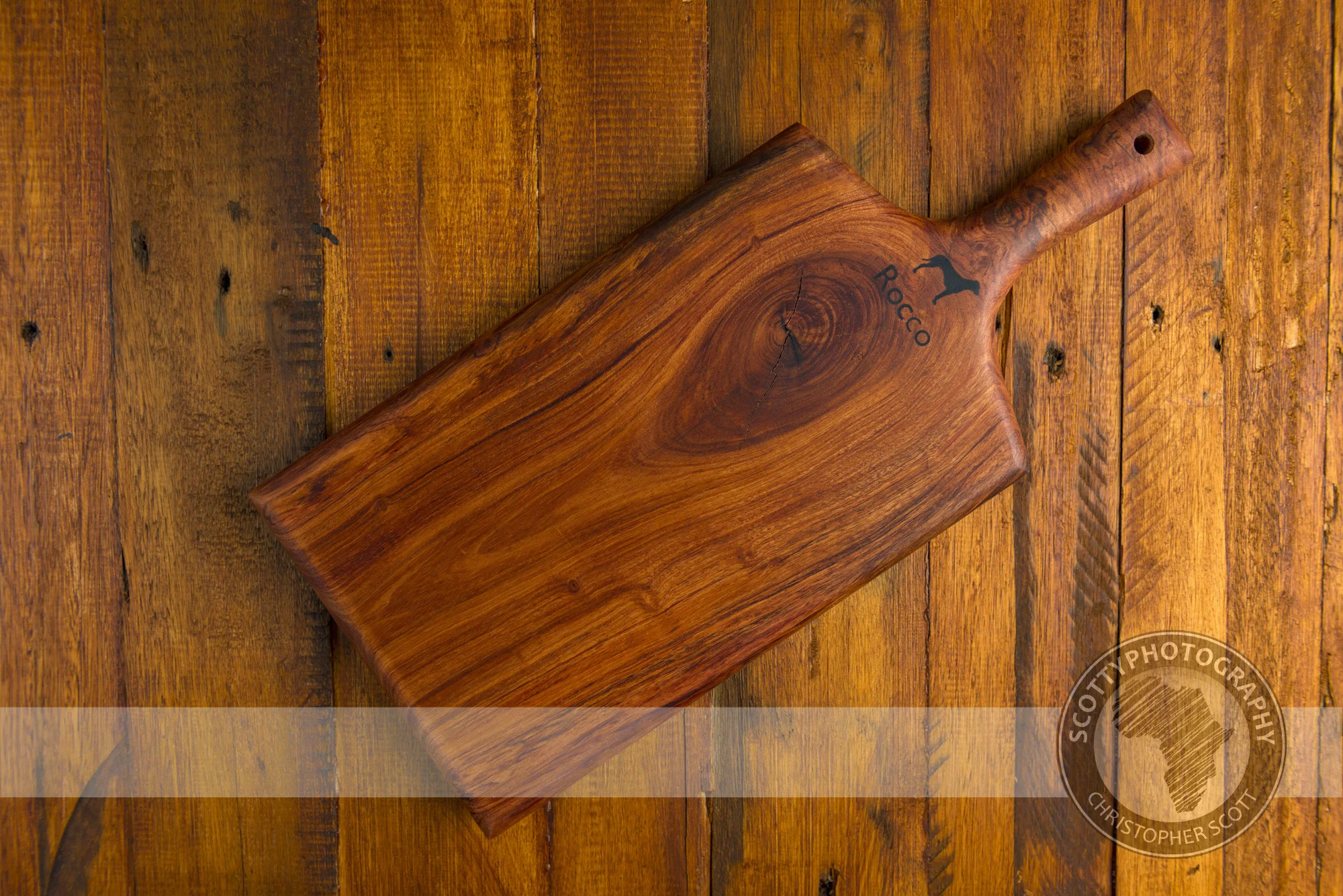
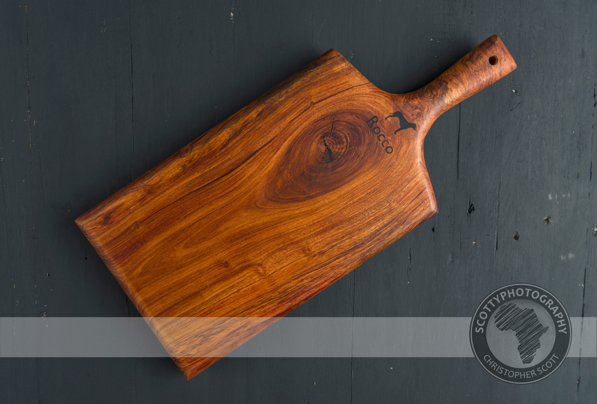
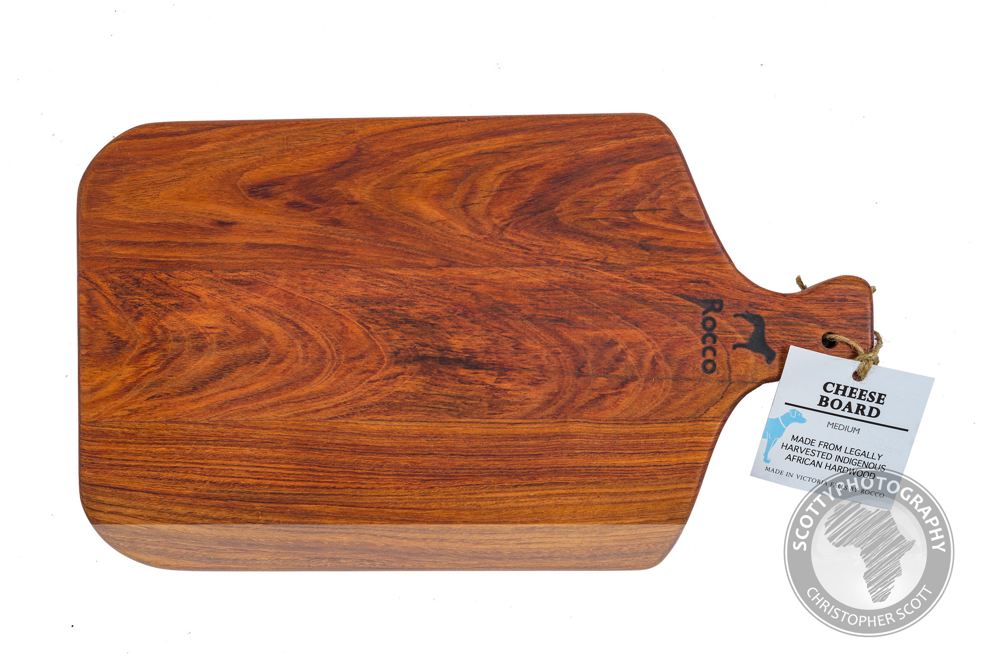
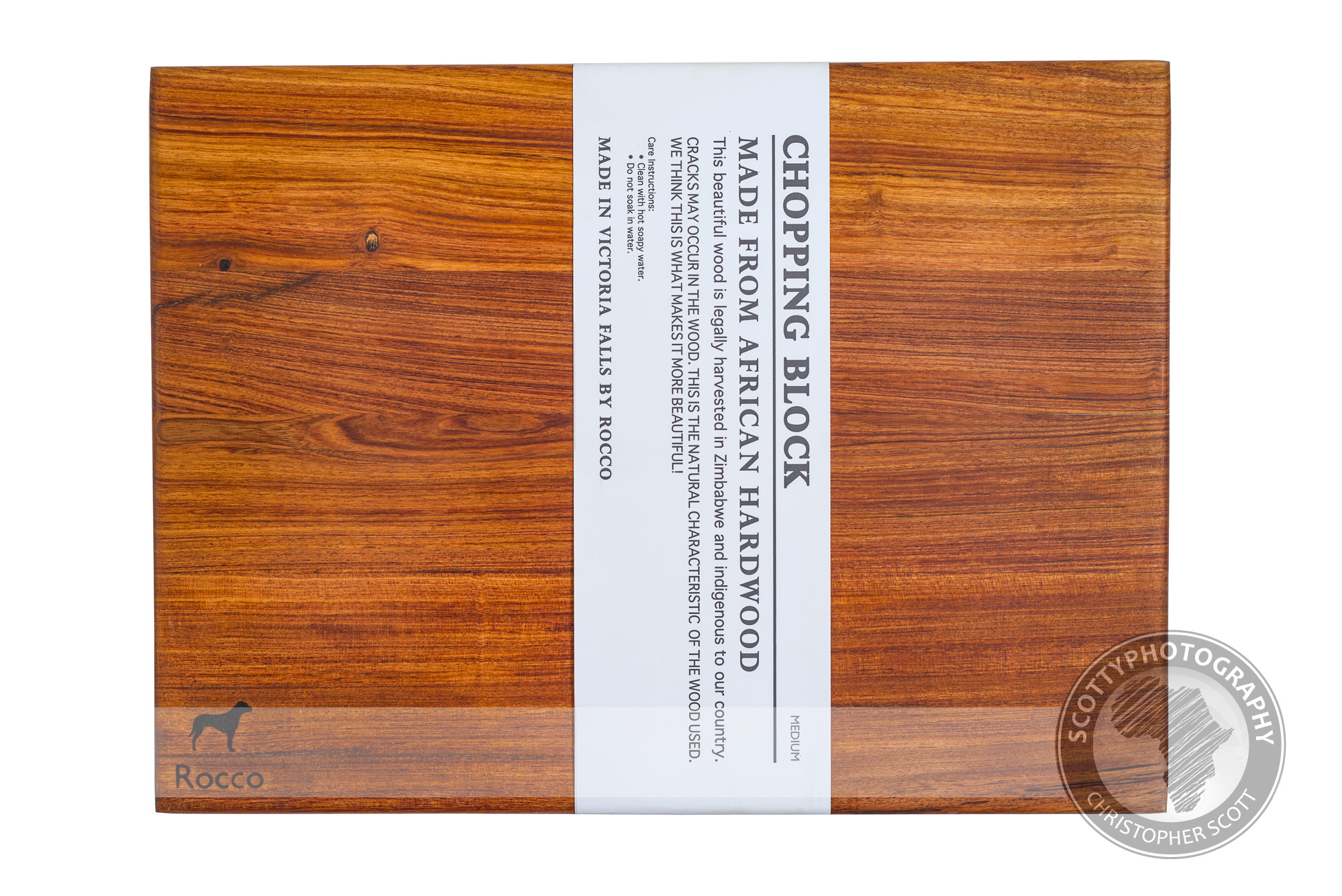
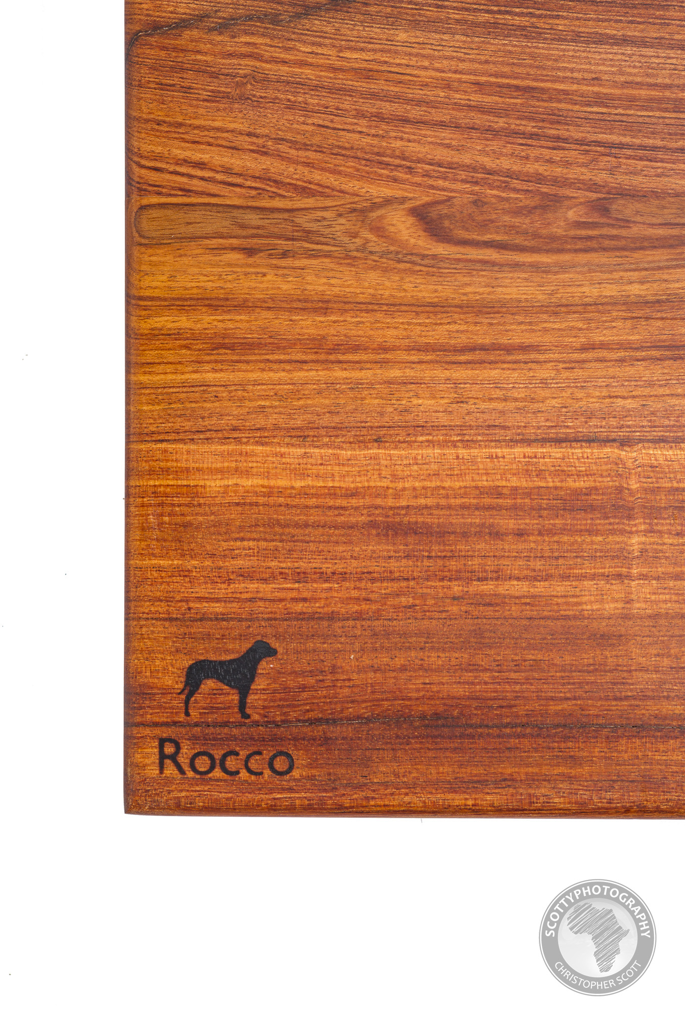
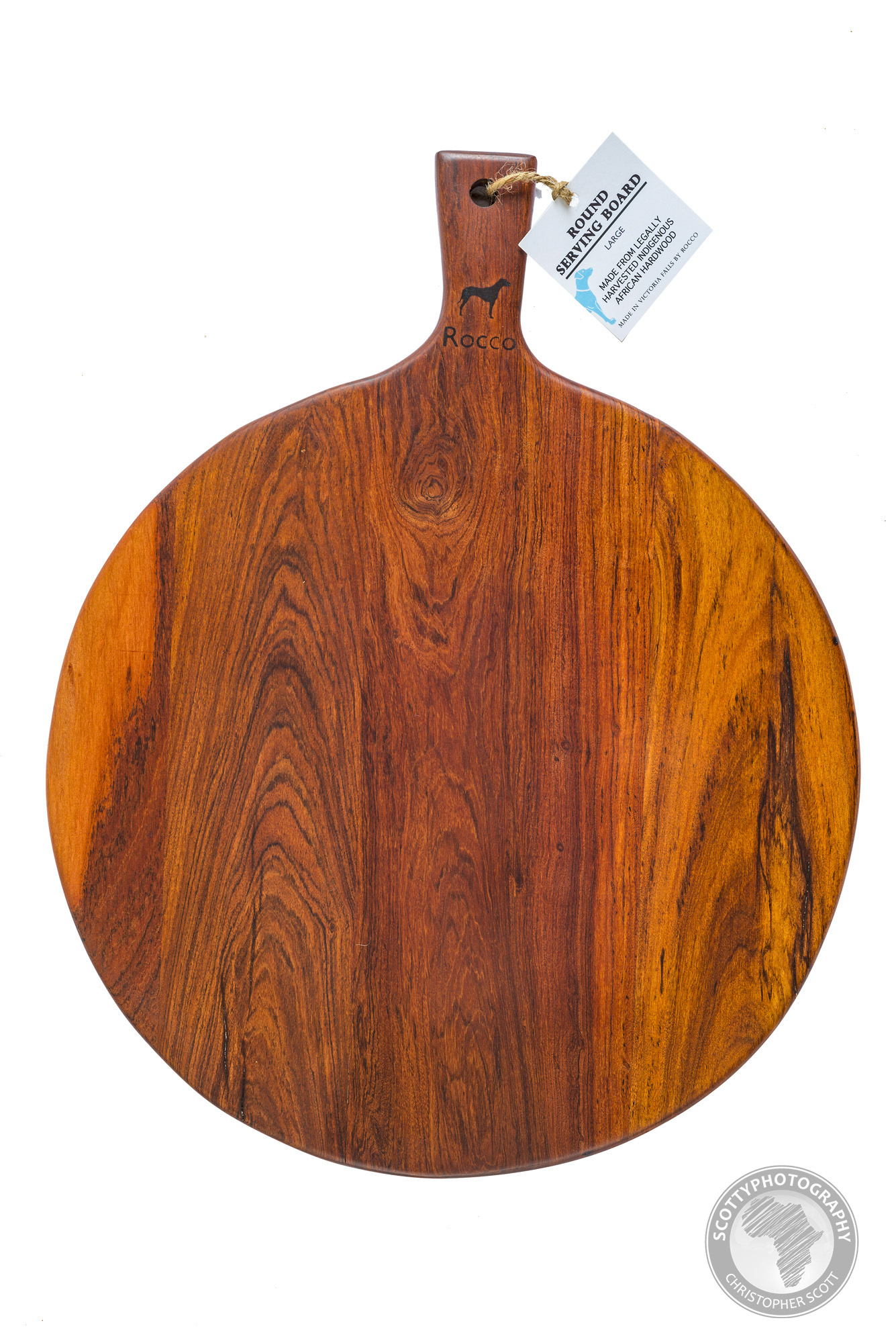
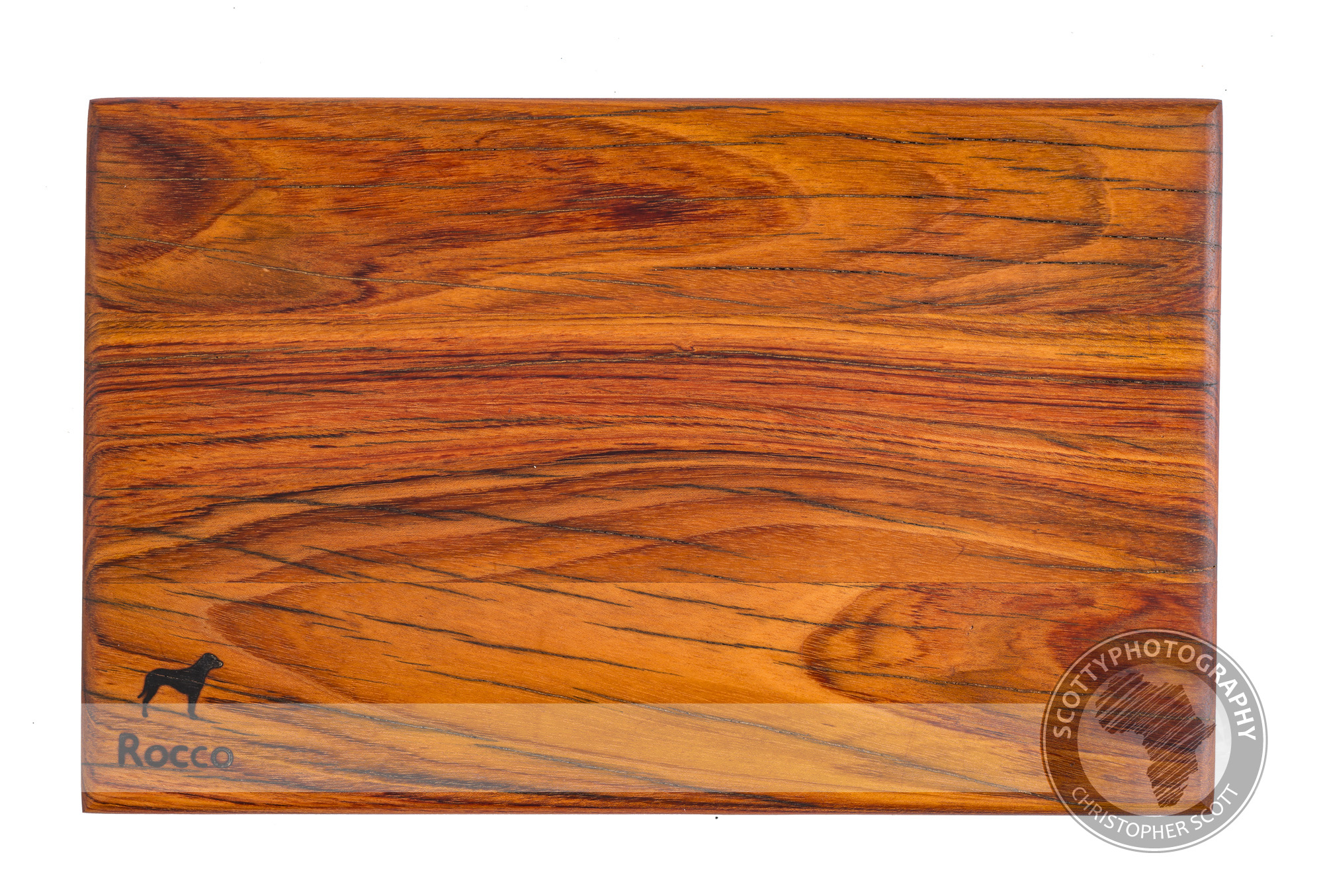
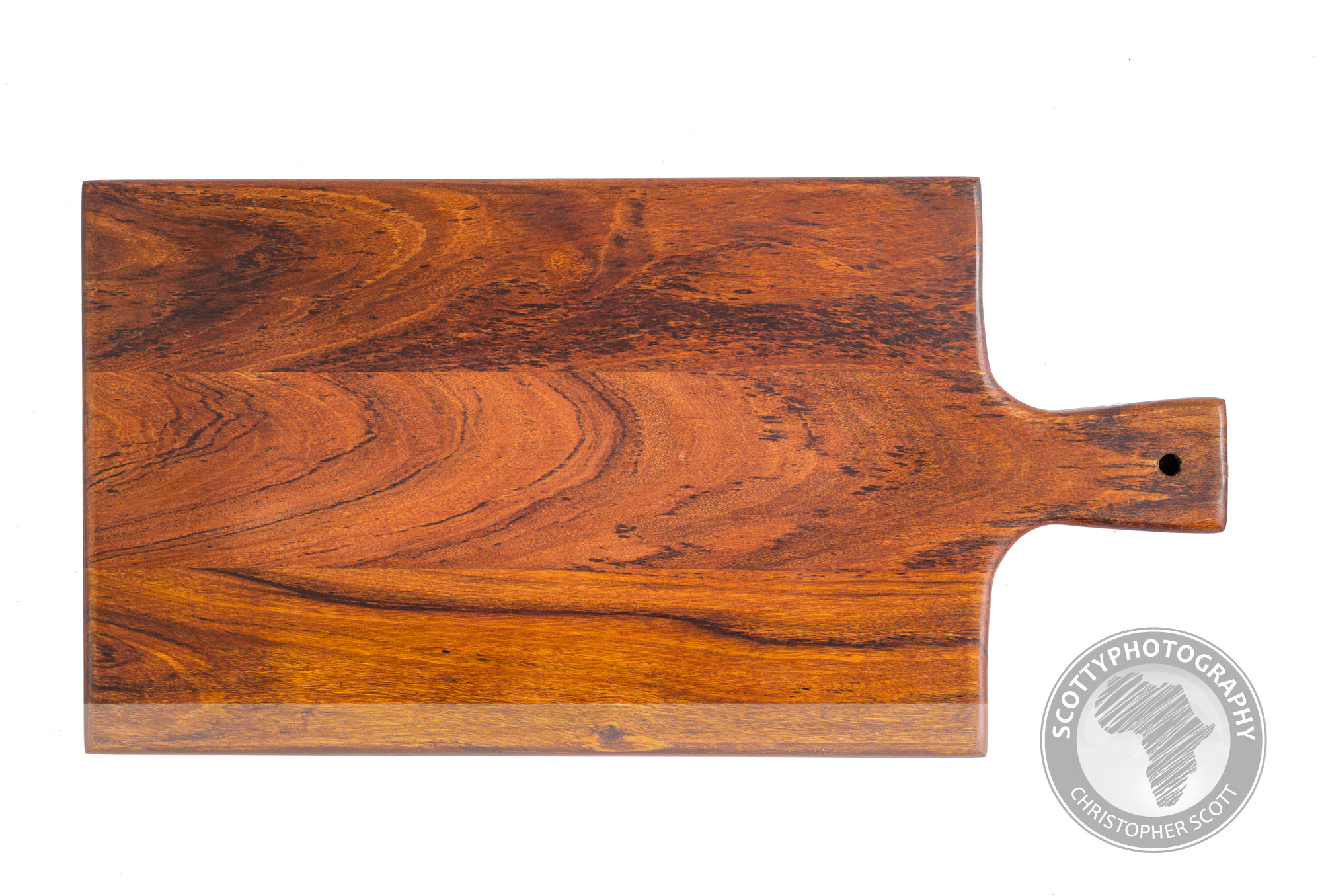
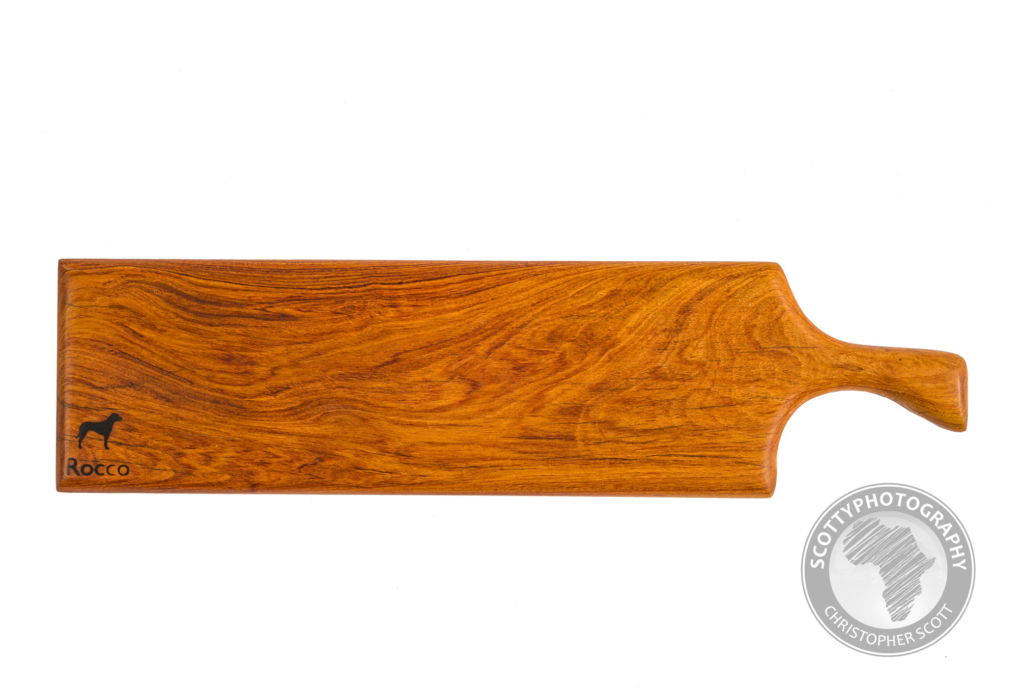
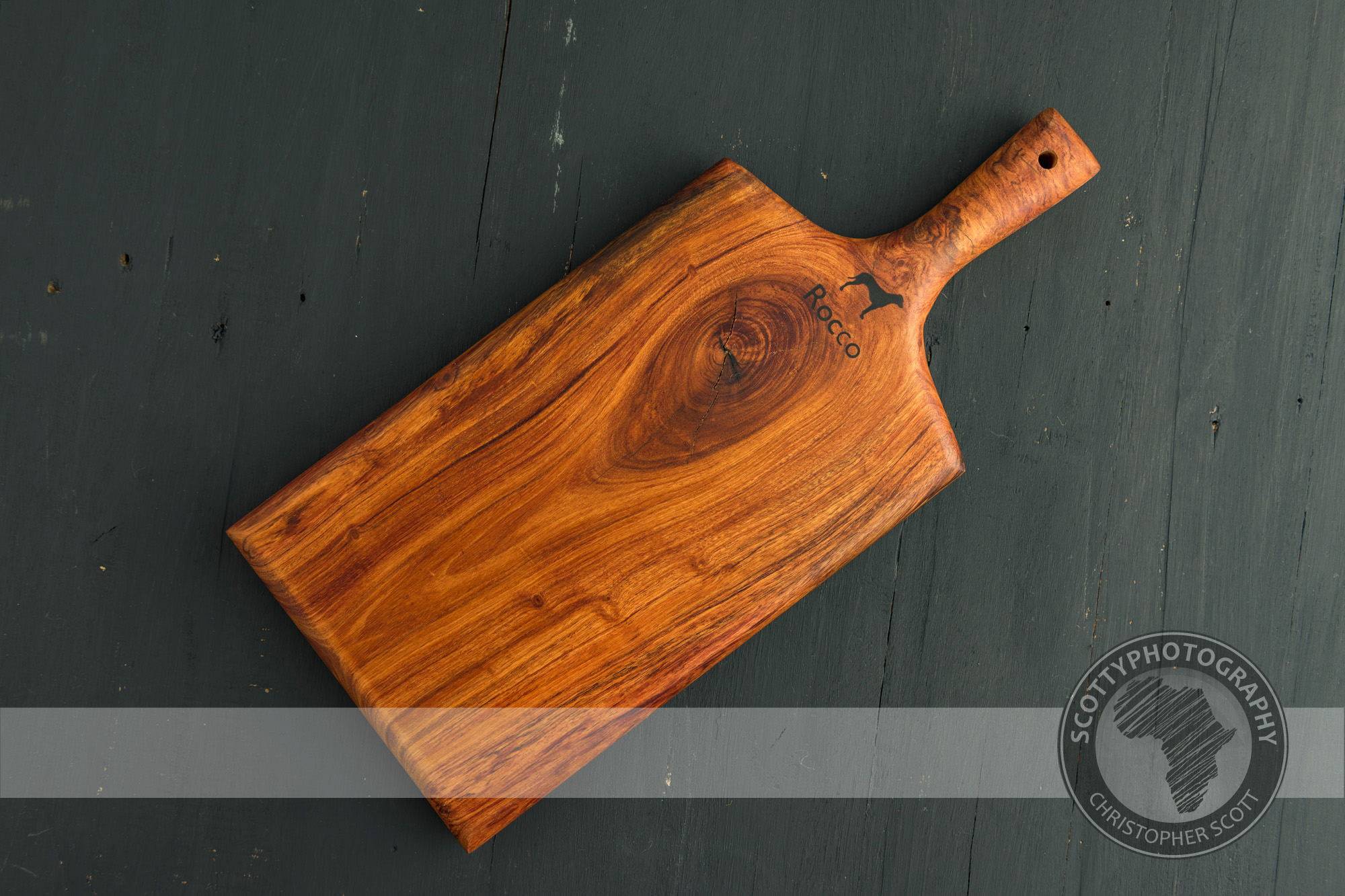
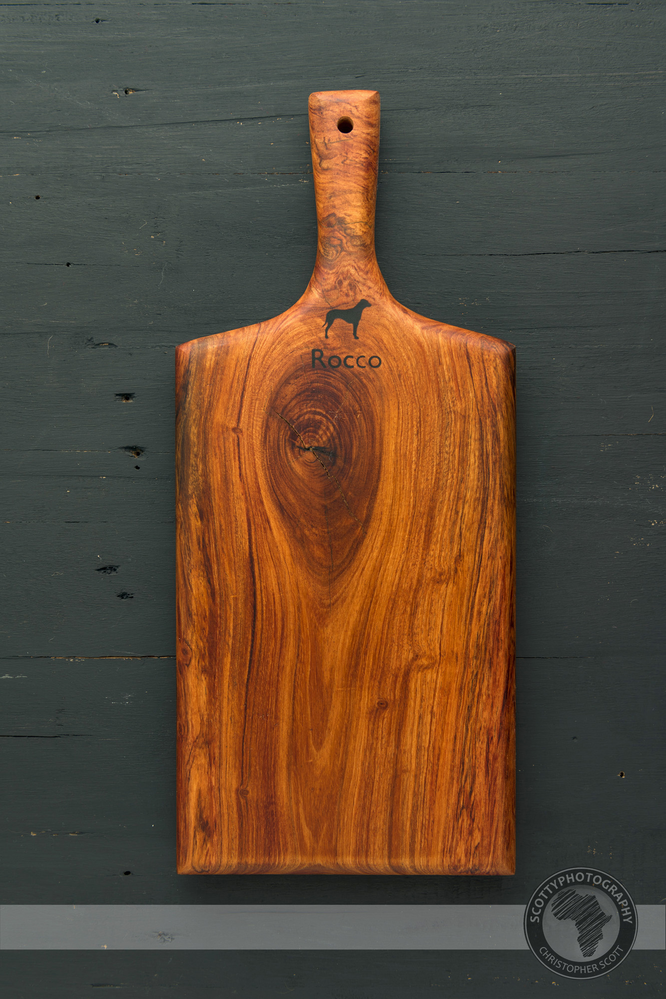
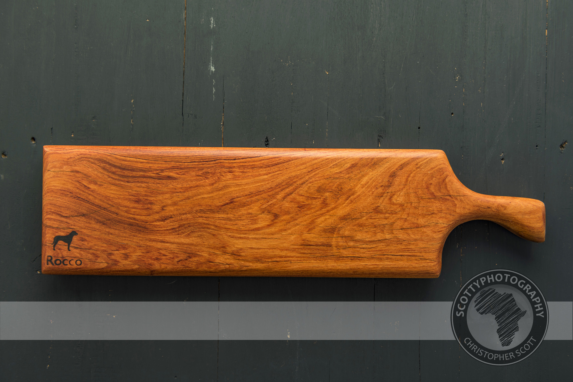
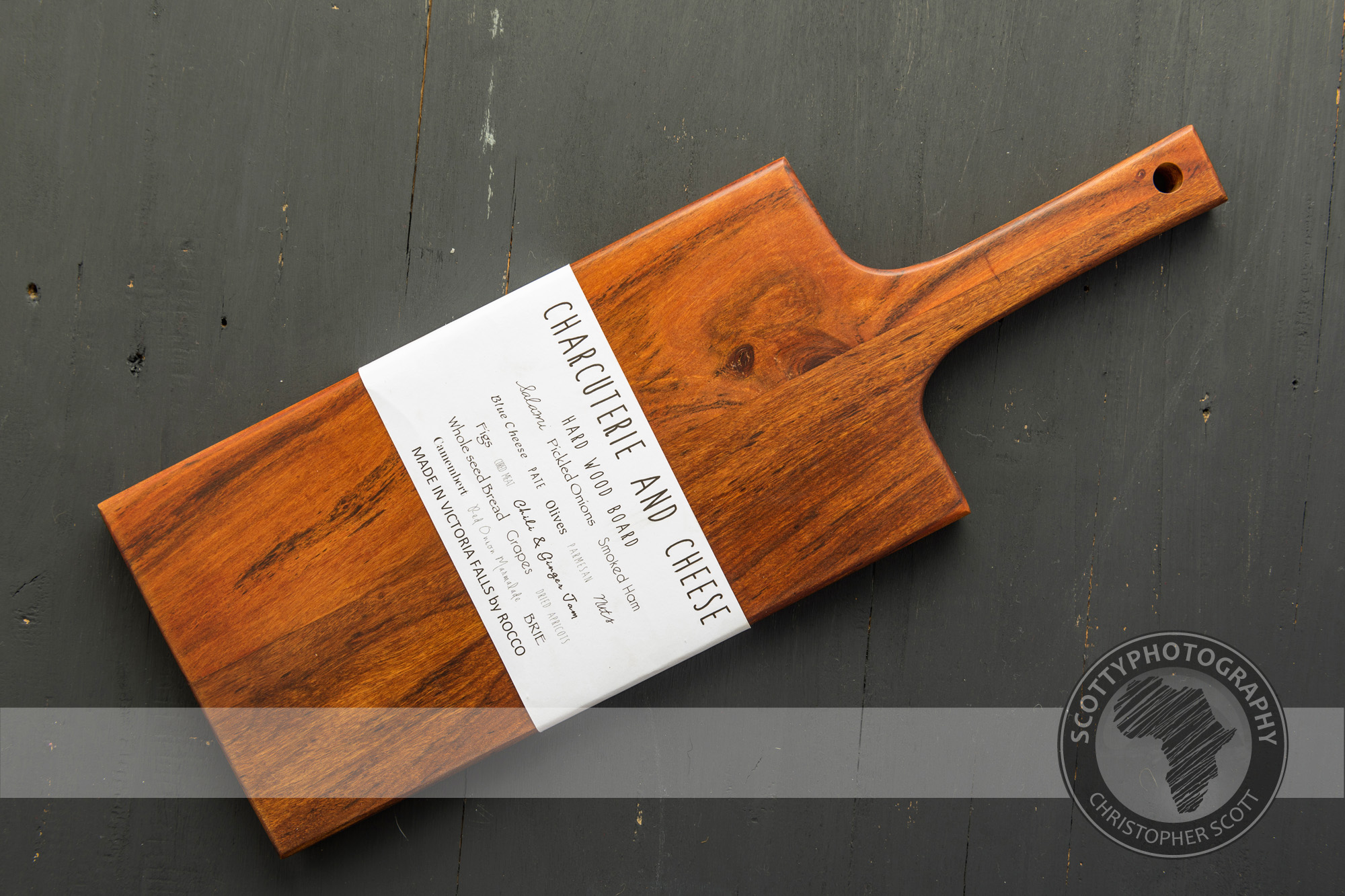
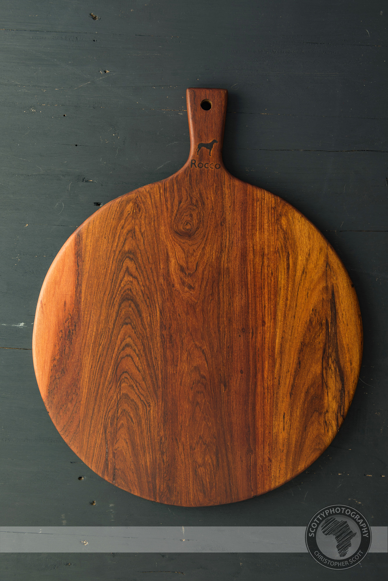
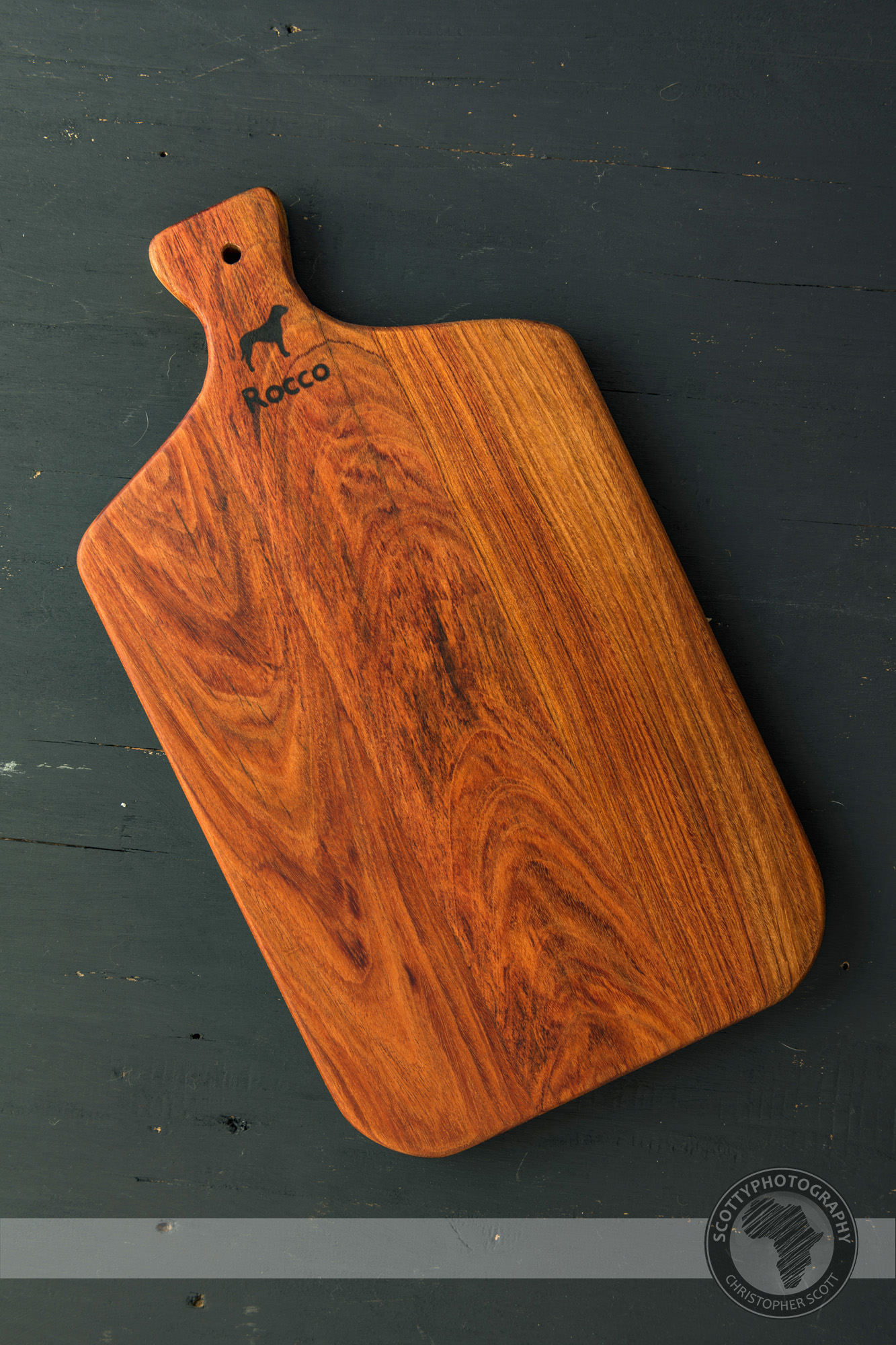
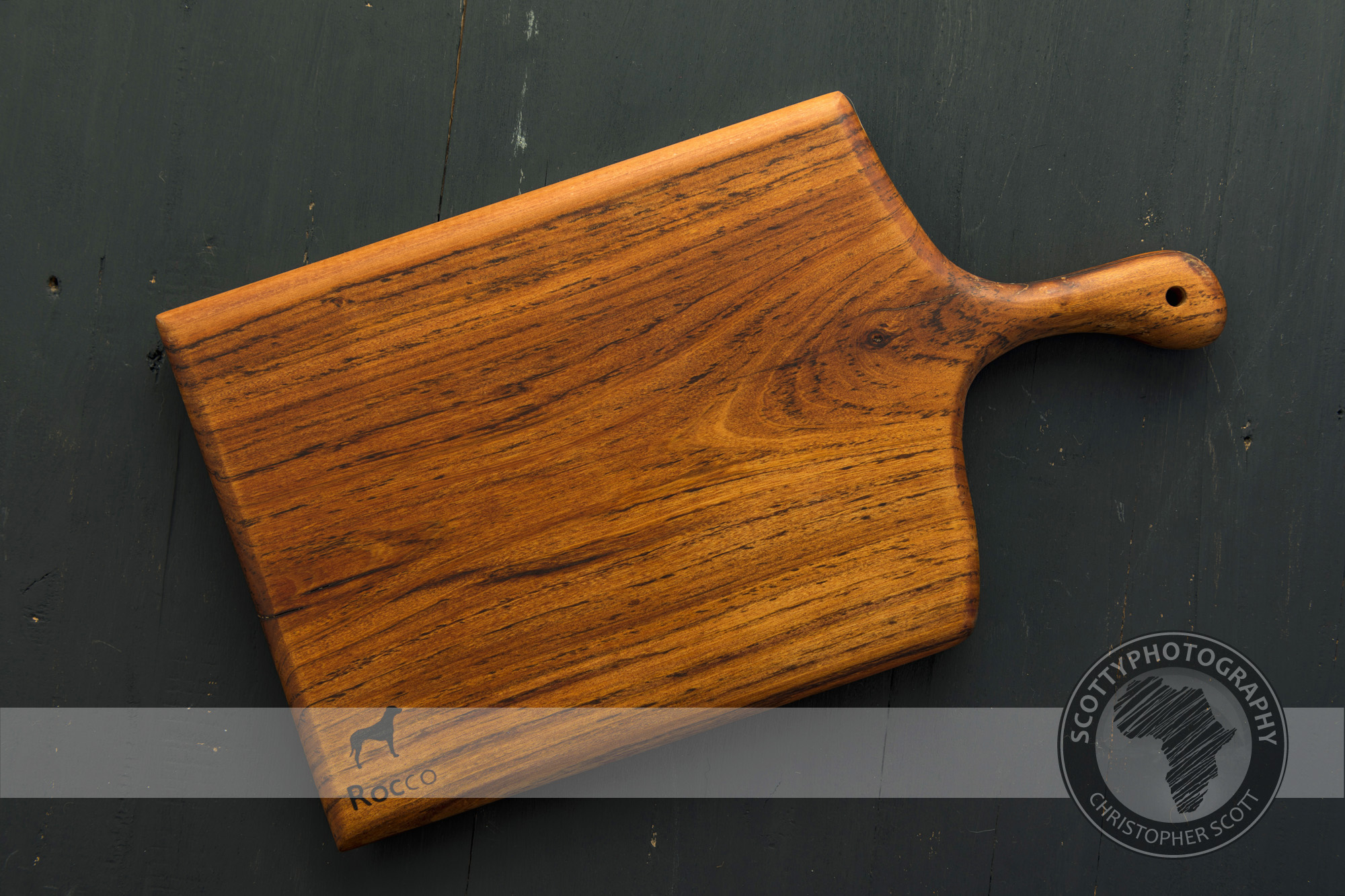
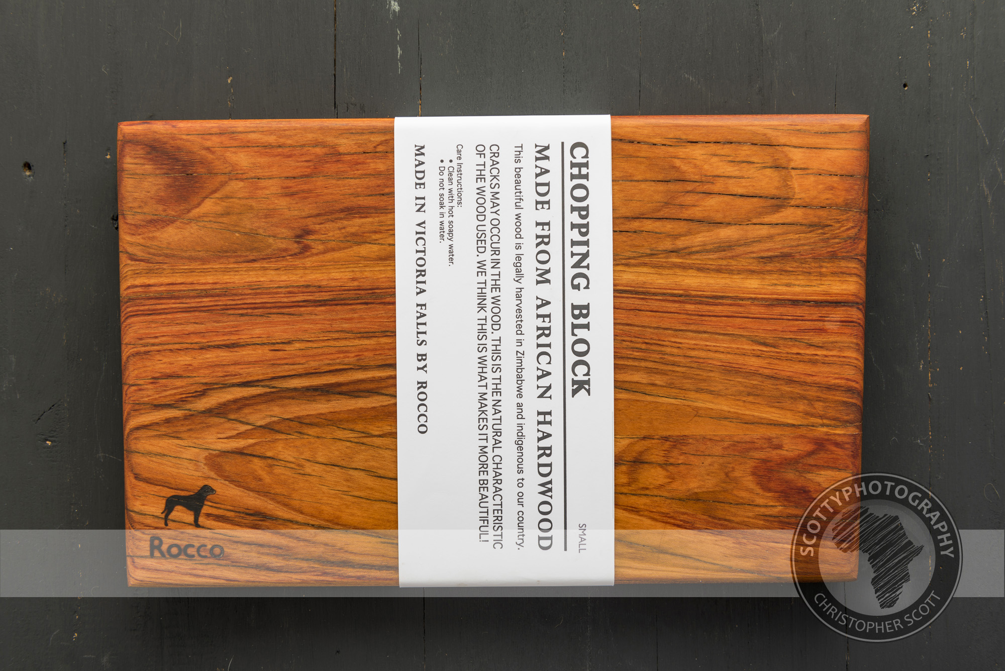
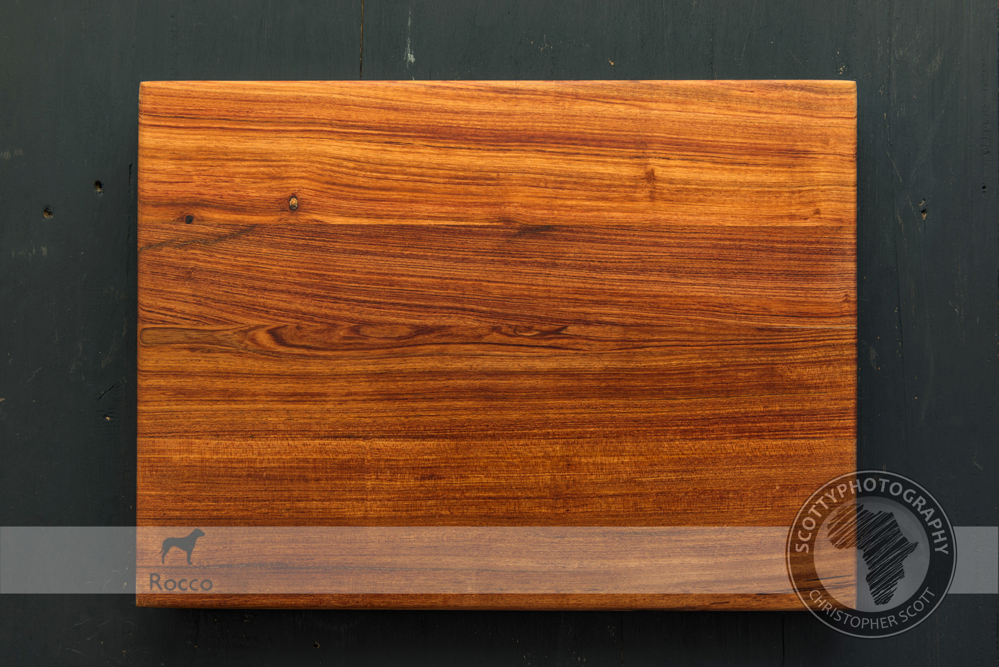
I was thrilled when we where approached by Rocco to photograph their awesome range of teak platters and chopping boards. Sustainably harvested from Zimbabwean teak, the products from Rocco ooze woody warmth and the natural grains in the wood lent themselves well to the camera in the studio.
To give the client an idea of how their product would look on different backgrounds we photographed the same serving board on all of our different surfaces in the studio. Rocco liked one surface in particular and we then photographed all of their product on that one surface, check out all the different shots below? Which one is your favourite? Please leave us a comment at the end of the newsletter wit your preferences.
IN addition to the different surfaces we also photographed the products on a clear white background and deep-etched the images so that Rocco had the option of having a uniform clean look on their website gallery as well as being able to place the deep-etched images onto adverts and marketing materials. You cans see the clean, white images below.
And finally we photographed all the products on the dark, charcoal surface that was the client’s preferred choice. As you can see the warm, richness of the wood contrasts well with the darker surface, allowing you to really appreciate the unique grain of the wood.
We thoroughly enjoyed working with the team at Rocco to showcase their amazing product, if you have a product that you would like photographed please don’t hesitate to contact us!
Capturing Coffee...
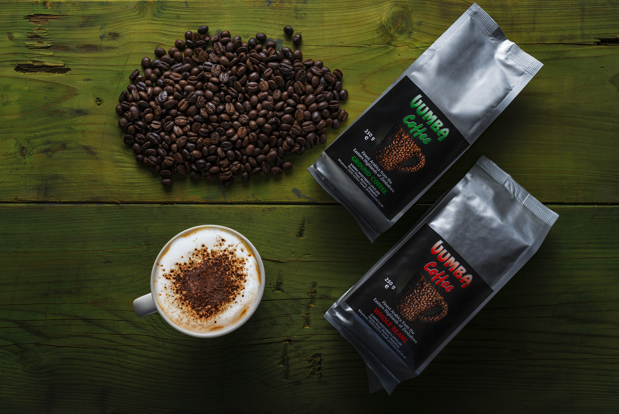
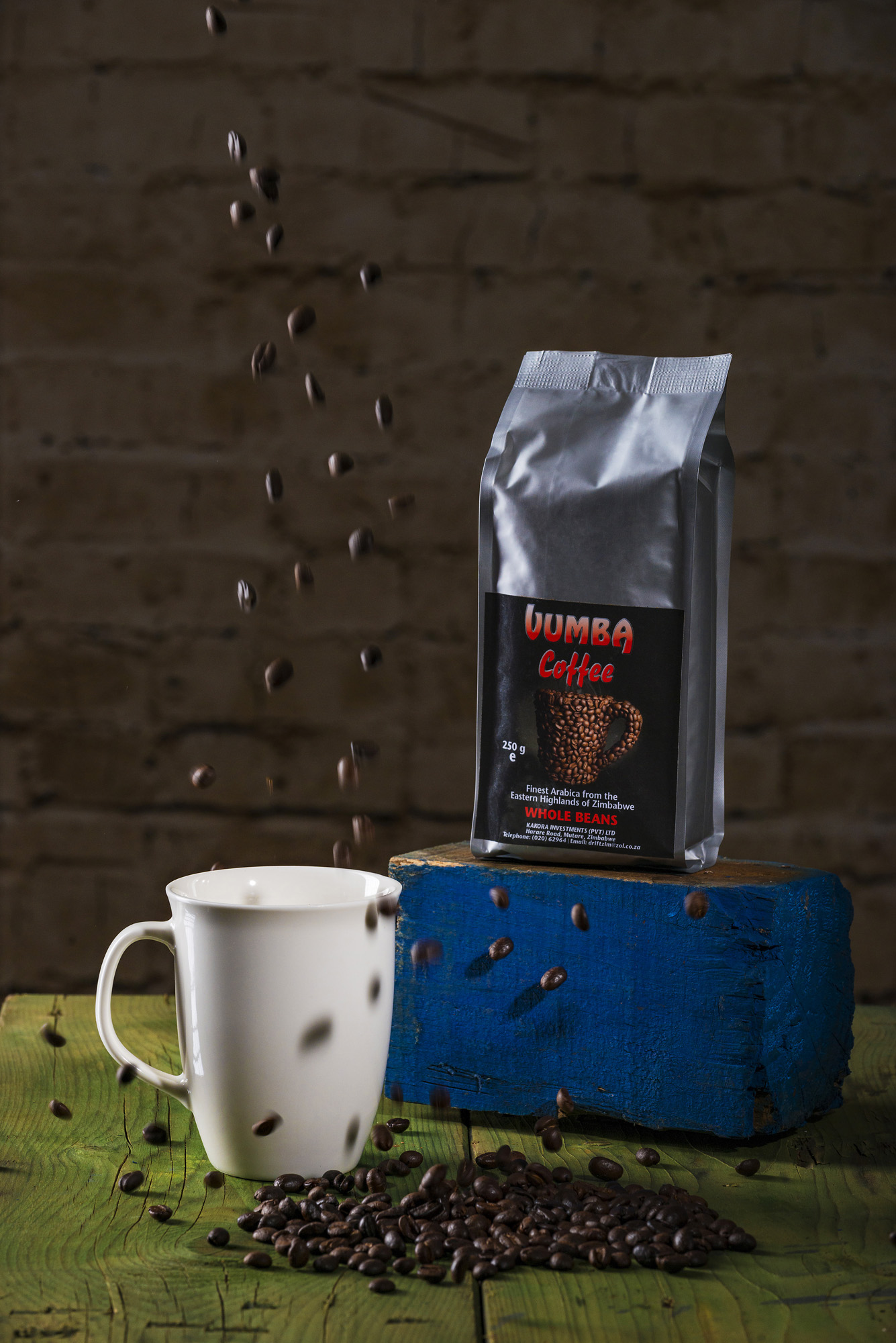
We all love it, it picks us up when we are tired and smells heavenly when its being brewed but must be one of the most under appreciated staples in the kitchen. I was mulling this over early one damp morning when I decided to try and showcase some of Zimbabwe's finest coffee products. So off I shot to the shops and spent an aromatic half hour wandering around the coffee section of our local supermarket. I ended up selecting Vumba Coffee, a brand made in Zimbabwe's eastern highlands because I liked the vibrancy of the brands' logos and wanted a challenge photographing the shiny silver packaging.
Check out the time-lapse video below of me seting up the studio and shooting thje product.
I tried a few different setups initially and wasn't overly happy with the results as I wanted to hero both the packaging as well as the coffee beans themselves. I eventually settled on a setup where the light from a large 30x120cm softbox 'grazed' the product at a very low angle. I liked the striking, contrasty atmosphere that this lighting setup produced as well as the muted effect on the silver packaging.
However there where several shots that I also feel did the product justice, I did battle to contain the reflective nature of the silver packaging as well as manage the various bumps and dips created by the coffee in the package, a little bit of photoshopping was required to try and smooth out these inconsistencies.
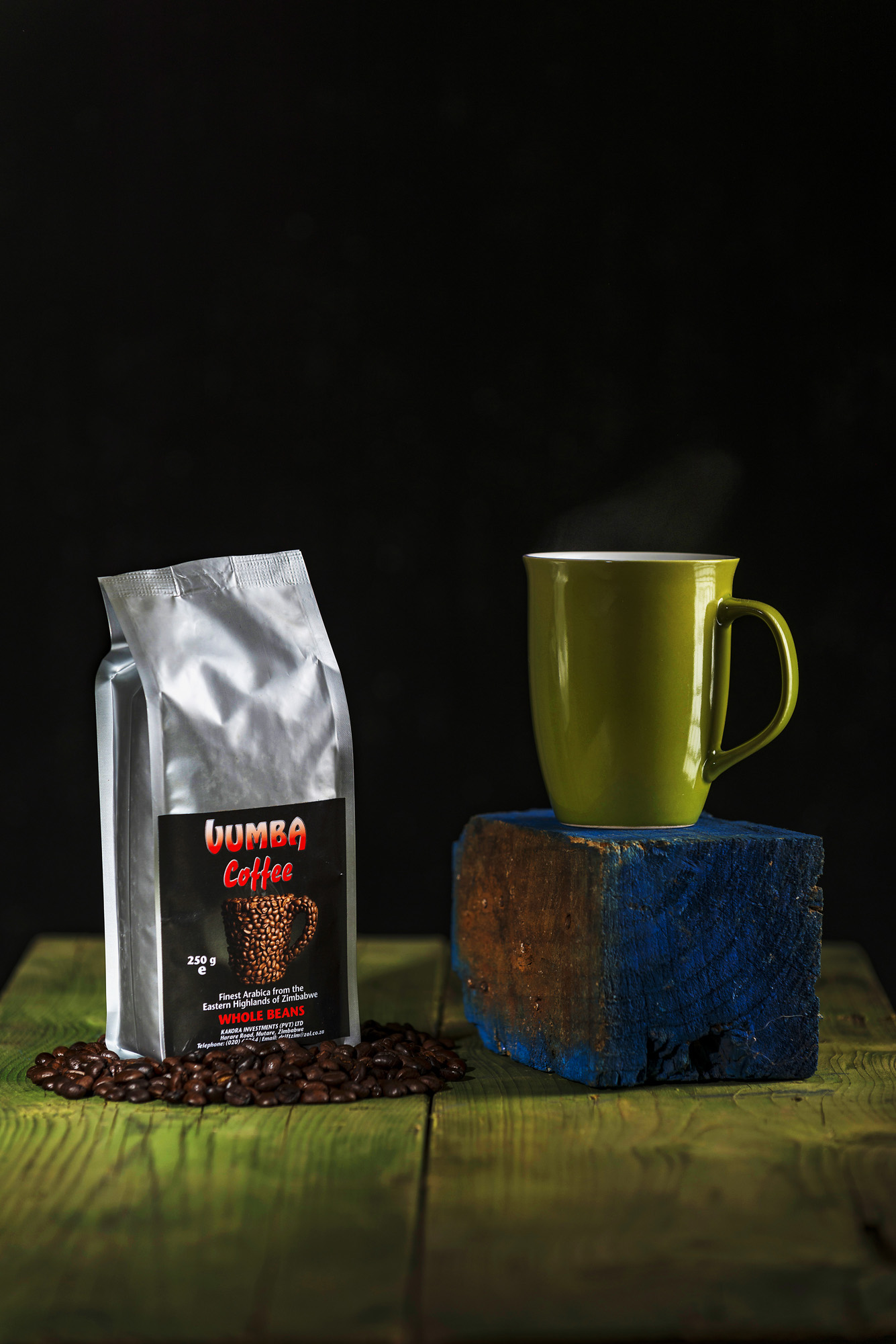
For the above image I used a black background and a beauty dish with a tight grid to create a very focused pool of light on the product, with a very shallow depth of field this keeps the focus on the product and the mug. In this shot I particularly like how the vibrancy of the red in the label stands out against the subtle green wood and particularly the stark black background. The use of a lot of 'dead space' above the product would allow for the addition of any artwork to be added without impinging on the product shot.
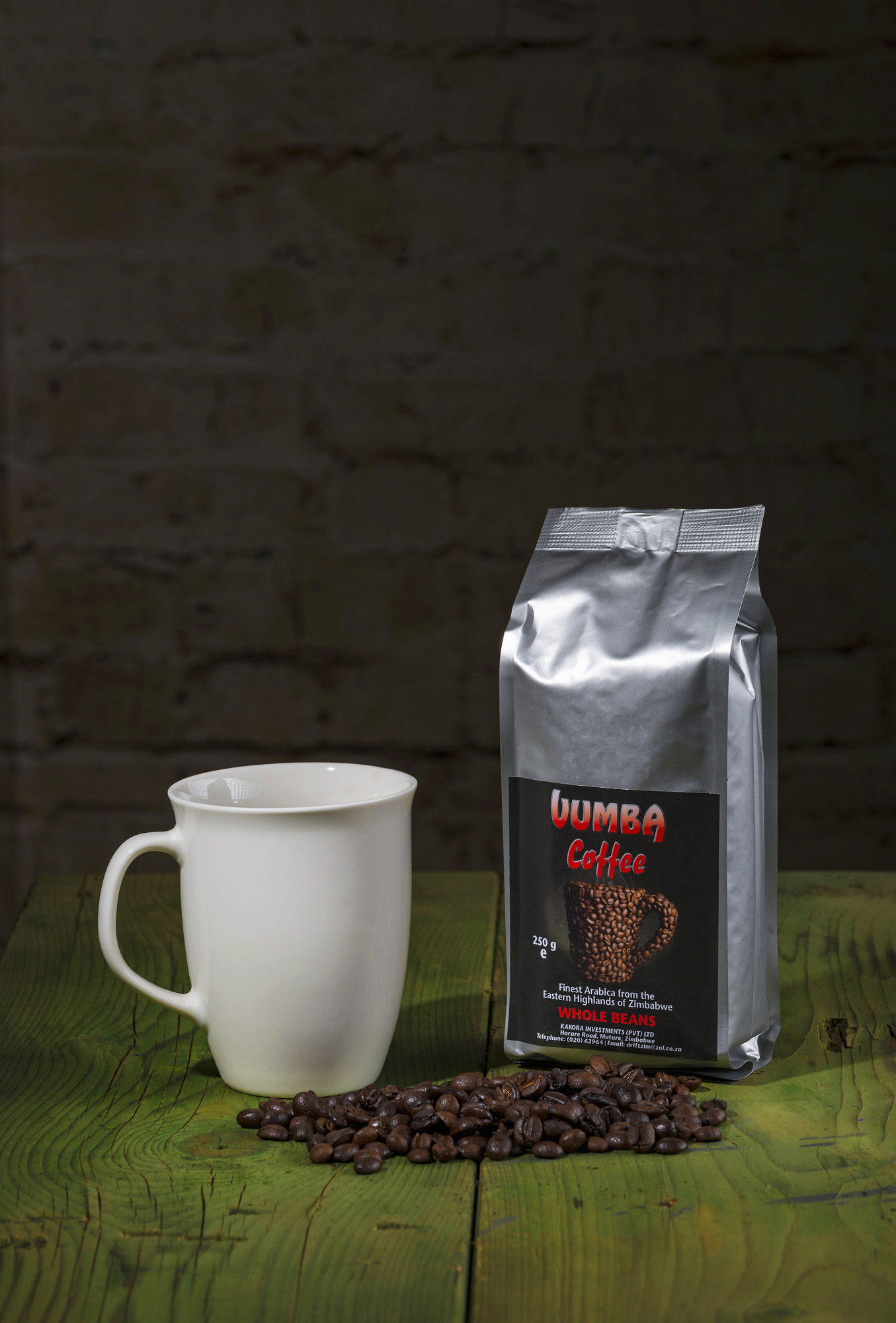
I went with a similar setup in the above scene but added a few more lights so that the product was less dramatically lit as well as a background. I didn't light the background so that it wouldn't be distracting but visible enough to add an extra layer of meaning to the picture. In keeping with the more neutral look of this picture I also changed the colour of the mug to suit the overall mood of the shot.
Finally for the above shot I tried to add a sense of fun and excitement by dropping some coffee beans into the mug. I feel that the sense of movement and shadows created by the falling coffee beans adds an extra layer of excitement and vibrancy to the shot.
Overall I am happy with the results from the shoot as a whole but would lean towards the first picture being my favourite! Do email us and let us know your thoughts if you feel differently or have any feedback. Going forward I would really like to shoot and do a behind the scenes blog every month specifically on some of the wonderful products being made in Zimbabwe. So if you feel you have a uniquely Zimbabwean product that you would like showcased please be in touch!
Go behind the scenes and watch me as I setup my studio and shoot the above scenes in the below time-lapse video.
Lighting leather.....
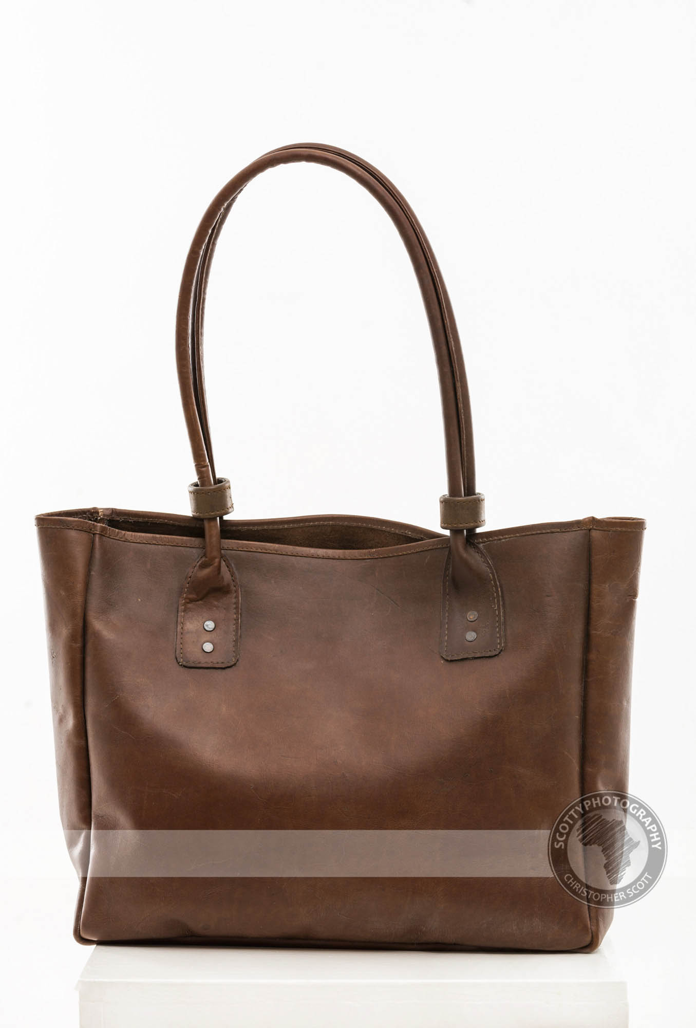
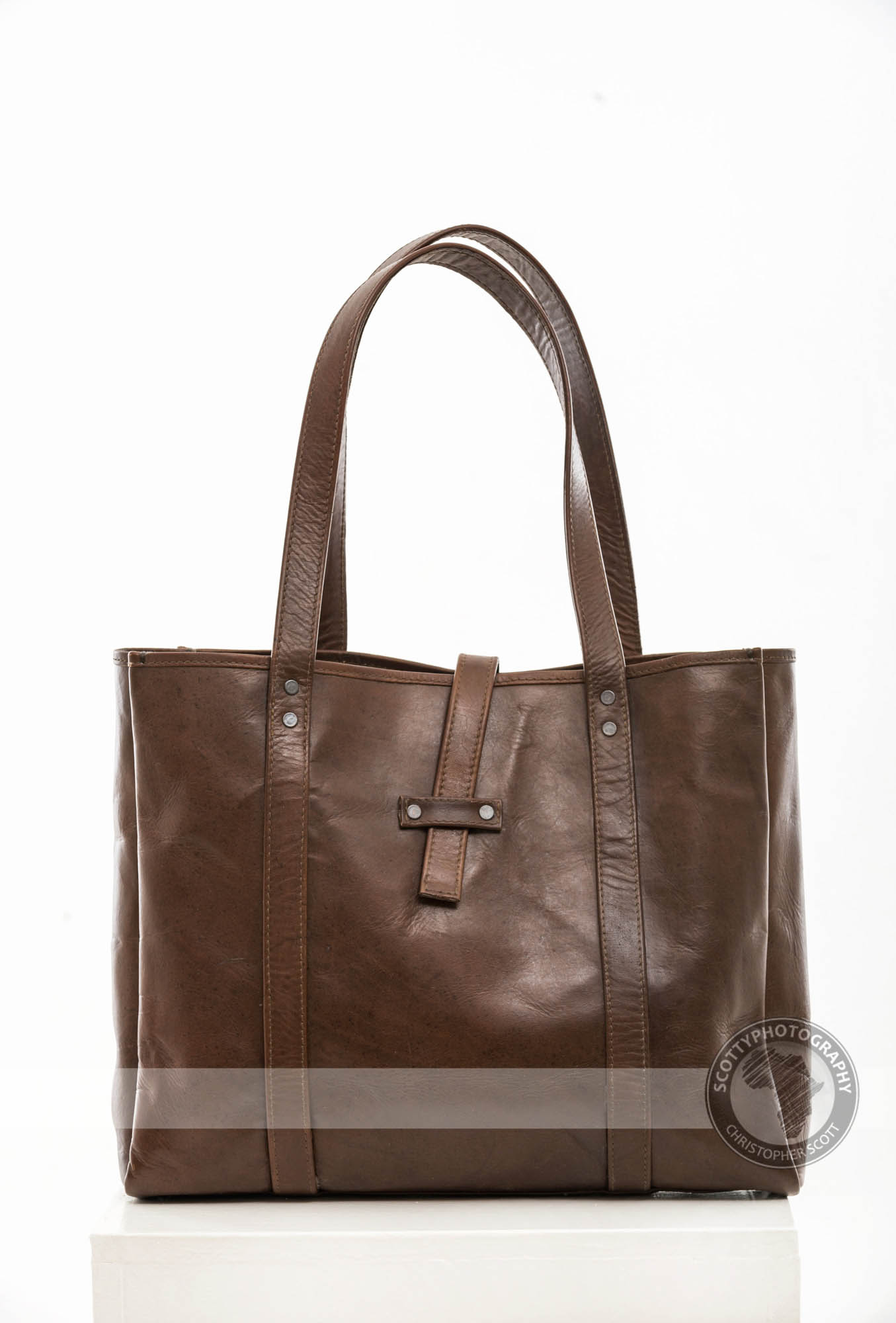
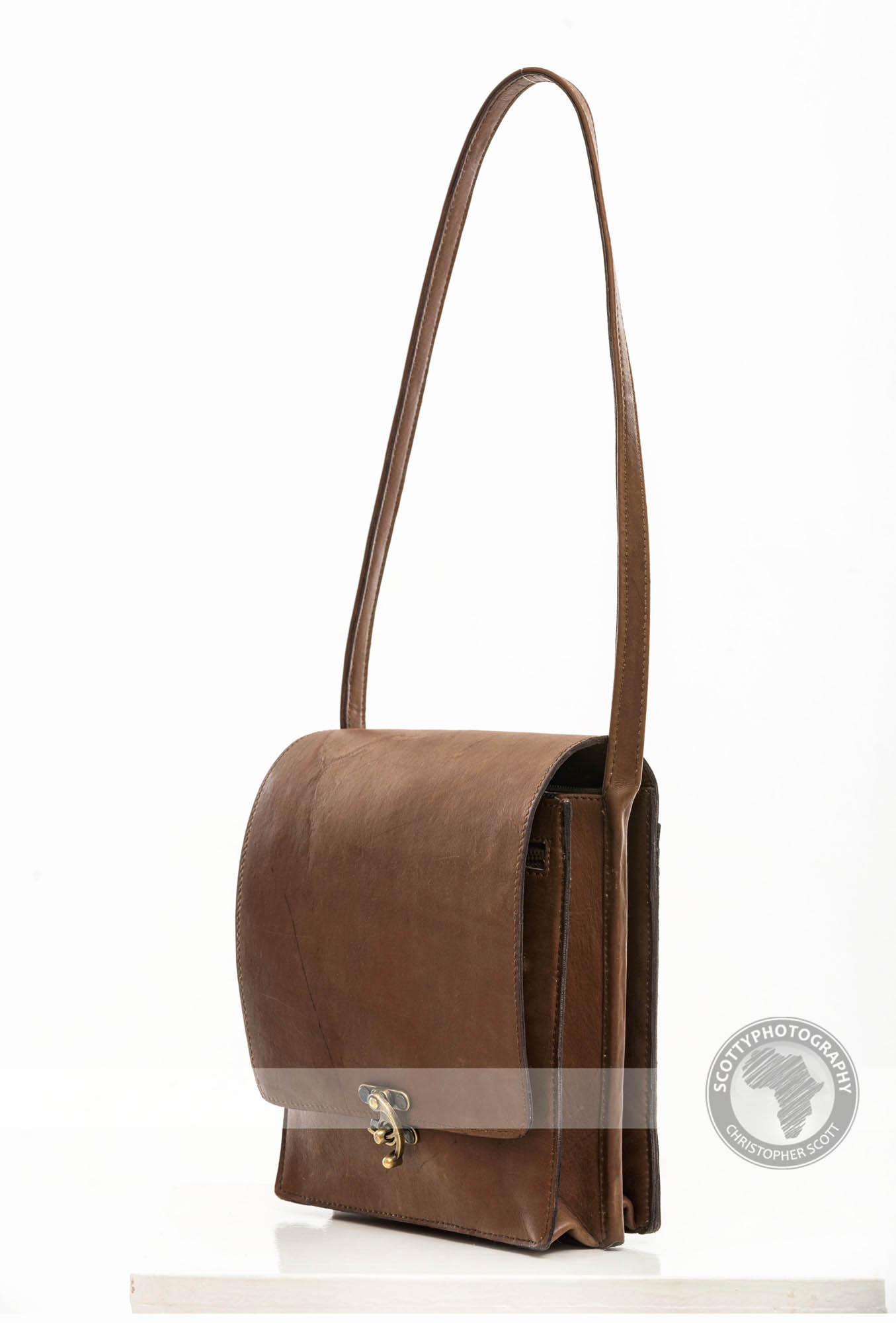
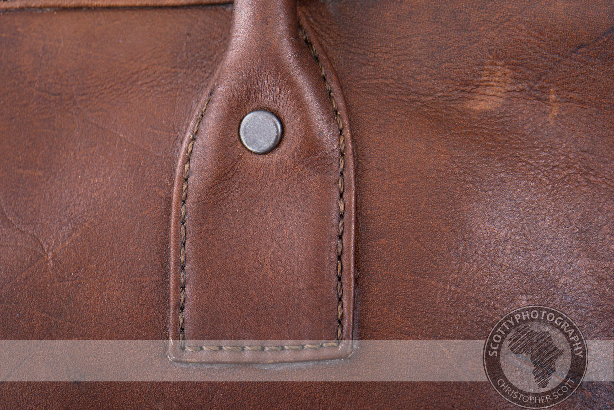
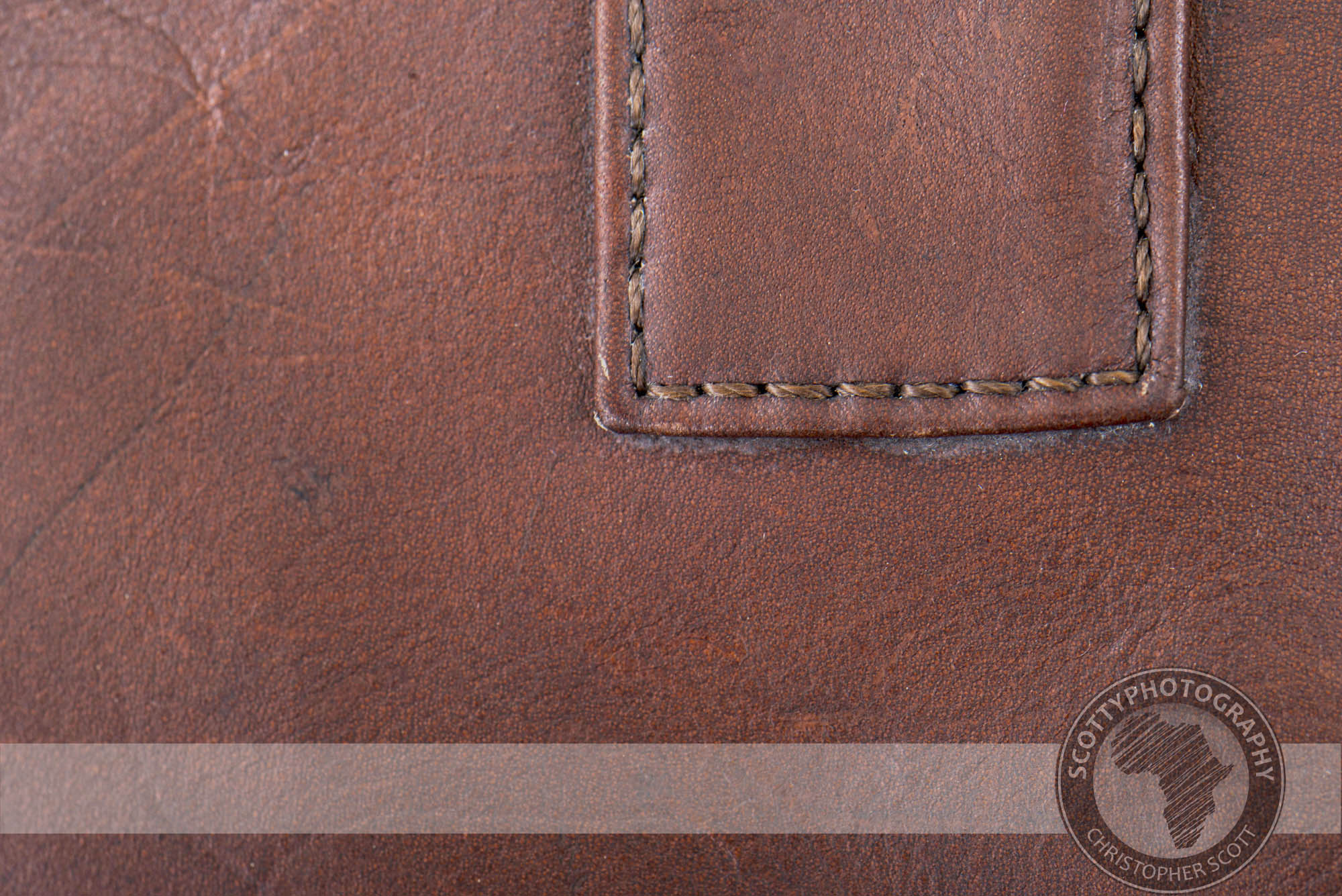
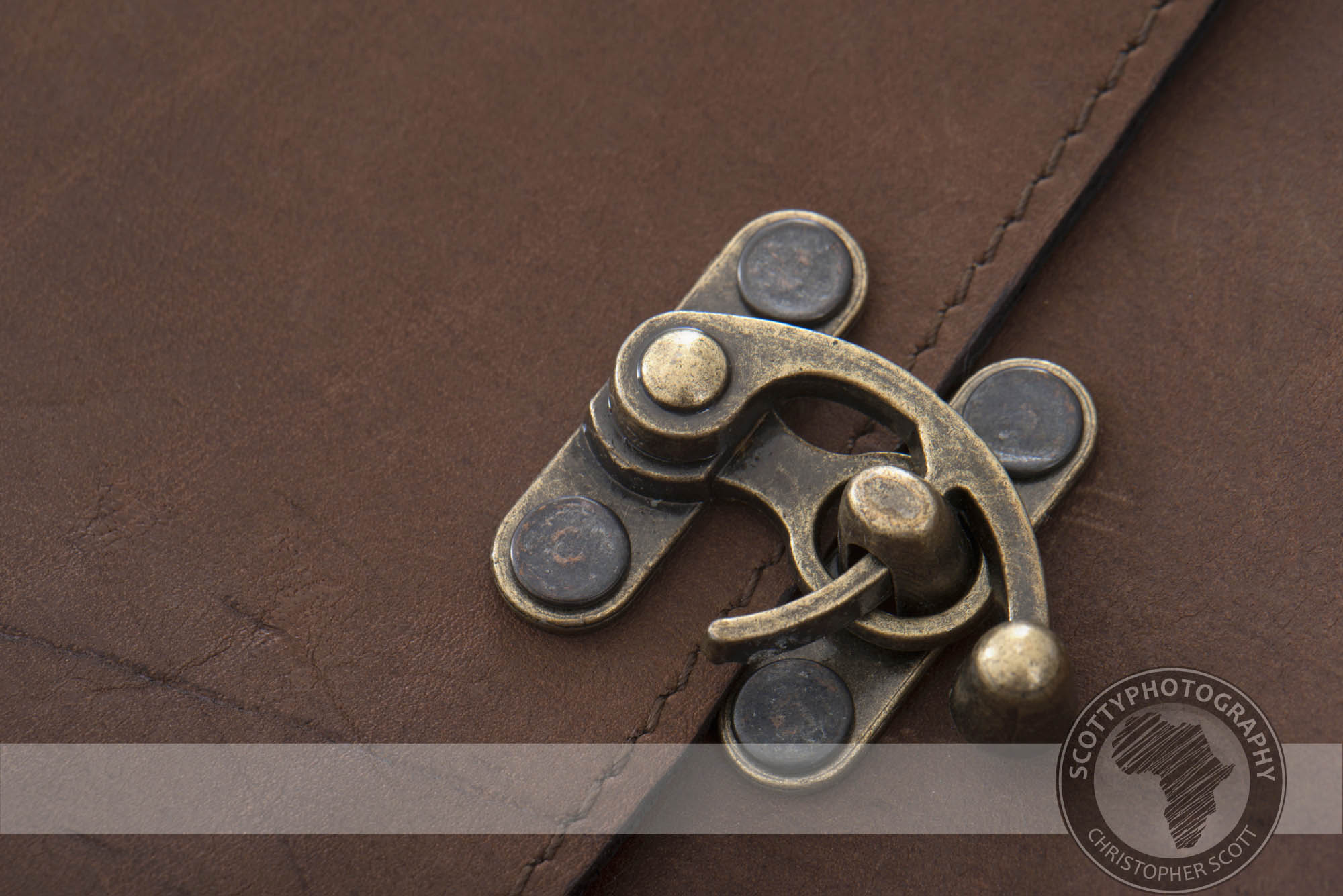
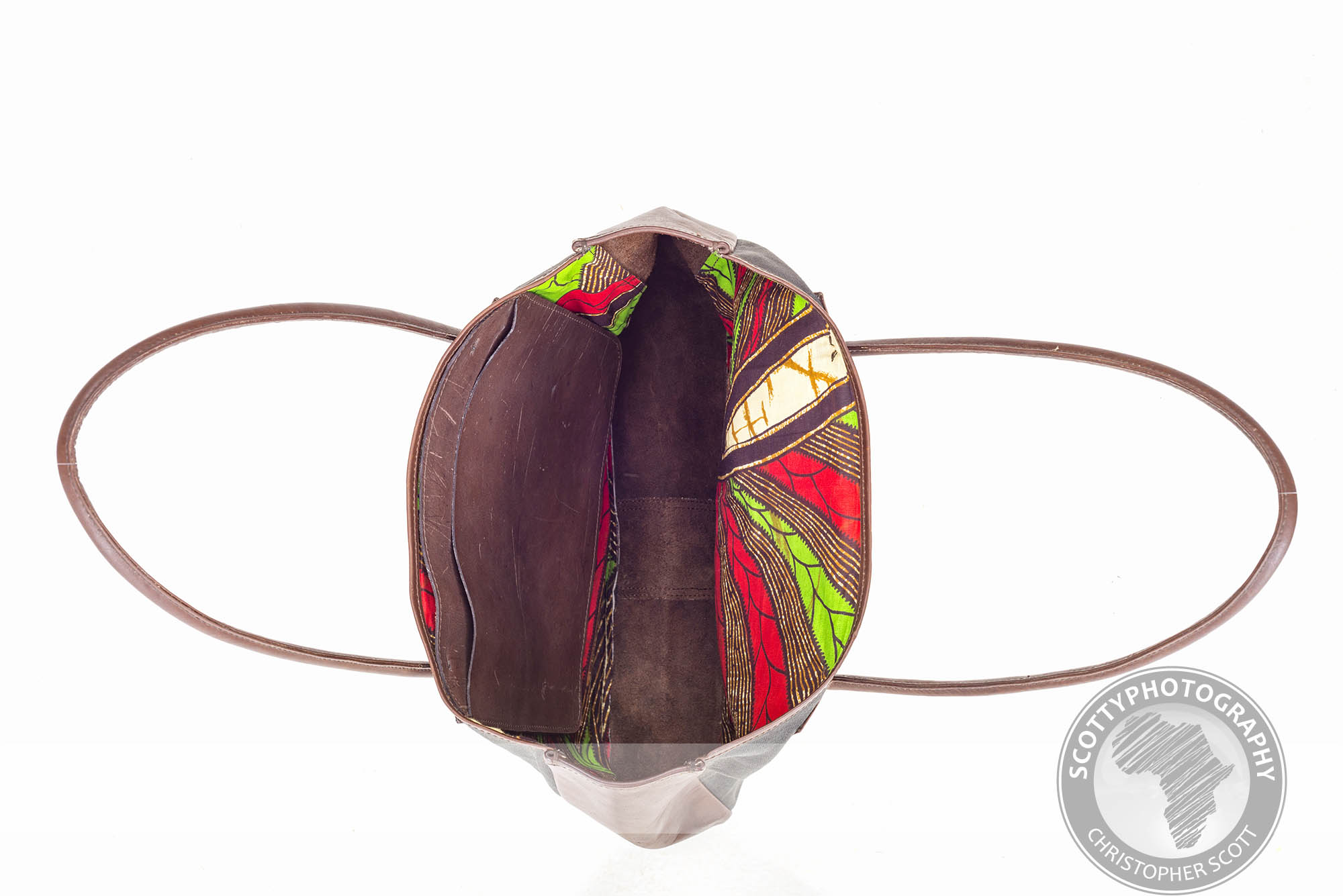
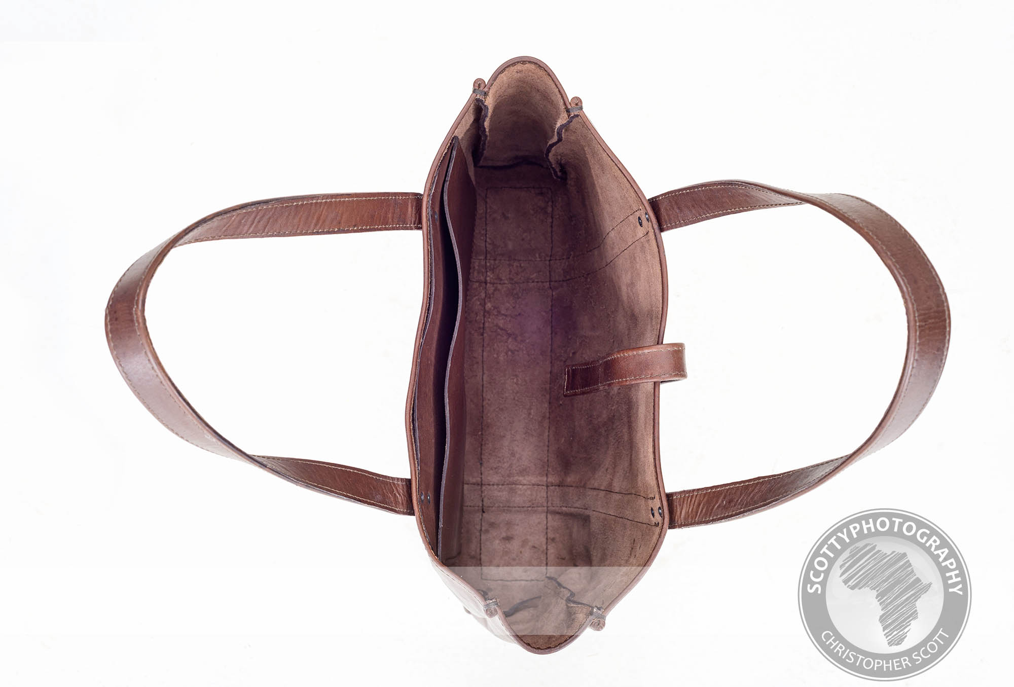
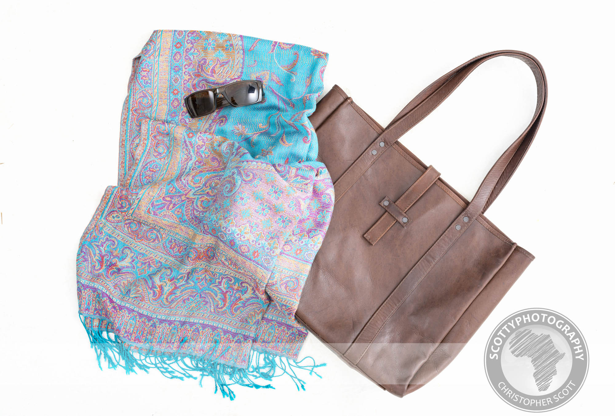
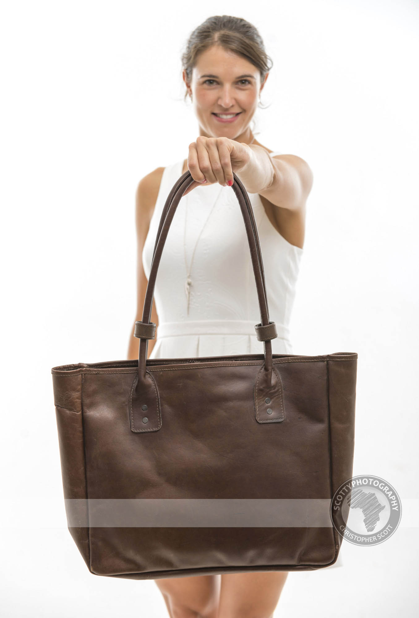
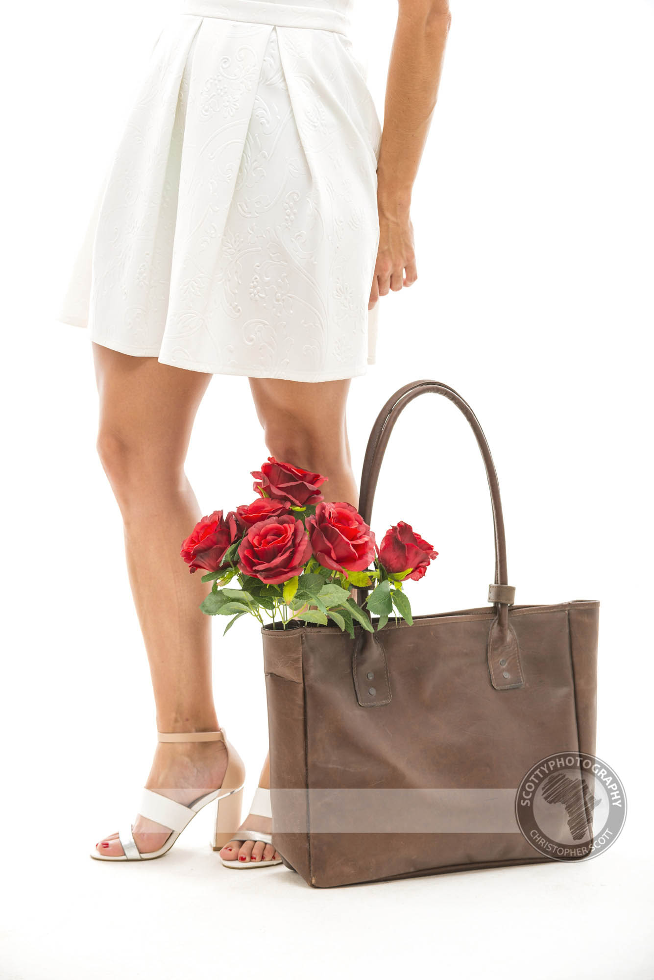
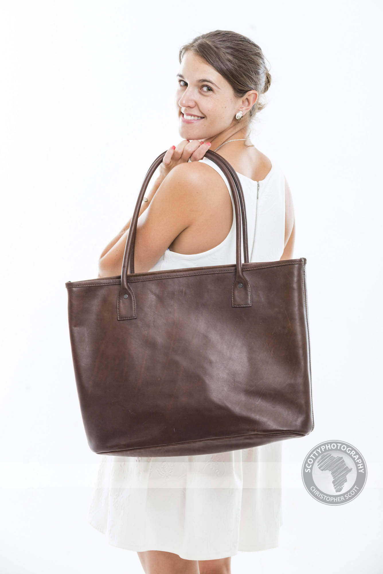
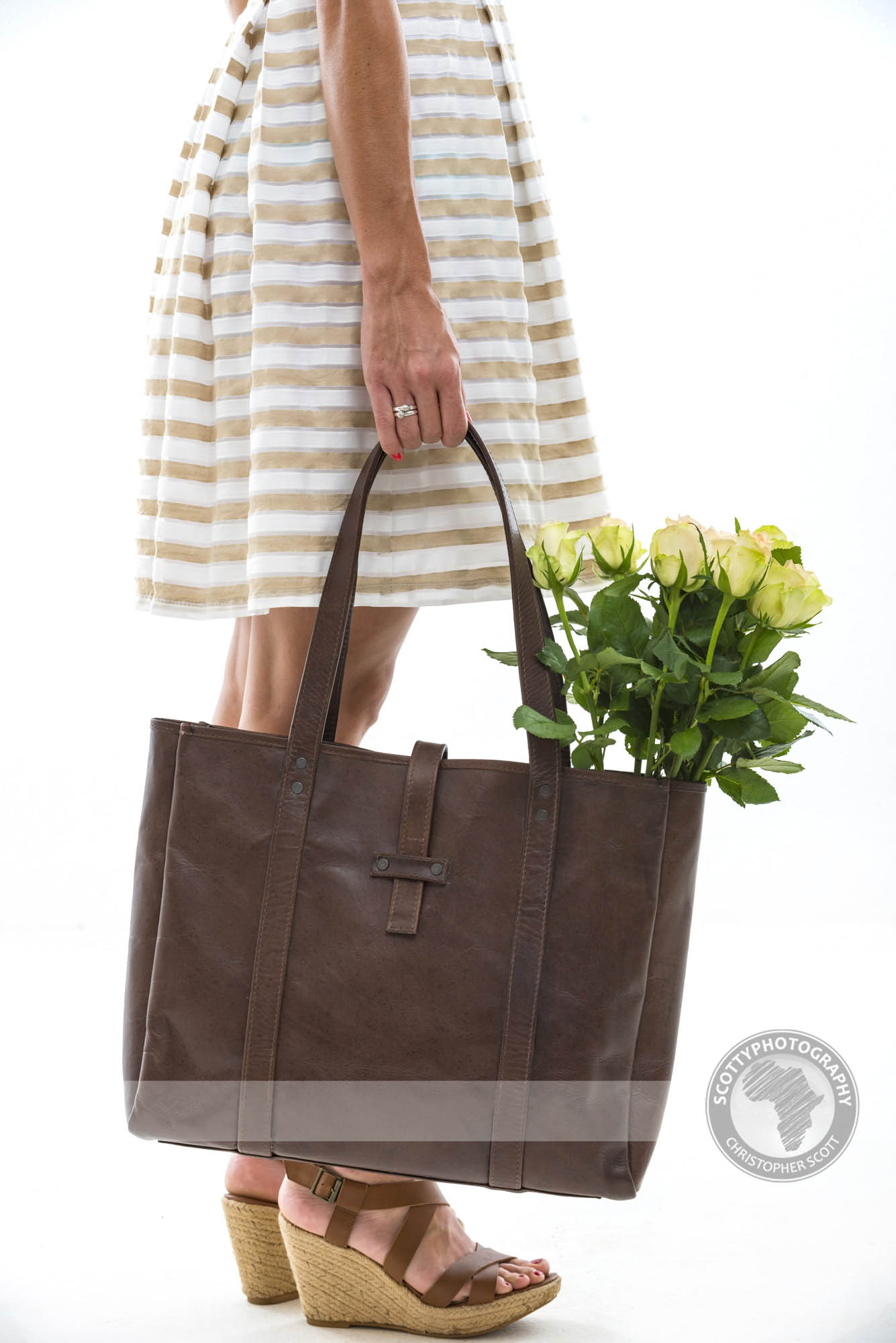
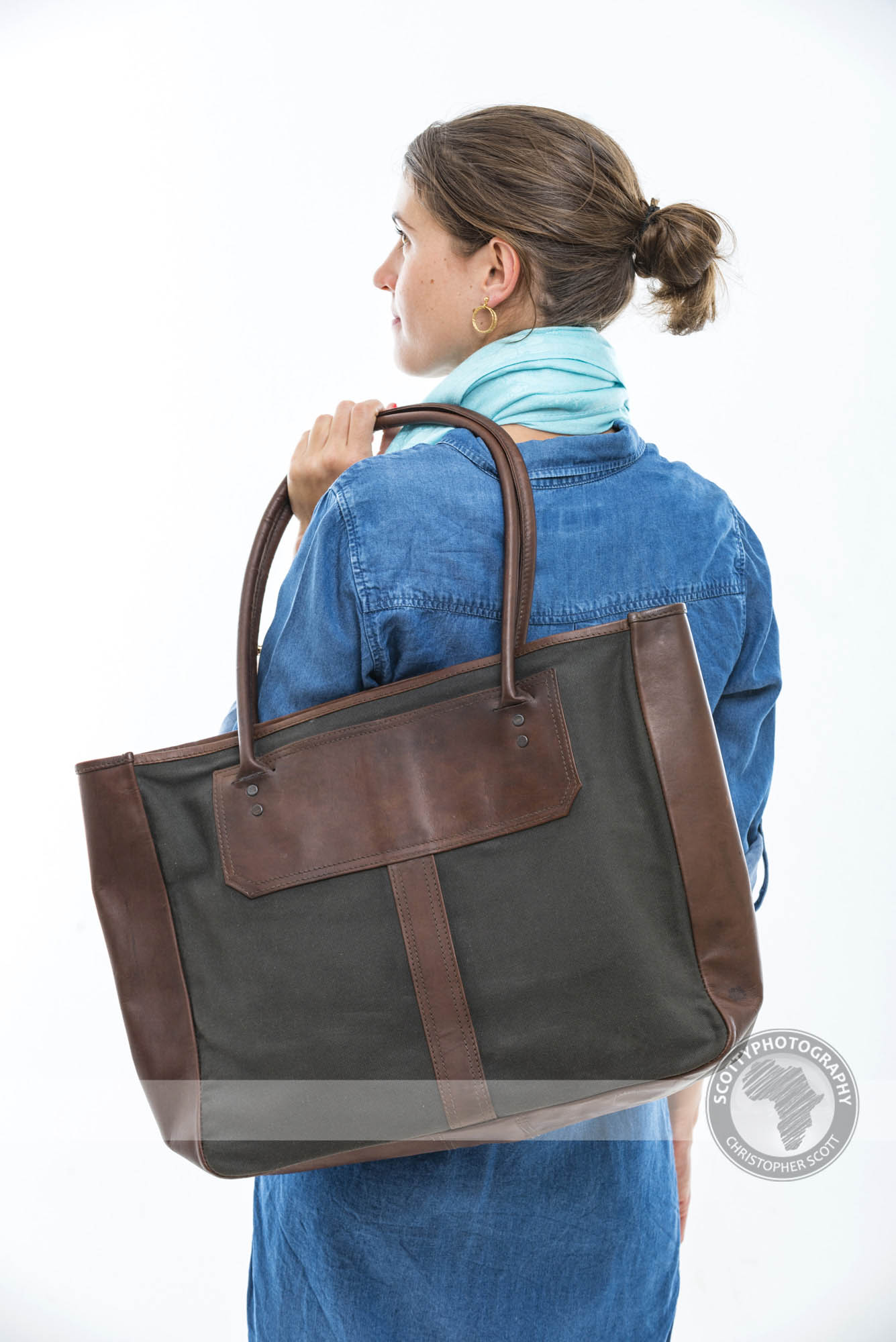
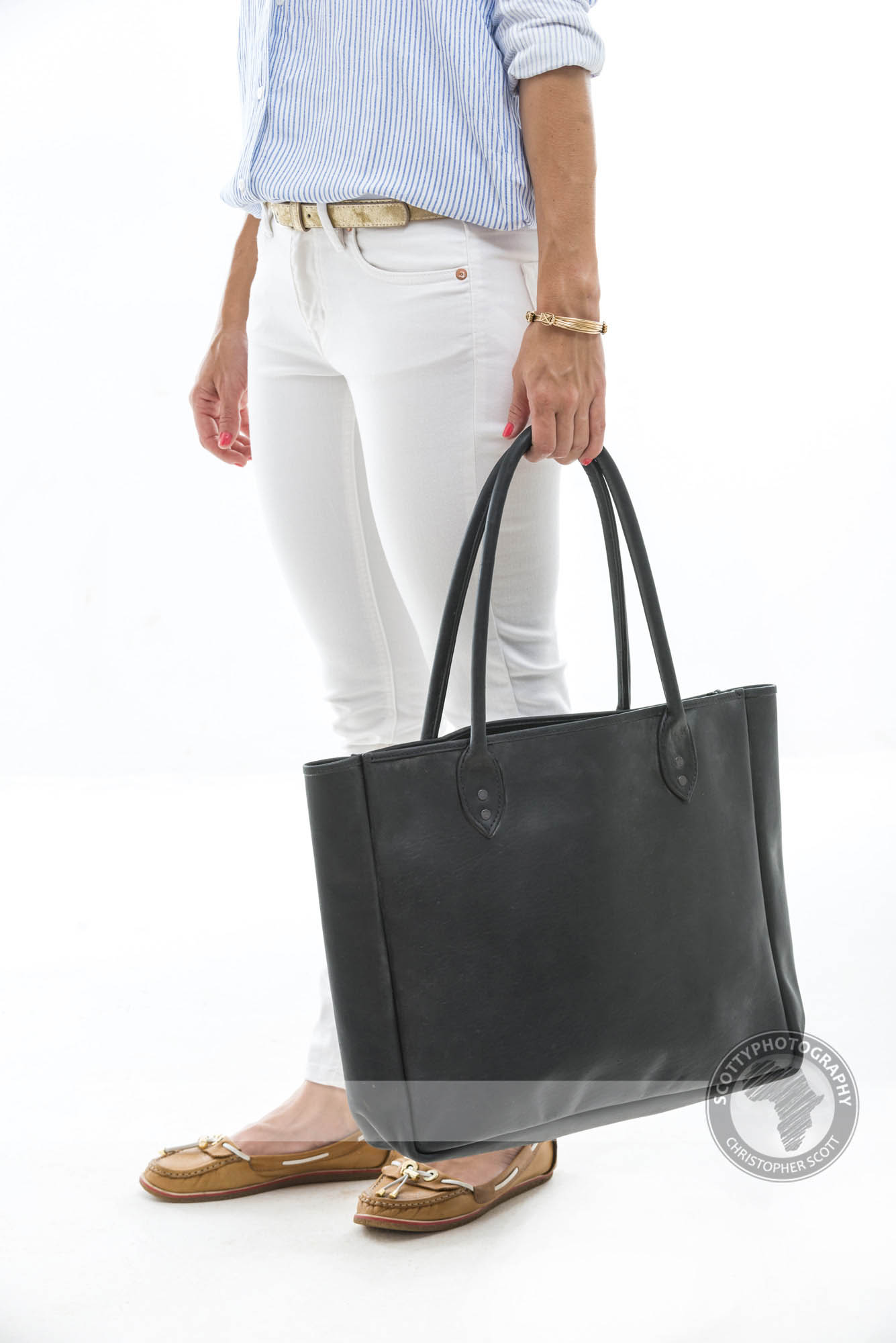
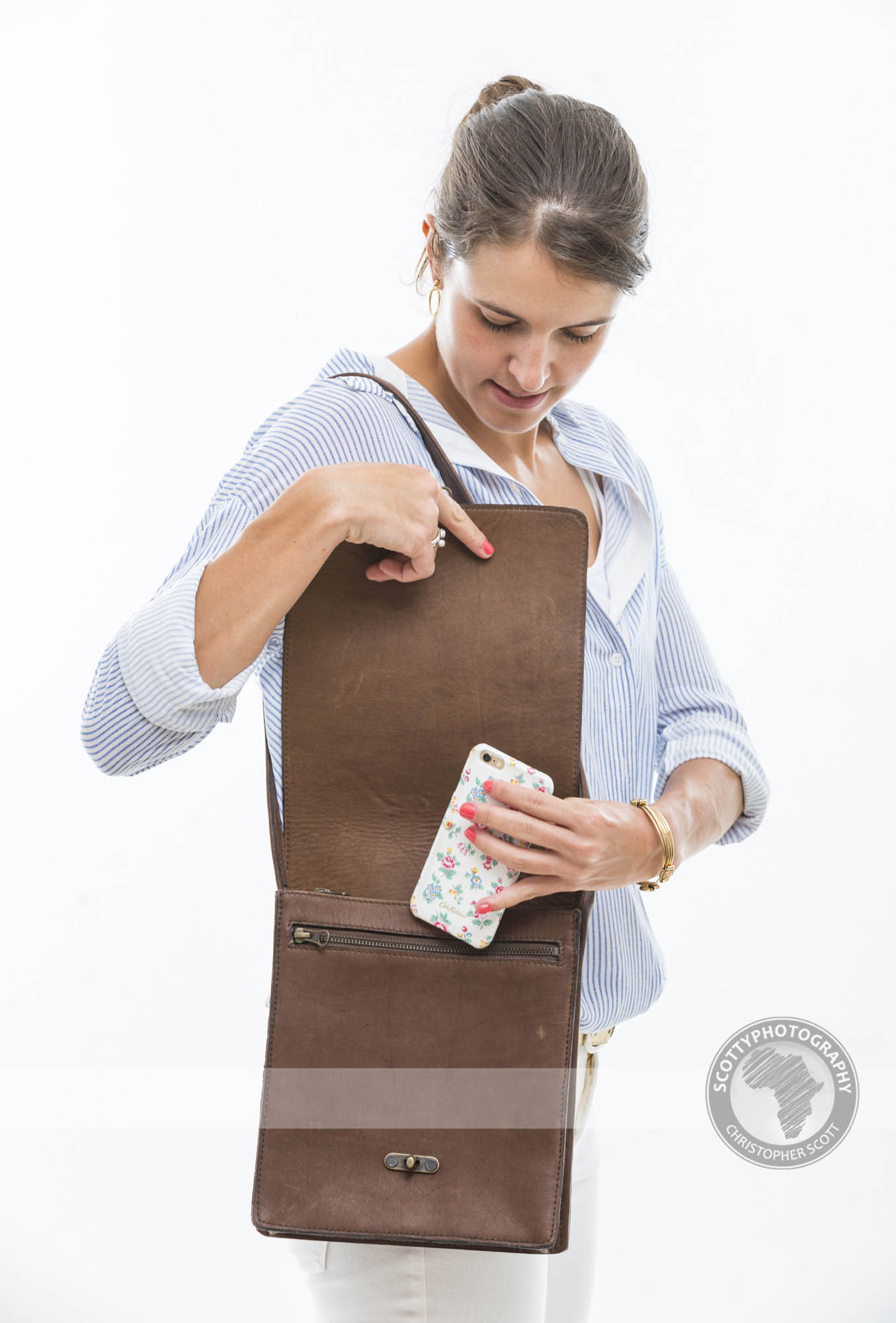
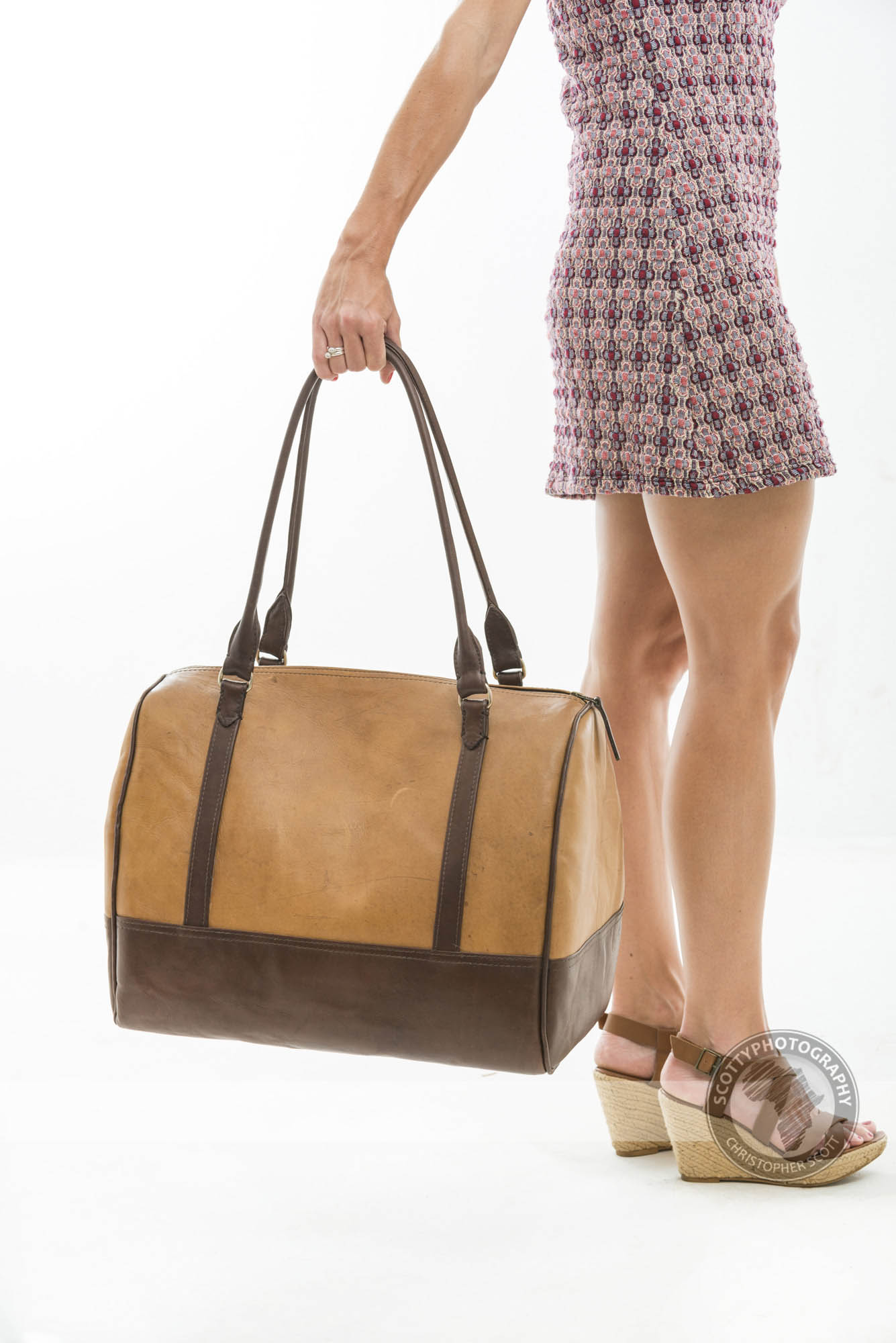
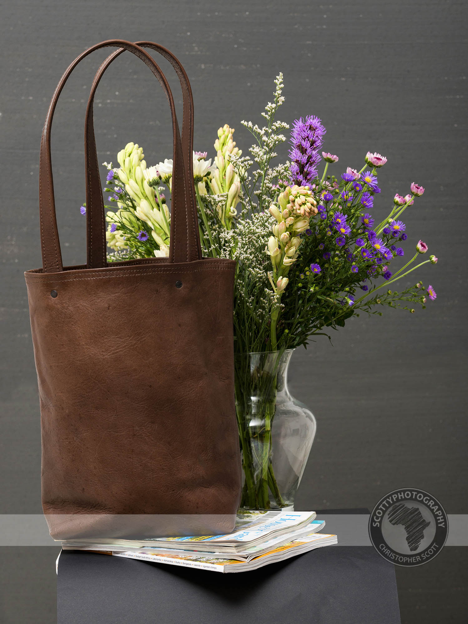
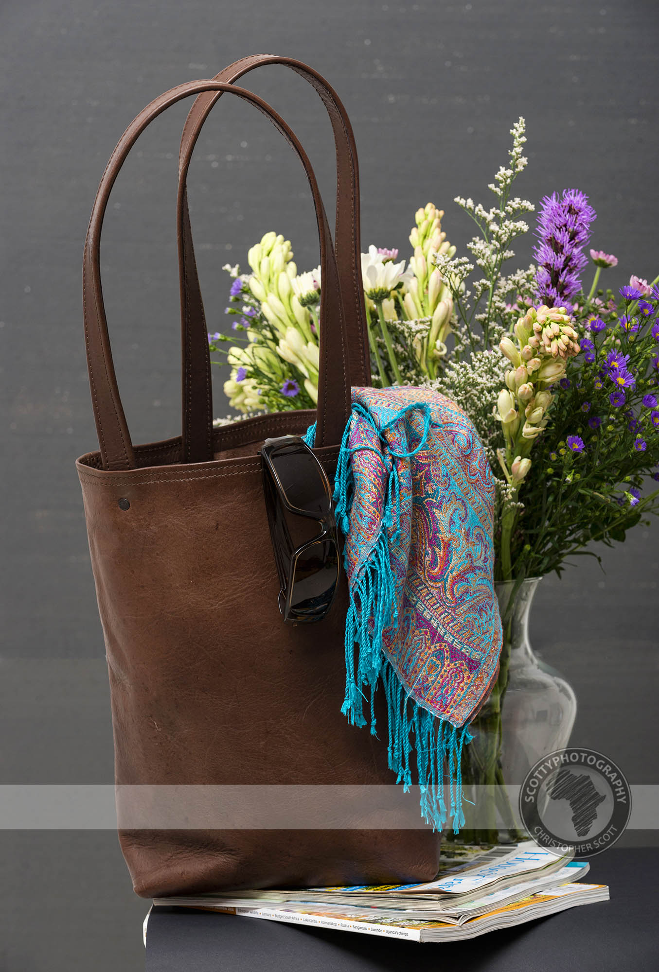
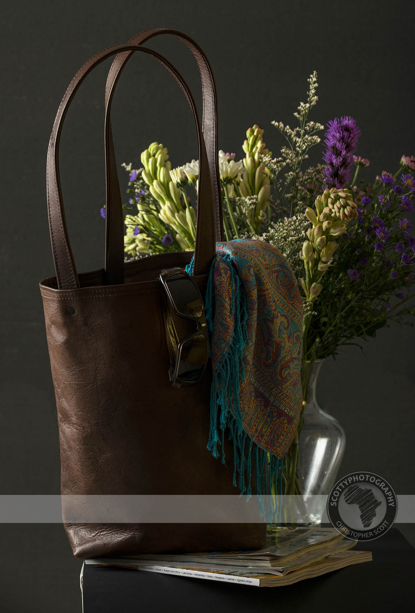
I am fortunate enough to do a variety of product photography in my studio, from bottles to art the variety can be endless and often great fun. This was certainly the case with our friends from Totes who make a fantastic range of handcrafted leather bags and engaged us to help them create a variety of images for their website.
Check out the lighting setup used on a styled handbag as well as some of the action in the studio in our behind the scenes video below.
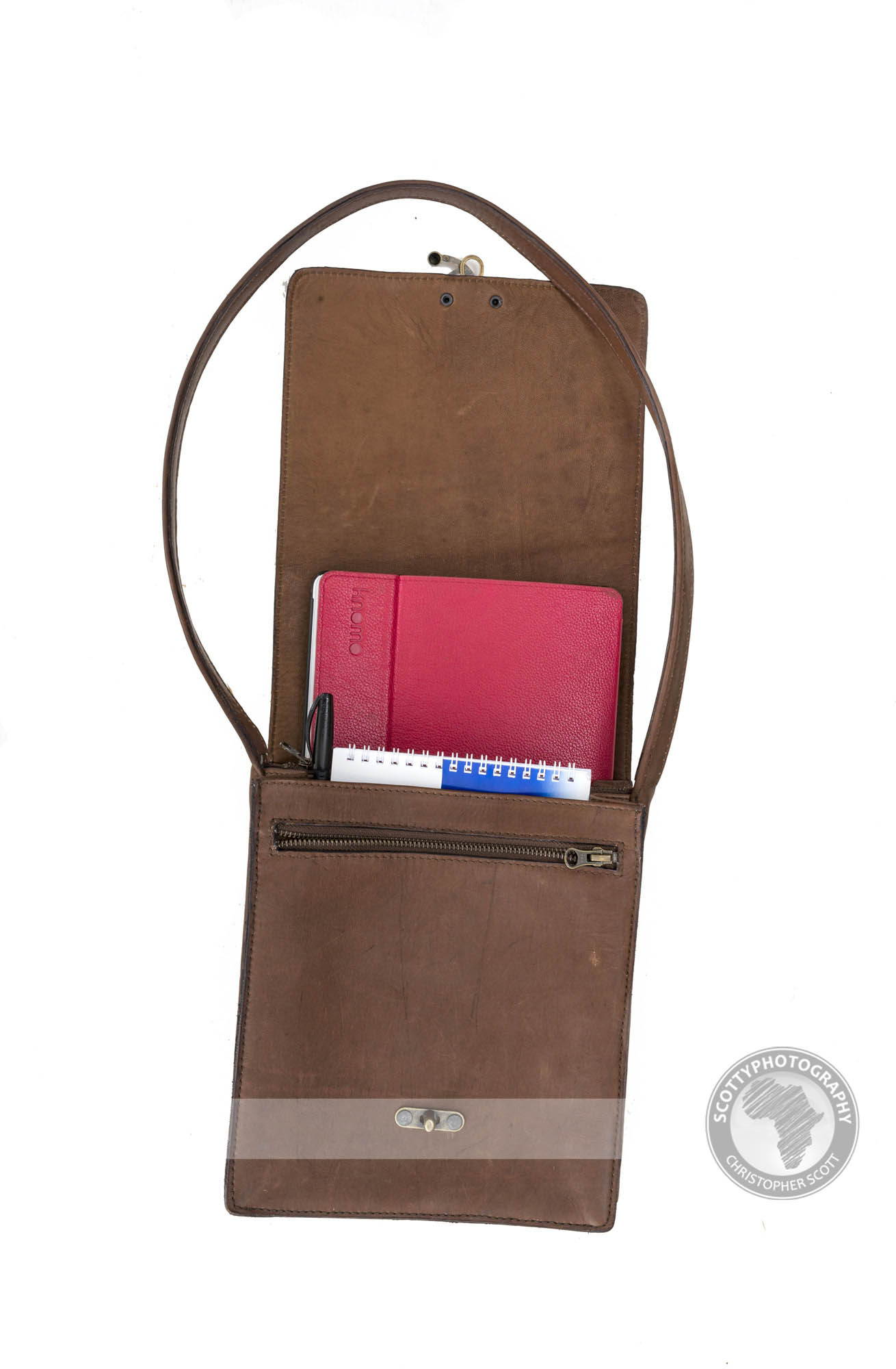
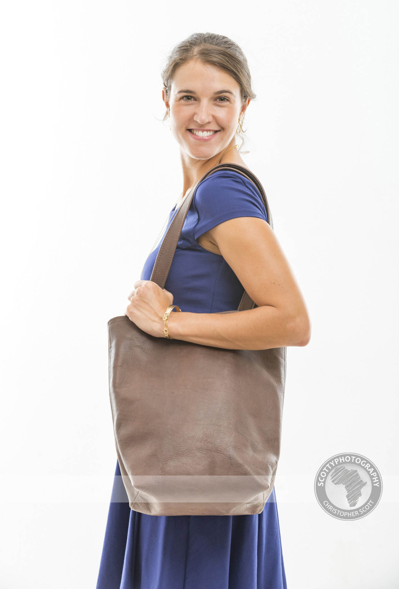
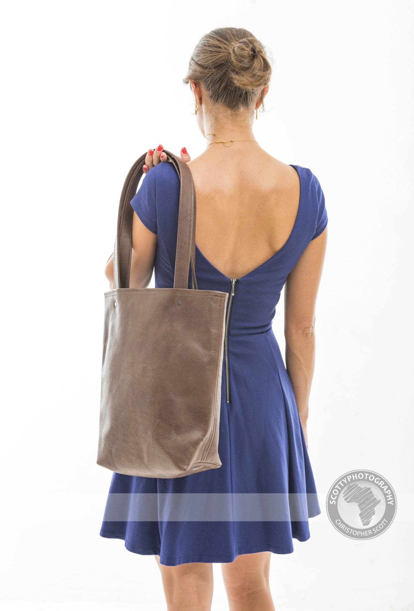
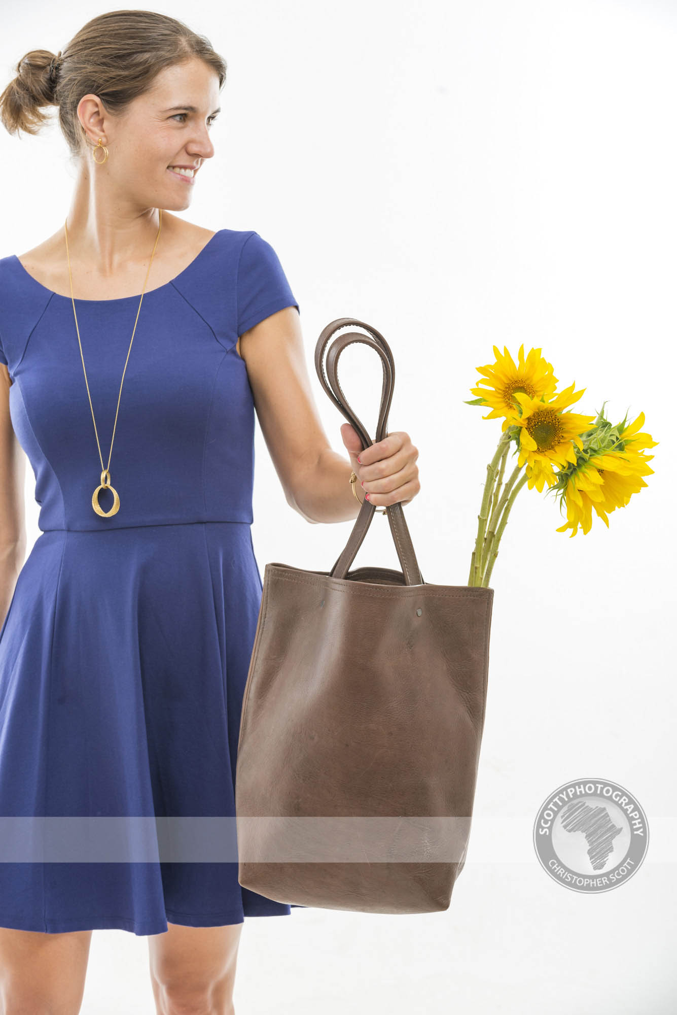
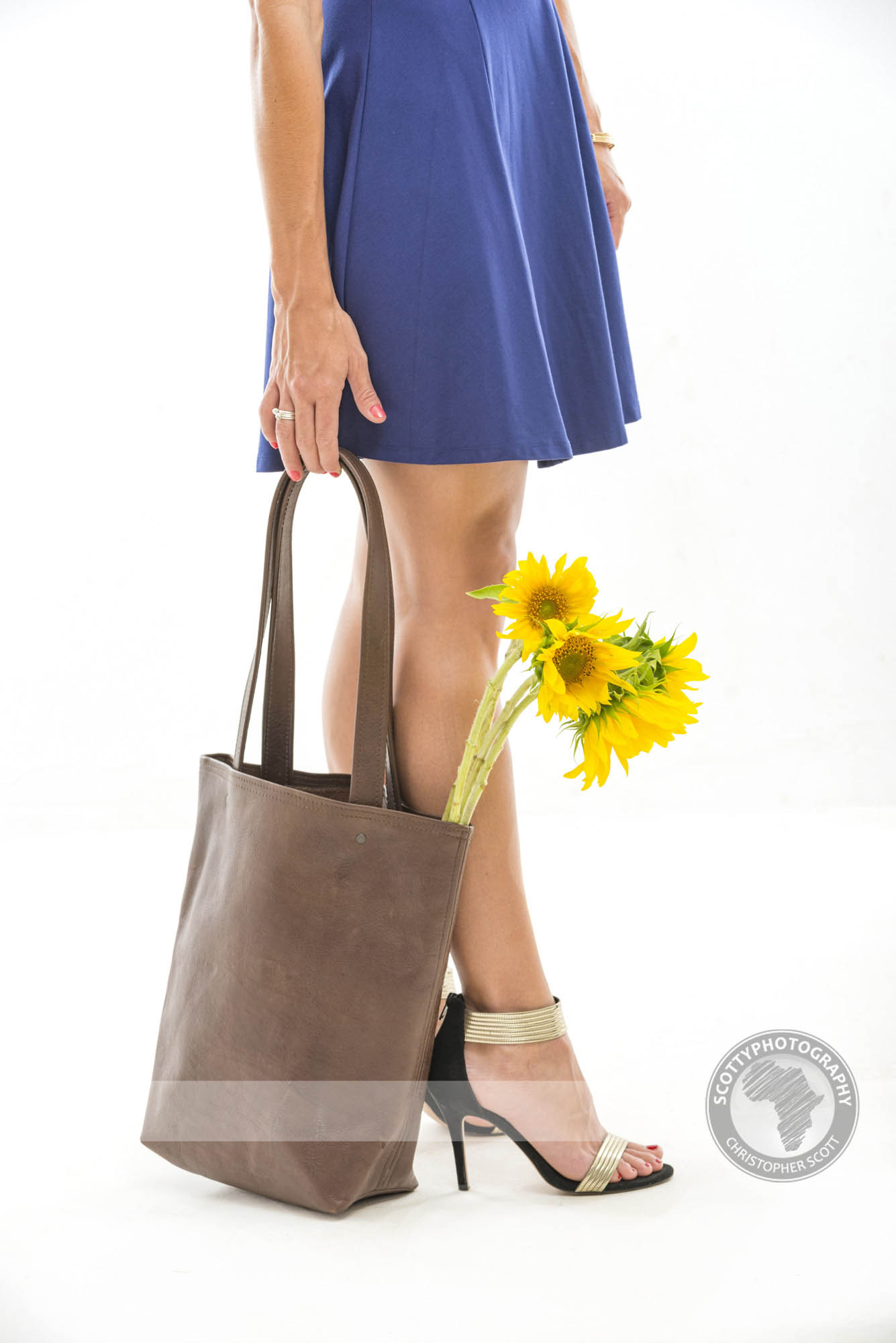
This is the kind of shoot we really enjoy, a new product and a brief that allows us to be creative within some set parameters. The brief involved photographing each item on a clean background showing the whole bag and then focusing in on some of the finer details such as the stitching, clasps and lining to showcase the quality of workmanship that goes into each bag.
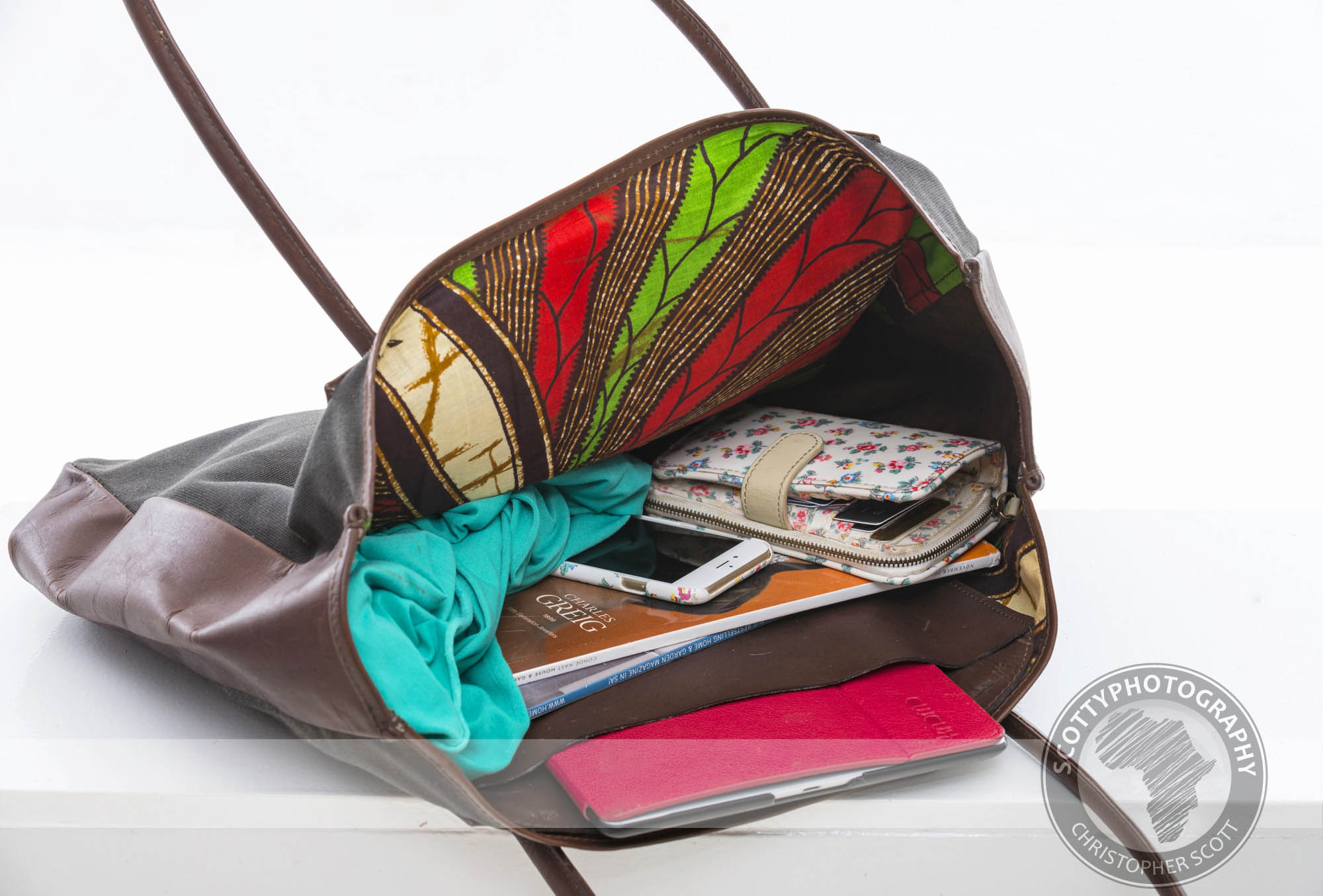
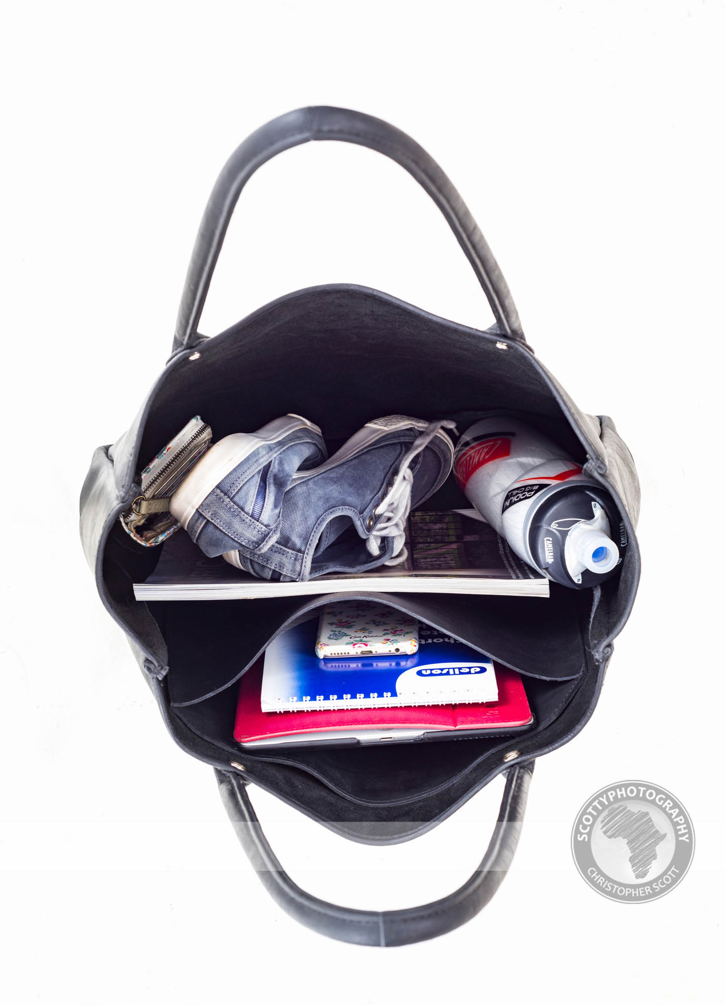
As the bags are all different shapes and sizes we wanted to display some functional pictures showing an everyday use of the bag using props that you would liklely carry around in a specific bag. The props also give a sense of size and scale to each product.
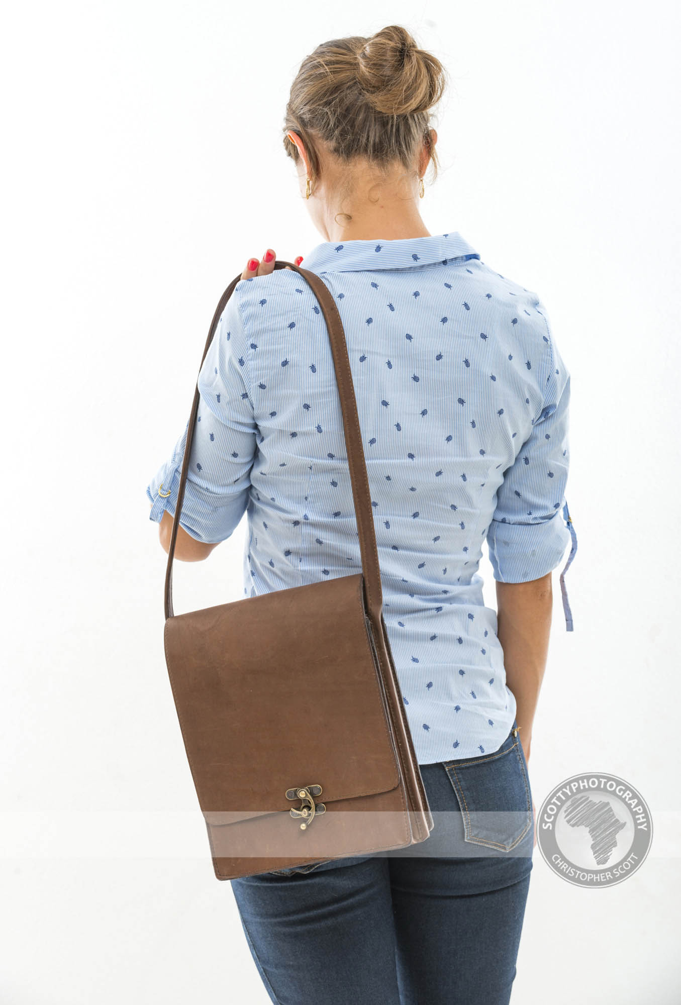
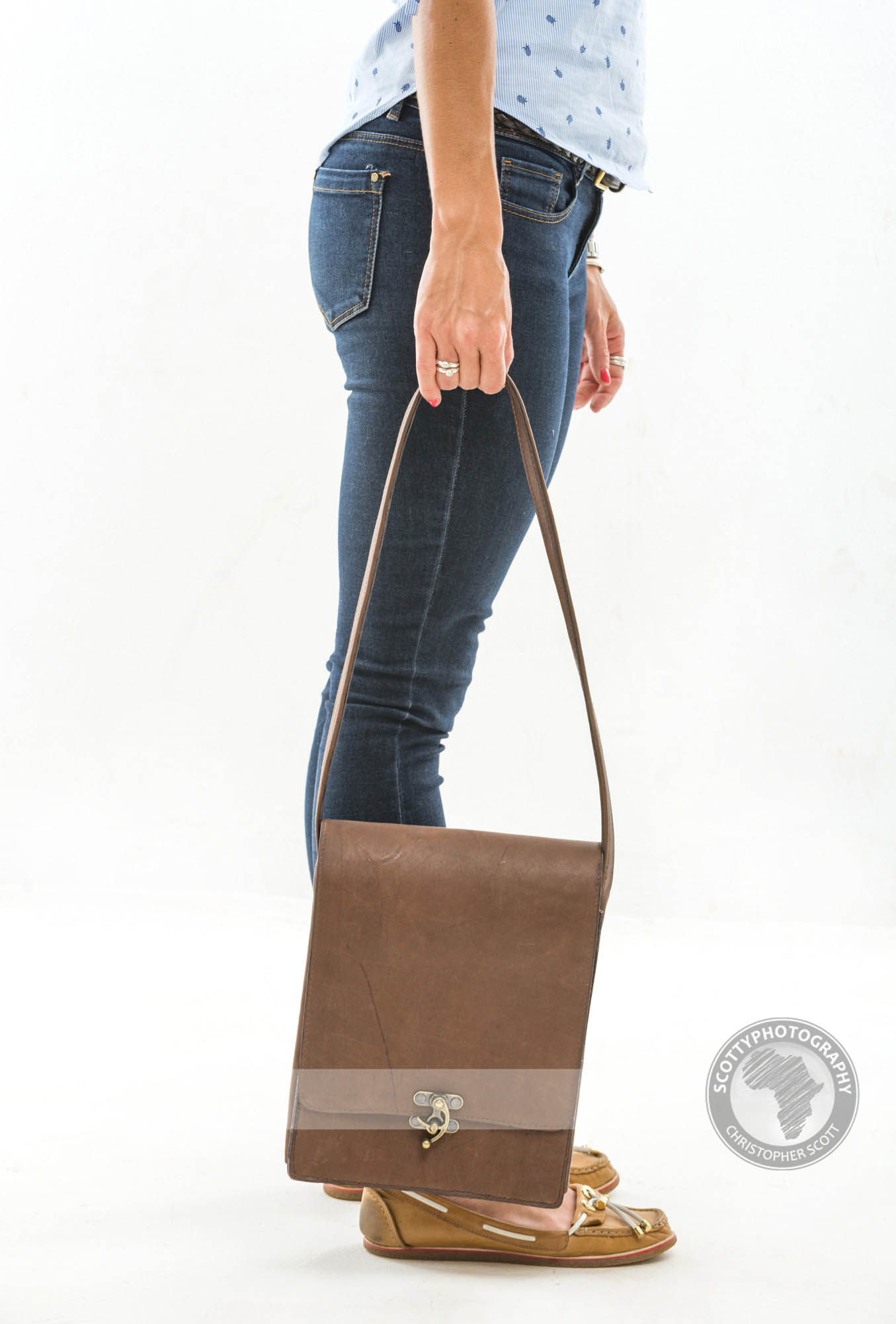
Now I am told by people in the know that no self respecting woman would buy a handbag without 'seeing' how it would look on her so of course we had to oblige and have several pics of each bag being 'modelled' by our discerning volunteer.
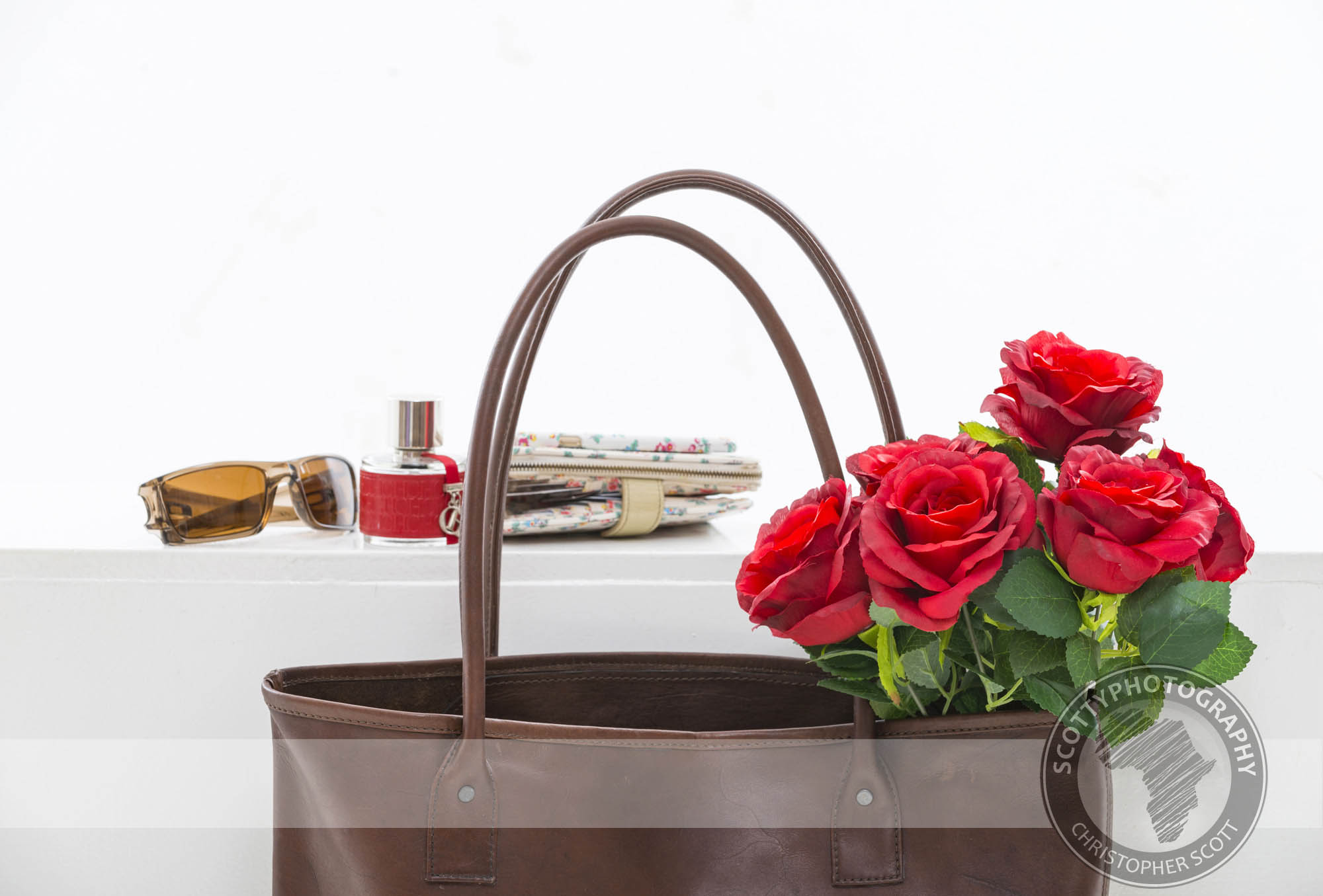
And finally towards the end of the shoot we did a few styled shots on a grey background with some softer, more angled lighting to create a few 'grab' images that may be used in brochures and fliers.
If you have a product that you would like photographed please don't hesitate to check out our commercial showreel and gallery and don't hesitate to contact us if you would like more information.
Chilli.....
I am a big fan of chilli sauce, there are not many meals where I am not reaching for some bottle or concoction to heat up my meal, zing up the taste and generally make me sweat and smile simultaneously. This obsession has over the years prompted me to grow my own chillies, in such magnificent volumes that we had to freeze bags and bags of them so we didn't have to forcibly wade through piles of drying chillies every time we entered the kitchen.
Eventually my stoic wife's sensibilities and patient support diverged and we had a 'conversation' that ended with a moratorium on the chilli harvesting, with the annoyingly accurate observation that several kilograms of the fiery red birdseye variety would probably suffice for the next few years. So my reign as a chilli farmer came to an end just as my wife's career as the in-house chilli sauce making magician began (with no constant, insistent nagging by her husband of course).
Months of home-made chilli consuming heaven passed until one fateful dinner at a friend's house when the Doctor was suddenly and inextricably inserted into our lives. The shapely bottle, the smokey twang, the lemony zest were all too much for me that night and I ended up eating more chilli sauce than anything else (not fun the next morning). And so to my wife's eternal, and annoyingly thinly veiled, relief my obsession with home made sauce was ushered out to make way for my new mistress, Dr Trouble's Double Oak Smoked Lemon Chilli.
Made on a farm in central Zimbabwe by someone who can only be described as a genius, in my eyes anyway, the wonderful sauce is consumed in volumes in the Scott household and so was a perfect candidate on a rainy day for an impromptu studio product shoot.
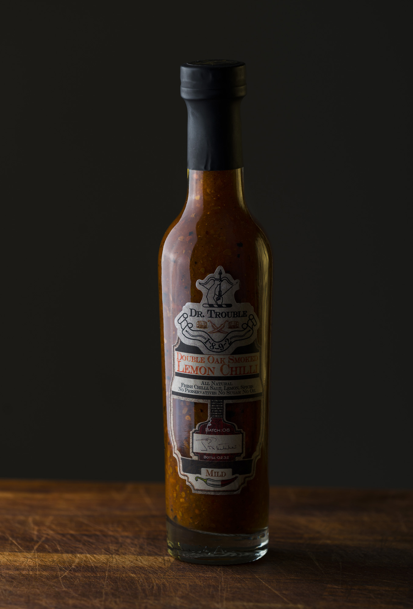
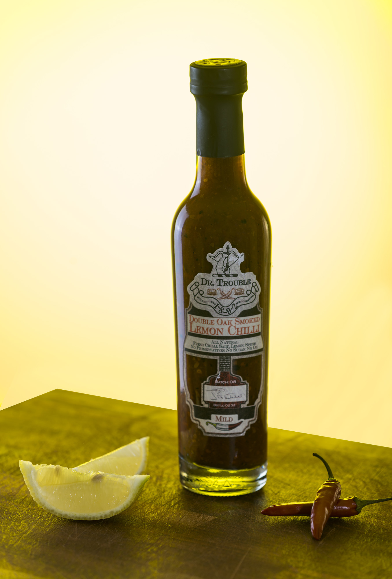
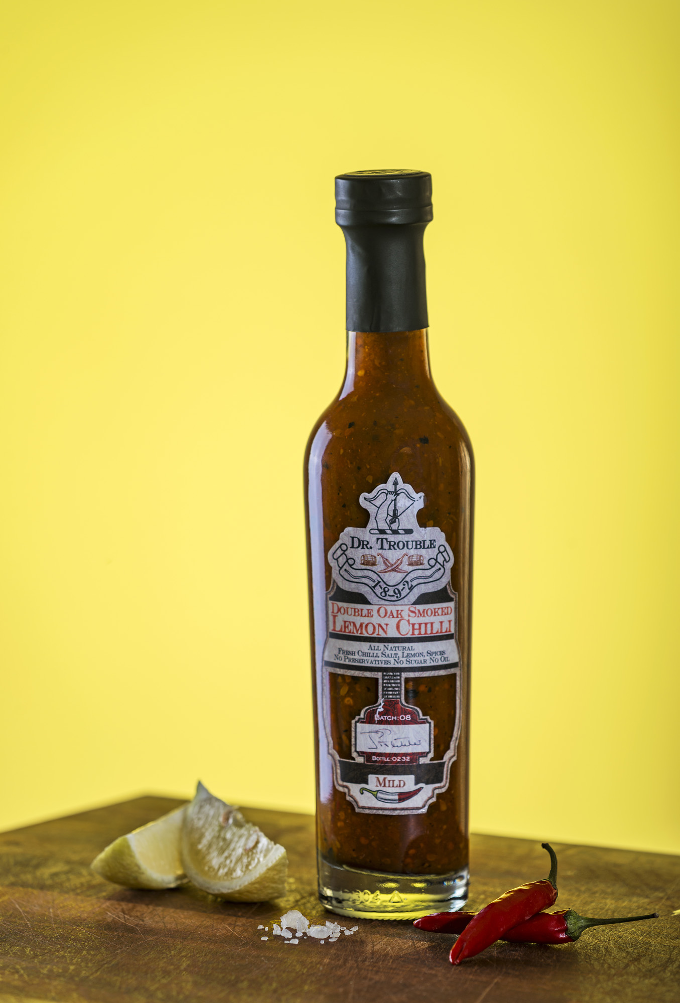
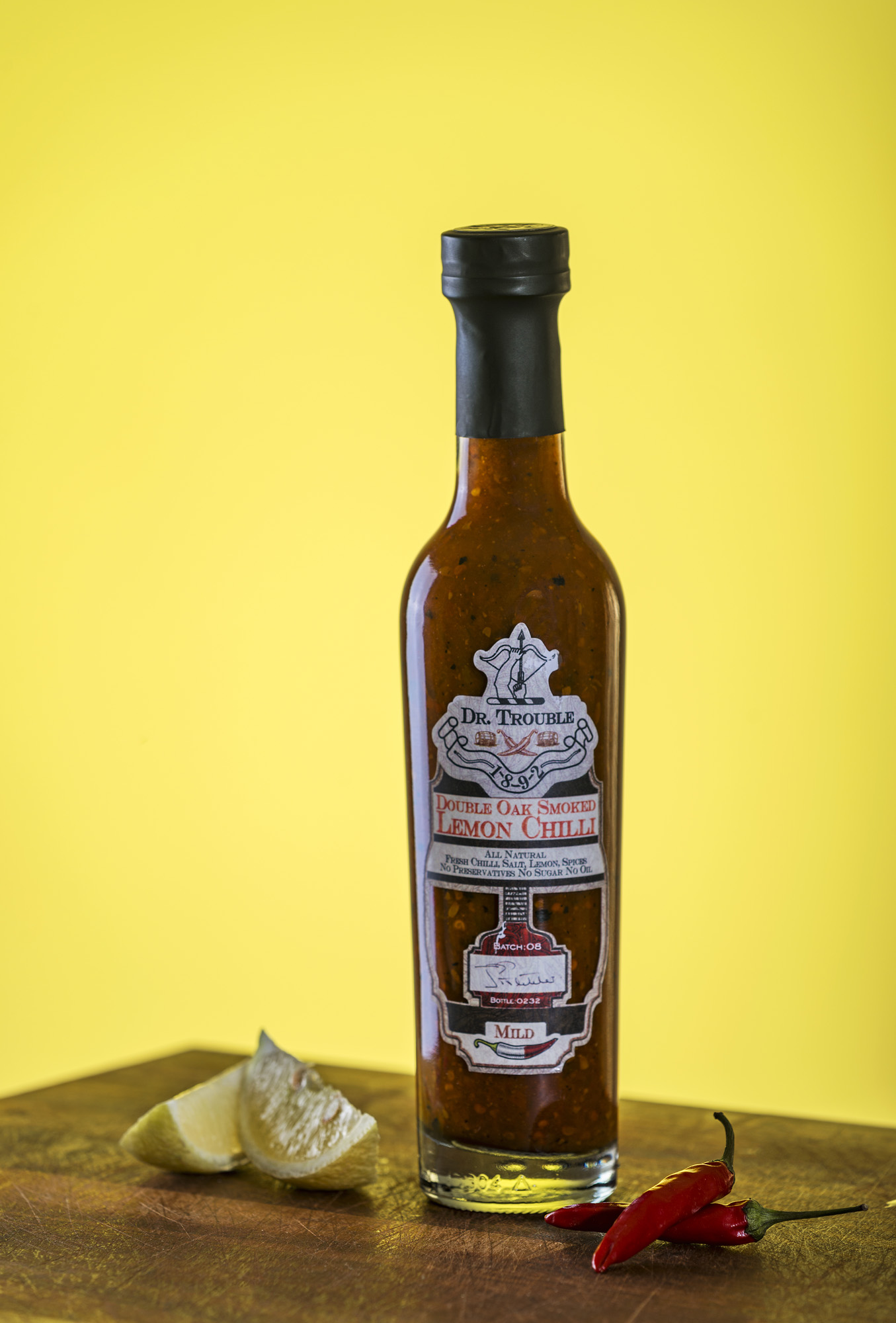
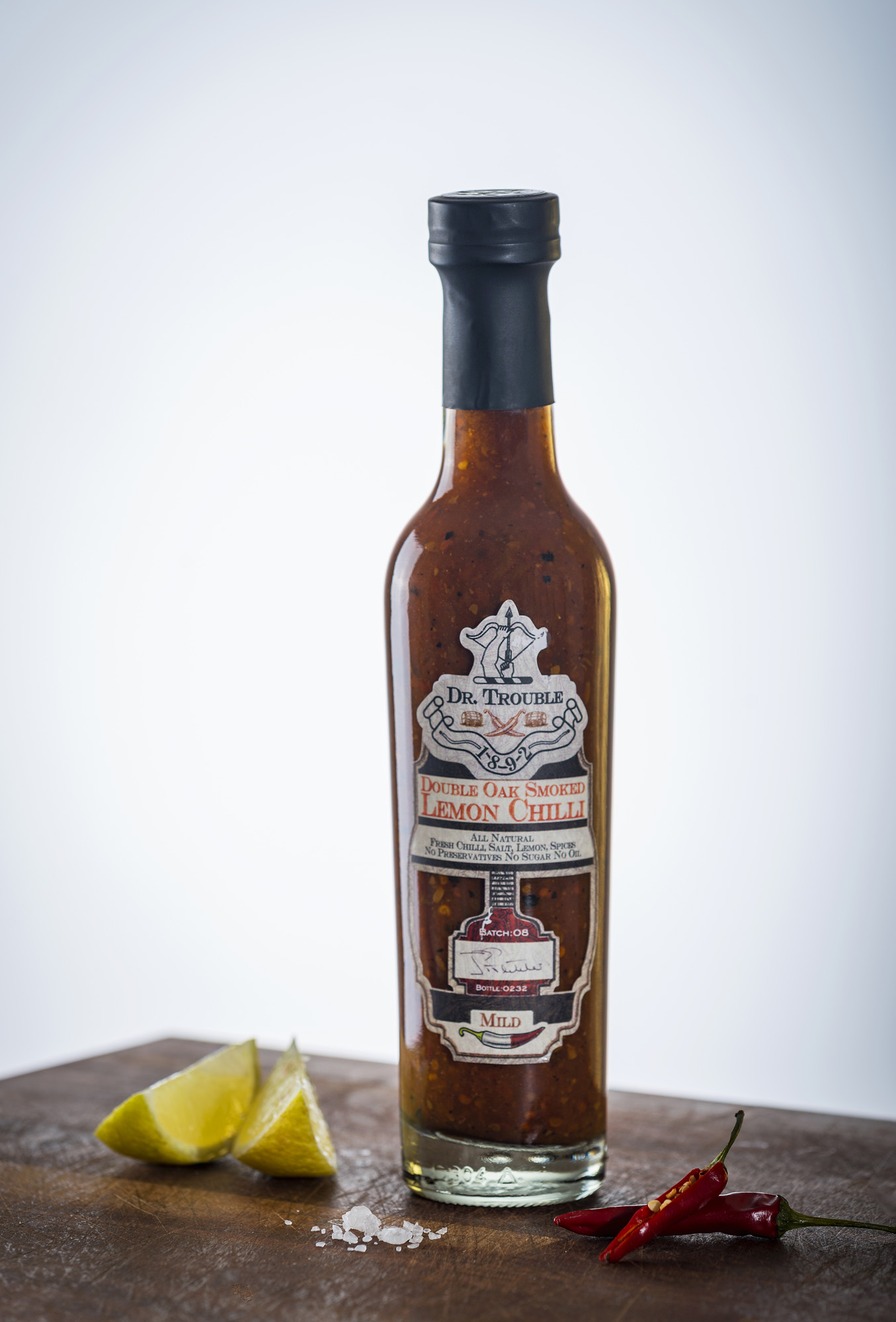
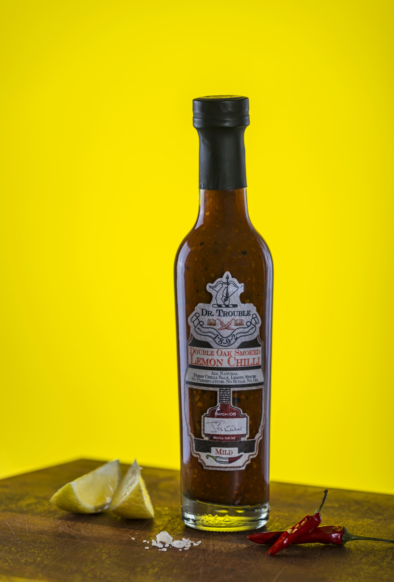
There is no doubt in this day and age that colourful, engaging photography will set your product apart from the competition and, whether its studio photography or lifestyle photography showing the product in use in an everyday setting, good visuals are vital.
In this instance I used a relatively simply lighting setup to achieve several different 'looks' while still maintaining the product as the hero of the image. Variety certainty is, especially in this case, the spice of life and I strove to create different images that could easily stand on their own as visually appealing to a wide audience.
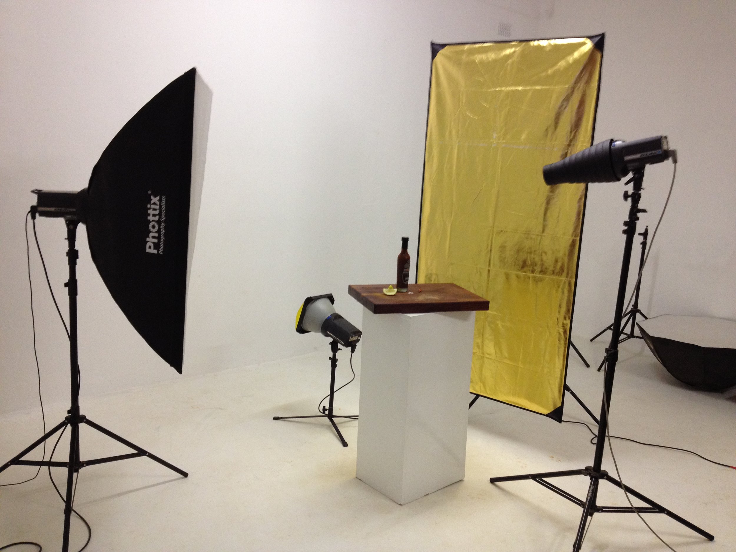
Using a solid wodden chopping board as a base to create that warm, oak feel we created a lighting setup around the product that would best enhance the shape of the bottle. On the left is a standard 50x90 softbox set on a low power to create a gentle rim light on the left hand side of the bottle.
Opposite the softbox on the right is a large gold reflector that will create an even softer gold rimlight on the right side of the bottle. A snoot with a tight grid illuminated the label on the bottle as well as the condiments just in front of the bottle. Finally a light set on low power with a reflector and gel will light up the background, we settled on a lemonish yellow as it spoke to the lemon in the product and did not fight too much with the subtle red of the chilli in the bottle.
From the above series of pictures we can see how the different lights used in the setup illuminated the product. Top left shows the softbox creating the rimlight on the edge of the bottle as well as the rimlight on the right of the bottle created by the large reflector. This showcases the shape of the bottle nicely.
Top right illustrates the use of the yellow gel on the reflector pointed at the backdrop and then bottom left shows how the snoot and tight grid illuminated the label and the condiments on the board. Bottom right is a final shot with all the studio lights firing simultaneously.
Watch more about this product lighting setup in this brief behind the scenes video;
So my love afar with chilli has resulted in a product shot that is both visually appealing and dynamic, usable in a variety of marketing environments and likely to instill the same mouth watering response in a potential customer that it does with me, always!
So how can we help you create stunning imagery that will help sell your brand or product? Contact us, we are always happy to chat and advise or visit our corporate gallery to see more examples of our photography.
