We all love it, it picks us up when we are tired and smells heavenly when its being brewed but must be one of the most under appreciated staples in the kitchen. I was mulling this over early one damp morning when I decided to try and showcase some of Zimbabwe's finest coffee products. So off I shot to the shops and spent an aromatic half hour wandering around the coffee section of our local supermarket. I ended up selecting Vumba Coffee, a brand made in Zimbabwe's eastern highlands because I liked the vibrancy of the brands' logos and wanted a challenge photographing the shiny silver packaging.
Check out the time-lapse video below of me seting up the studio and shooting thje product.
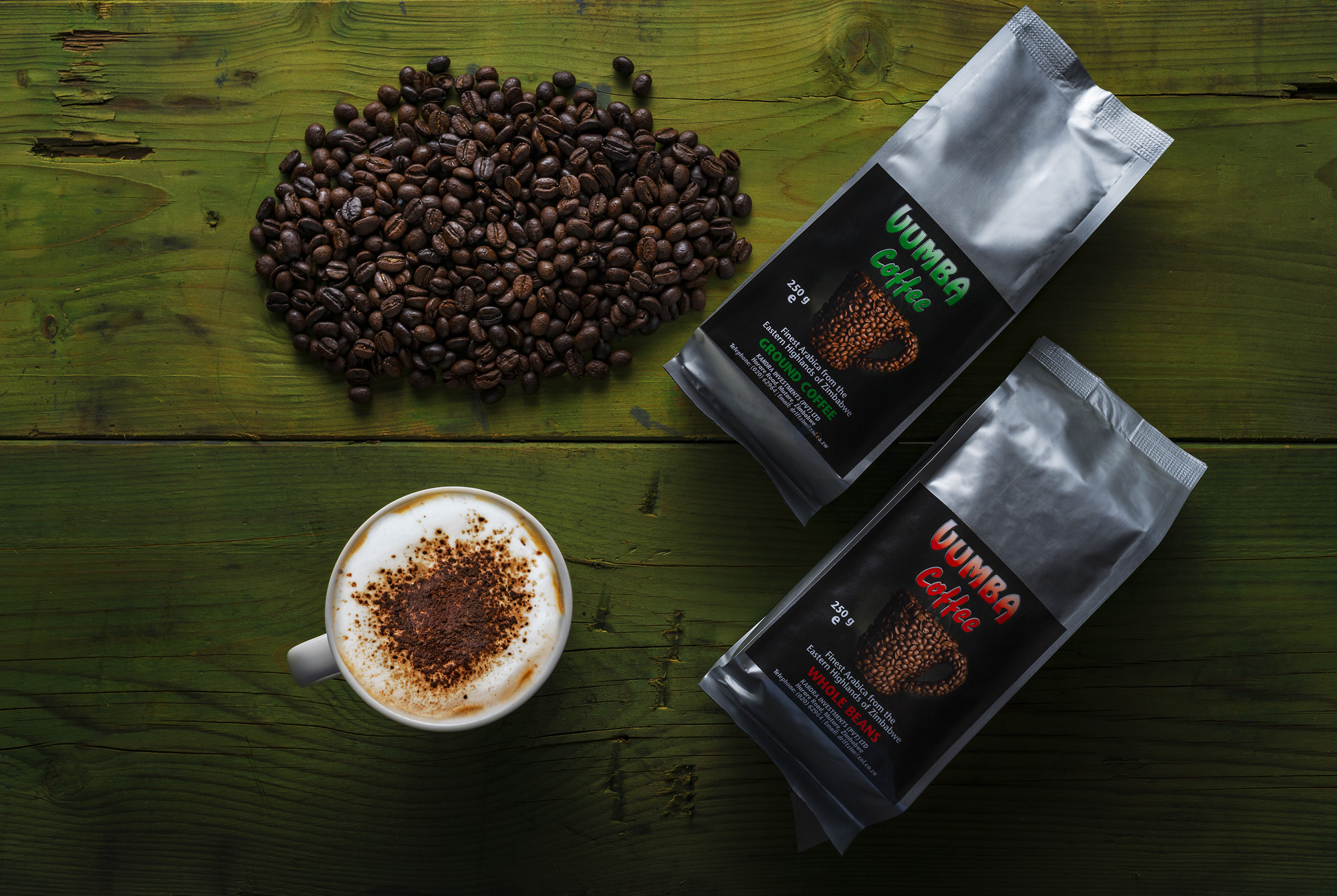
I tried a few different setups initially and wasn't overly happy with the results as I wanted to hero both the packaging as well as the coffee beans themselves. I eventually settled on a setup where the light from a large 30x120cm softbox 'grazed' the product at a very low angle. I liked the striking, contrasty atmosphere that this lighting setup produced as well as the muted effect on the silver packaging.
However there where several shots that I also feel did the product justice, I did battle to contain the reflective nature of the silver packaging as well as manage the various bumps and dips created by the coffee in the package, a little bit of photoshopping was required to try and smooth out these inconsistencies.
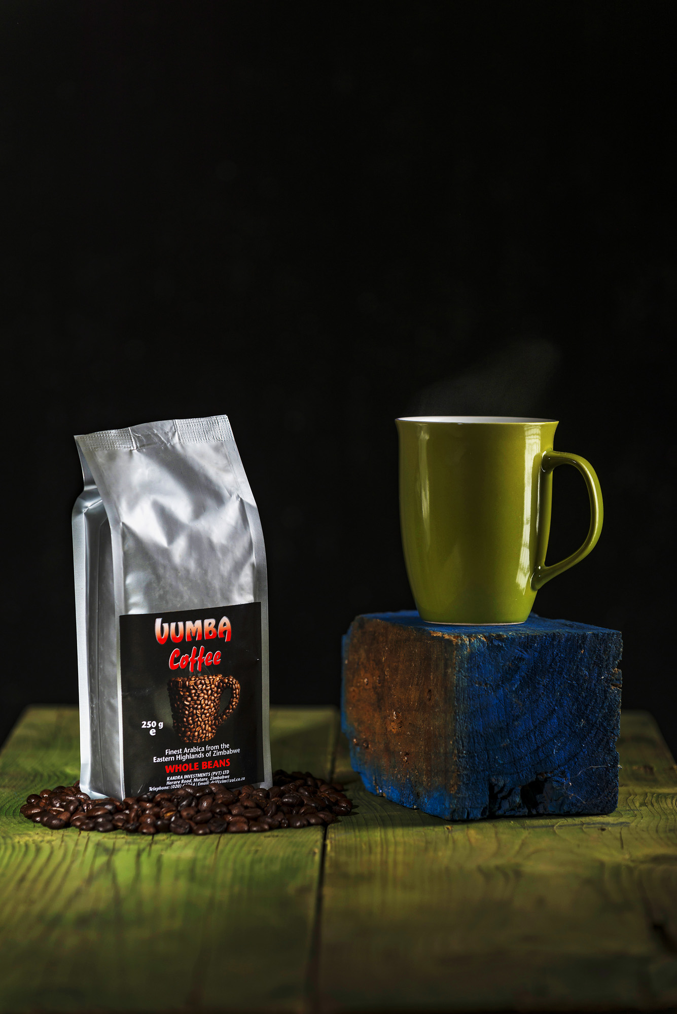
For the above image I used a black background and a beauty dish with a tight grid to create a very focused pool of light on the product, with a very shallow depth of field this keeps the focus on the product and the mug. In this shot I particularly like how the vibrancy of the red in the label stands out against the subtle green wood and particularly the stark black background. The use of a lot of 'dead space' above the product would allow for the addition of any artwork to be added without impinging on the product shot.
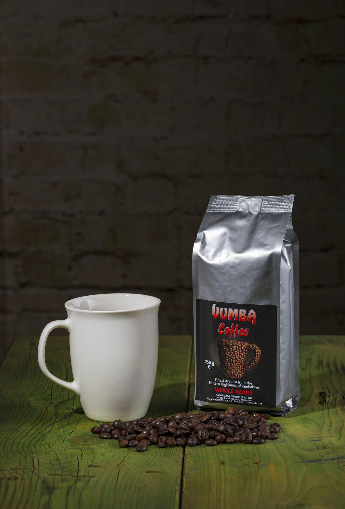
I went with a similar setup in the above scene but added a few more lights so that the product was less dramatically lit as well as a background. I didn't light the background so that it wouldn't be distracting but visible enough to add an extra layer of meaning to the picture. In keeping with the more neutral look of this picture I also changed the colour of the mug to suit the overall mood of the shot.
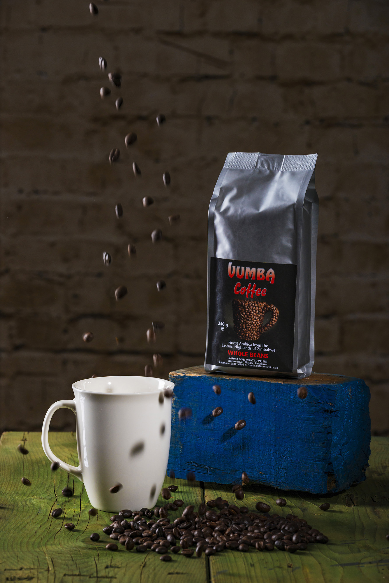
Finally for the above shot I tried to add a sense of fun and excitement by dropping some coffee beans into the mug. I feel that the sense of movement and shadows created by the falling coffee beans adds an extra layer of excitement and vibrancy to the shot.
Overall I am happy with the results from the shoot as a whole but would lean towards the first picture being my favourite! Do email us and let us know your thoughts if you feel differently or have any feedback. Going forward I would really like to shoot and do a behind the scenes blog every month specifically on some of the wonderful products being made in Zimbabwe. So if you feel you have a uniquely Zimbabwean product that you would like showcased please be in touch!
Go behind the scenes and watch me as I setup my studio and shoot the above scenes in the below time-lapse video.
